hi my name is sammi. i'm 14 years old and i do amazing things that most 14 year old kids can't do. my ego is the size of the sun and i'm not kidding you at all.
... if you are looking for my illustrations, click this.. if you are looking for my personal website where i post illustrations, graphics, literature and web design, click this. actually, click that regardless. i could use a few more pageviews. i rarely make banners anymore, but...
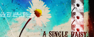
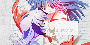
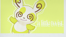
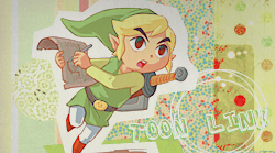
you may not use my banners as i have either made them for close friends or myself.
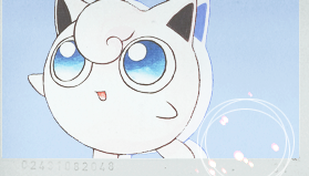
i have 270+ pokemon icons posted here and 53 posted here. these are recent and date back, the furthest, from 25 04 2010. these icons can be offensive.


 new icons from 2010 here
good light textures that don't suck downloadable here
more new icons i haven't posted on livejournal
there are a few more sitting around on my desktop but i am too lazy to upload
click to see orig image


over the years i've become less reliant on textures that i haven't made-- i do not use them in any of my recent icons but use some in my recent banners. i completely exclude brushes that i haven't made from my recent work as well. i now focus more on minimalism and raw photoshop skill as well as colour harmony.
thank you for your time.
... if you are looking for my illustrations, click this.. if you are looking for my personal website where i post illustrations, graphics, literature and web design, click this. actually, click that regardless. i could use a few more pageviews. i rarely make banners anymore, but...
2008


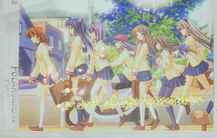
actually, the one above is a coloured manga scan, meaning i coloured it from its original black and white version.


2009
2010


actually, the one above is a coloured manga scan, meaning i coloured it from its original black and white version.
2009
2010
i have 270+ pokemon icons posted here and 53 posted here. these are recent and date back, the furthest, from 25 04 2010. these icons can be offensive.
good light textures that don't suck downloadable here
more new icons i haven't posted on livejournal
there are a few more sitting around on my desktop but i am too lazy to upload
click to see orig image


over the years i've become less reliant on textures that i haven't made-- i do not use them in any of my recent icons but use some in my recent banners. i completely exclude brushes that i haven't made from my recent work as well. i now focus more on minimalism and raw photoshop skill as well as colour harmony.
thank you for your time.
Last edited:
")


