• Hi all. We have had reports of member's signatures being edited to include malicious content. You can rest assured this wasn't done by staff and we can find no indication that the forums themselves have been compromised.

    However, remember to keep your passwords secure. If you use similar logins on multiple sites, people and even bots may be able to access your account.

    We always recommend using unique passwords and enable two-factor authentication if possible. Make sure you are secure.
  • Be sure to join the discussion on our discord at: Discord.gg/serebii
  • If you're still waiting for the e-mail, be sure to check your junk/spam e-mail folders

aocom's sprites!

Wonderful spriting work in general. Nice shading, detailed, and very original designs (I applaud you for making a six-legged humanoid-raccoon hybrid actually work :) )

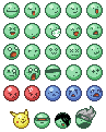
I particularly adore the serpentine dragon and the red bird sitting on the fluffy cloud. I'll tell you now how refreshing it is to see well-made sprites, inspiring too! Yup, hope to see more from you.
 

Mex

Banned
Very good! Shell is the best!
But would it be named "Tortoise" forever?
I can help you with names.
 

-aocom v2-

Victory is ours!
Amazing, just amazing. Really, nicely done! But how is "winter" a clue?
The only piece of crit I could find is that there is a little too much dithering at the bottom of the neck.
its the season it represents.

Very good! Shell is the best!
But would it be named "Tortoise" forever?
I can help you with names.
It'll have a name, don't worry (at least, eventually it will. :p). ^^

Im not sure if this is right but I think each N, S, E, W creature is also linked with a season. I probably have no idea what Im talking about :/
You're right. ^^

Bird:red:summer:south
Dragon:blue:spring:east
Tortoise:black:winter:north
Tiger:white:fall:west

however, I'm going to make the tiger an ice type, since it's white, so yeah. <<''
Maybe it will be here by this weekend, I am not sure.
 
I was right? Ch'yeah! *coolface*


I think making the Tiger an ice type is a good idea.. I dont really know what other type it would be :/ Cant wait to see it though.
 

jakepwnsjoo

Pokemon Shaman
Hehe, the seasonal constellations. ^^

Can't wait for that tiger, Ao. Lovin' the sprites, by the way. The pokemon sometimes are a little too detailed, but lately you've been making them more simple and nintendo style, and that's always a good thing. ^^
 
DRILL SHARKS! <3
They look awesome. =3

And, like I sadi on CS, the :3 smiley is by far the best.
The Pikachu ones outline looks a bit mounted by it's ear though.
 

the Paradox

Resident retart

These look like heartless. I can imagine them moving arround in a disorganized manner, and dancing in blasts of ATP gone array. I find no flaws, whatsoever.

EDIT: exept that their hind legs are kinda pointy, you may want to smoothen them out a little.
 
Last edited:

-aocom v2-

Victory is ours!
the back legs are more stabilizers, if anything. just to help it stand, since its mode of transportation is digging. but when it does move on foot, its kinda jerky.

toxwal2.png

toxwal, the poison water
wal.gif
 

the Paradox

Resident retart
Hmmm... not my favorite of your works. If anything, the shading could be rounder on the body, and flatter on the fins. One of it's tail fins seems bigger than the other and there is a cluster of outline that it would be better off without. I like the shine effect you gave to it, though, and the gas comming out of the blowhole is a nice touch.
 

the Paradox

Resident retart
It is supposed to be kinda flatish. cluster of outline? wut? the 4 pixel saquare of same-color outline right before the tail starts

027venofawn.gif


028reichstag.gif


deer fakemonss
See quote.

Oh, Aocom, However did you reach such level of awsomeness? I just think that on the second one, the first branch on it's right (yes, it's right) antler should be curved, if only by one pixel, it'd look more simmetric, unless you were aiming for some level of imperfection. I love the markings, the way you shaped the antlers, and the purple things at the top of it's limbs. Basically, everything that makes it different from a normal deer.
 
The front-left of the bigger one looks really bad on a dark background.

...well don't look at it on a dark background -_-

I LURRRVVV the Deer fakemon!
They are so unique and cute little creatures.

There really is something about your fakemon, they all have this appeal and supreme originality about them. [:
 

the Paradox

Resident retart
Me too! I love the way he uses anti-aliasing to make diferent effects. ZOMG! lets start a faclub! </boredom, really>

I think that the first one should have a longer neck. It has such a magestic body, and a stubby, little neck. I also think that some of the ear "cavity" on it's left ear should be shown, as the other one is visible.
 

PearledWave§

Well-Known Member
Lol, aocom is like "teh mastr of speshul effeks." Or texture at least.

Of course there is nother I'd rather say than "good job."
 
Top