-
Hi all. We have had reports of member's signatures being edited to include malicious content. You can rest assured this wasn't done by staff and we can find no indication that the forums themselves have been compromised.
However, remember to keep your passwords secure. If you use similar logins on multiple sites, people and even bots may be able to access your account.
We always recommend using unique passwords and enable two-factor authentication if possible. Make sure you are secure. -
Be sure to join the discussion on our discord at: Discord.gg/serebii
You are using an out of date browser. It may not display this or other websites correctly.
You should upgrade or use an alternative browser.
You should upgrade or use an alternative browser.
Azulart's creations
- Thread starter Azulart
- Start date
Wow, these are awesome! I really like the Virgil, Warrior of Light, and Aipom banners
thank you very much, great hearing that.
I found it funny you like the Aipom banner, it was my second Animation banner I made
not doing much Animation banners anymore though, lot of work.
these are amazing!
i might want to put one in my sig
btw what is the painting of?
Thank you ^^, your free to have them in your sig.
What painting are you refering too? If your talking about the green one, thats an stock image plus Servines photoshopped
FairyWitch
Metroid Hunter
the peirre banner is much better imo keep up the good work azul ^_^ glad to have you in my shop
Wow. You've got a lot here and a lot of variety as well. Since I really like colorful pieces, I love that so many of your pieces use a lot of different colors. I'm not really sure which stuff you'd like me to comment on most, but I'll say what definitely caught my eye is your wallpapers. I love a sort of surreal/spacey/fantasy look and, while you do that in some of your other graphics, it really shows up in your wallpapers. There's absolutely no doubt about which of your graphics is my favorite--it's this one. Of course, that one has a leg up in the first place because I love dragons and dragony things, but it also has a great colorscheme, effects, and oozes a sense of drama. I think the banner version you made of it is okay, but it loses a lot of its epicness in the shrink, and the text gets so small that I feel like it might as well be removed. But the wallpaper is fantastic.
Your other wallpapers are really cool, particularly in the contrasting scenes they present. I love the greens in the next one down and the starry reflection on the water. I will say I was a little put off by the visible outlines around the tree and mountains at first, but I think the image is stylized enough that it works. For the next one down, the flooded pyramid scene is obviously really striking, but what draws my eye is that kickass sky.
So yeah, there's some really awesome stuff here and the style that you're using in your wallpapers is one that I definitely find really appealing.
FairyWitch
Metroid Hunter
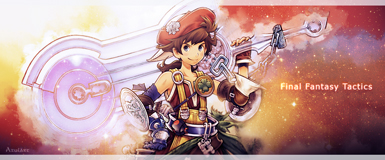
the banner looks good its very good i like the style of it...the color variation are very nice as well...the final fantasy text seems a bit blurry but everything else is amazing azul...keep at it

FairyWitch
Metroid Hunter
this signature is amazing imo azul i saw it in the shop and got side tracked what i was posting XD anyway love the colors and effects you did to it...the lightning bolt is amazing i need to start making some unique sigs now XD
i need to start making some unique sigs now XDBelieve it or not, but the Luxray banner was really difficult to make.
I just started to learn how to make Smudge banners, and immidatly had to apply the style in an weird shape xD
I'm satisfied of the result though, Dylan was aswell
Thanks one again for the great words Eeve!
I just started to learn how to make Smudge banners, and immidatly had to apply the style in an weird shape xD
I'm satisfied of the result though, Dylan was aswell
Thanks one again for the great words Eeve!

Thanks! The customer of the signature wanted it to be dark,. I tried to light it up a little, but then it dindt mix up well with the background. (It would also stand out too much, which shouldnt be the effect in this case.) If it's an problem for the customer, I'll lighten the text though
Thanks! The customer of the signature wanted it to be dark,. I tried to light it up a little, but then it dindt mix up well with the background. (It would also stand out too much, which shouldnt be the effect in this case.) If it's an problem for the customer, I'll lighten the text though
Ok, it's just that the flow doesn't match if the colors are like that, makes it off balance and difficult I read is you know what I mean. Maybe it's just my phone though.
Ok, it's just that the flow doesn't match if the colors are like that, makes it off balance and difficult I read is you know what I mean. Maybe it's just my phone though.
Hmm, well what the phone shows you is not how the real image is imo.
Check it out again on PC and tell me after if you notice the same issue
Im on a computer, and it looks the same, but bigger. I'd suggest the text be white in the middle and get darker as it goes out to the left and right.
I made the text white in my file, but dind't like the result at all. It destroys the feeling of the cold-heartedness in the banner.