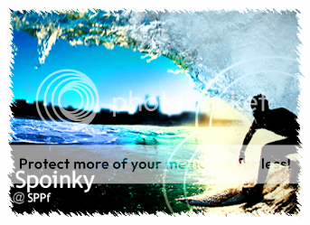
Recently I have been making banners using Photoshop Elements 2 and I thought I'd post them to get some Crit ") Oh, and BTW, Elements 2 doesn't have selective colouring O:
Oh, and BTW, Elements 2 doesn't have selective colouring O:
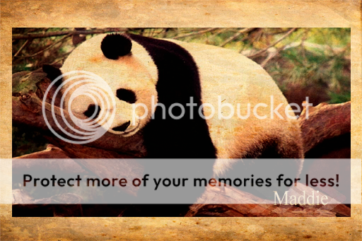
Oh, and BTW, Elements 2 doesn't have selective colouring O:v.1
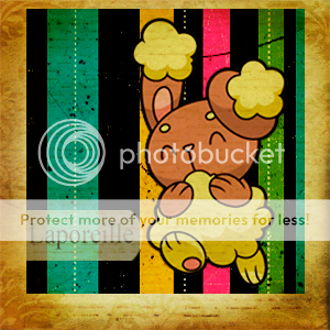
 v.2
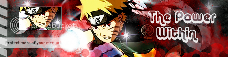
v.2


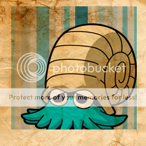
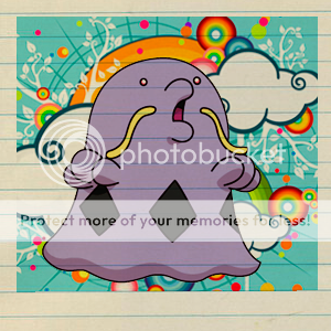
As you can see, I often use the same style but occasionally I do different things<33 C+C would be much appreciated D
D
Last edited:


