-
Hi all. We have had reports of member's signatures being edited to include malicious content. You can rest assured this wasn't done by staff and we can find no indication that the forums themselves have been compromised.
However, remember to keep your passwords secure. If you use similar logins on multiple sites, people and even bots may be able to access your account.
We always recommend using unique passwords and enable two-factor authentication if possible. Make sure you are secure. -
Be sure to join the discussion on our discord at: Discord.gg/serebii
You are using an out of date browser. It may not display this or other websites correctly.
You should upgrade or use an alternative browser.
You should upgrade or use an alternative browser.
[Banners]
- Thread starter John's Knight
- Start date
krazyelements241
Well-Known Member
i like the yellow one better because yellow is my fave color well one of them! lol...but they are both good ! yuppers! they are!
John's Knight
Well-Known Member
New one!
Brandon-kun
lalalalalalalalalala
It would've been better black and white, in my opinion, but if you like it, then you can keep it like this.
Even though you used very light colors in some areas, you pulled off the text thing. You made is visible, which is awesome. You also have good lighting!
Wow, I must say, you can really improve.
This:

To This:
All I can say is . . wow.
Even though you used very light colors in some areas, you pulled off the text thing. You made is visible, which is awesome. You also have good lighting!
Wow, I must say, you can really improve.
This:
To This:
All I can say is . . wow.
John's Knight
Well-Known Member
Thanks Rasengan. Yeah, seeing things like that, I guess I really did improve. Yay me! *shot*
Magne-2000lbs.
Shut up!
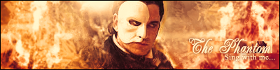
How'd you make those fire effects in your Phantom banner? Are they renders?
John's Knight
Well-Known Member
How'd you make those fire effects in your Phantom banner? Are they renders?
Nope, they're all filters.
rogelio1018
New Member
how do u put on the banners????(im a noob at this)
Magne-2000lbs.
Shut up!
Filters? How? You must've had SOMETHING, and then filter it, right?
John's Knight
Well-Known Member
how do u put on the banners????(im a noob at this)
You host them on imageshack, or *******, or photobucket, or any other image hoster.
Filters? How? You must've had SOMETHING, and then filter it, right?
Mainly the background, since I had two C4Ds at low opacity.
Magne-2000lbs.
Shut up!
*applause* Just the background? Hmm... I just get a copy of the render and do some weird things with it. Or a brush, but those are overrated.
John's Knight
Well-Known Member
*applause* Just the background? Hmm... I just get a copy of the render and do some weird things with it. Or a brush, but those are overrated.
I'm doing a tutorial about that banner, so you'll know just how I did it ^_^
Magne-2000lbs.
Shut up!
This is odd. Once someone makes a tutorial, another person makes one too.
Anyway, thanks!
*notices something* Is "rogelio1018" using your banner?
Anyway, thanks!
*notices something* Is "rogelio1018" using your banner?
John's Knight
Well-Known Member
This is odd. Once someone makes a tutorial, another person makes one too.
Anyway, thanks!
*notices something* Is "rogelio1018" using your banner?
The tut was started on Friday, but didn't get the chances to finish it.
And it appears it is...without giving credit...
Magne-2000lbs.
Shut up!
So you did eh? I started one today and finished today.
Btw, what do you do to your text that makes it readable? I mean, you have it at a bright color above a bright background (clip), but how is it still readable?
Btw, what do you do to your text that makes it readable? I mean, you have it at a bright color above a bright background (clip), but how is it still readable?
John's Knight
Well-Known Member
So you did eh? I started one today and finished today.
Btw, what do you do to your text that makes it readable? I mean, you have it at a bright color above a bright background (clip), but how is it still readable?
Late, sorry <<;
I usually put a drop shadow on it. Easy like that =D
EDIT: banner I did yesterday, it sucks ;_;
John's Knight
Well-Known Member
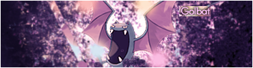
First sprite tag.

Magne-2000lbs.
Shut up!
Yeah, Tyranitar isn't blended in enough. Try putting in more effects in the tag.
Brandon-kun
lalalalalalalalalala
Er... xDFirst sprite tag.
Not your best, that's all I have to say. D: *dies from light* ;;