• Hi all. We have had reports of member's signatures being edited to include malicious content. You can rest assured this wasn't done by staff and we can find no indication that the forums themselves have been compromised.

    However, remember to keep your passwords secure. If you use similar logins on multiple sites, people and even bots may be able to access your account.

    We always recommend using unique passwords and enable two-factor authentication if possible. Make sure you are secure.
  • Be sure to join the discussion on our discord at: Discord.gg/serebii
  • If you're still waiting for the e-mail, be sure to check your junk/spam e-mail folders

Breaking News! 4th Gen Pokemon were in Red/Blue!

Chibi Pika

Stay positive
This is an amazing find! If you beat the Elite Four fifty times, then perform the missingno glitch and toss out copies of the duplicated item, then encounter Mewtwo, the amount that you tossed out will cause the corresponding Pokemon in the Sinnoh Dex to appear instead of Mewtwo!
Lucario_RB_screen2.png
Dialga_RB_screen2.png
Palkia_RB_screen.png


...Or, I just made some devamps. Yeah, I remember now, that was it... Silly me. I guess you can disregard all of that other stuff.

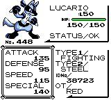
I've gotten rather addicted to making them. :3 Yeah, they're a little too "pretty" to be actual 1st gen sprites, but I don't think I did too bad of a job.

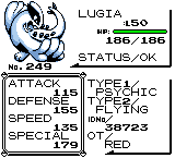
Also I made a Lugia:
Lugia_RB_screen3.png


~Chibi~;249;;448;
 

Lorde

Let's go to the beach, each.
Chibi Pika I like them all. My favorites are Lucario and Lugia (since they're my favorite Pokemon!) even though they do look a little too pretty to be in Red/Blue. I think Dialga and Palkia must have been quite the challenge to "devamp" since they're so big in the 4th Generation and you seem to have had to reduce their size a bit to make them fit in Red/Blue's status screens. Because of that, it's kind of hard to make out what they look like but like I said they are all pretty darn good :) Are you planning on making a few more?
 

Serris

Specialist Operator
Now these are the devamps I like to see. Unlike other people, you have taken the time to resize and colour and crappify (hell, even I don't know what I mean by that) to make them suit older games. You've resized, recoloured, and reshaded to suit the older games. These are excellent. Dialga is probably my favourite, followed by the Lucario. I really do like what you have done with them, especially the screenshot thing. I do look froward to seeing more. Great job, and keep up the great work.
 

tomthepom

Well-Known Member
Just like on Pokecommunity my comment is basically the same.
These are awesome, Lugia is my favourite out of them, keep up the good work.
Cant wait to see more.
 

Ryubane

Why yes, it exists
I wonder if I could fool my n00b sister...

Seriously though, these are good. These are really good interpretations of how they would look in-game, and you really took the time to make them look bad. Well, not bad, but...retro. You know what I mean by that. However, Lucario is a little large. Either that or Dialga and Palkia appear too small. I guess I'm just used to seeing them so large that smaller Devamps like this are a little strange. But hey, they're really good sprites. Splendid job, and I can't wait to see if you make any more.
 

ReaperNeku

The One and Only
the lugia and lucario looks a little too pretty to be in those old grandpas right? The dialga and palkia looks sweet since you took the time to crappify it :D
 

Chibi Pika

Stay positive
Chibi Pika I like them all. My favorites are Lucario and Lugia (since they're my favorite Pokemon!) even though they do look a little too pretty to be in Red/Blue. I think Dialga and Palkia must have been quite the challenge to "devamp" since they're so big in the 4th Generation and you seem to have had to reduce their size a bit to make them fit in Red/Blue's status screens. Because of that, it's kind of hard to make out what they look like but like I said they are all pretty darn good :) Are you planning on making a few more?
Indeed, Dialga and Palkia took a very long time to fit in that space. x3 Palkia in particular.
Now these are the devamps I like to see. Unlike other people, you have taken the time to resize and colour and crappify (hell, even I don't know what I mean by that) to make them suit older games. You've resized, recoloured, and reshaded to suit the older games. These are excellent. Dialga is probably my favourite, followed by the Lucario. I really do like what you have done with them, especially the screenshot thing. I do look froward to seeing more. Great job, and keep up the great work.
Yeah, I don't like how devamps are generally either recolors, or scratches that have been deformed to an exaggerated amount of ugliness. =P
These are incredile, the really do look just like RBY sprites.
The only one I would say is too "pretty" is lucario, it also looks a bit large, especially compared to the others.
I wonder if I could fool my n00b sister...

Seriously though, these are good. These are really good interpretations of how they would look in-game, and you really took the time to make them look bad. Well, not bad, but...retro. You know what I mean by that. However, Lucario is a little large. Either that or Dialga and Palkia appear too small. I guess I'm just used to seeing them so large that smaller Devamps like this are a little strange. But hey, they're really good sprites. Splendid job, and I can't wait to see if you make any more.
Yeah, the problem was height-wise, he wouldn't fit in anything smaller, but the three Legendaries took up more space overall, which was what I was relying on. That and the general lack of proportions back then, such as Rhyhorn being huge.
the lugia and lucario looks a little too pretty to be in those old grandpas right? The dialga and palkia looks sweet since you took the time to crappify it :D
Lol, yeah, it was hard to make Lucario look retro since I have such a rigidly perfect view of the way he needs to be drawn. xP

Thanks for the comments, all.

~Chibi~;249;;448;
 

Serris

Specialist Operator
Yeah, I don't like how devamps are generally either recolors, or scratches that have been deformed to an exaggerated amount of ugliness. =P
Exactly. Devamps, for them to work, have to be made ugly. And you've done exactly that. Which is great :D Hope that doesn't out bad XD Well. Not ugly exactly, but the reduced kind of quality in the appearance of the pokemon to suit the old games. If that made ANY sense at all XD
 

Ryubane

Why yes, it exists
I think what we're all trying to say is that your devamps are so ugly they're pretty. Which is exactly what the R/B/Y/G sprites were/are.

I've actually made an unpublished revamping guide that has the following statement about devamps, in a human analogy:

"[Making a modern sprite look old is] in the same way that elderly people don’t look ugly, but if a supermodel were to modify her body to make herself look elderly (Which would be o_O to a very high degree), she’d end up looking ugly, in an uncannily un-ugly way, just like an elderly person."

Which is what I believe is the purpose behind a good devamp. You've certainly done that. Bravo.
 

LudicoloGuy

ludiludiludiludiludi
These sprites are all great, but they look to... professional for RBGY.
 

Zozo1999

has left Serebii
Those are awesome, and proof thatit's fake, Steel types werent'y invented when red/Blue came out xD
 

Zozo1999

has left Serebii
Awesome

Those are awesome, and proof thatit's fake, Steel types werent't invented when red/Blue came out xD
 

Satoshi_poketo monsta

Home-Made Trainer.
That's a good looking devamps. even I was never make any, im still gonna like it.
 

Willow's Tara

The Bewitched
Wow they look pretty real like they could be from that era. Lugia reminds me of Silver from the anime in Master Quest too.
 
Top