Good stuff, Mew_
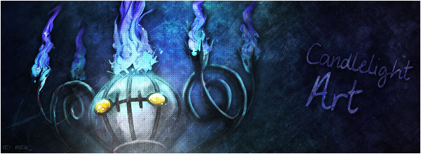
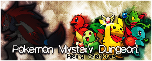
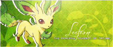
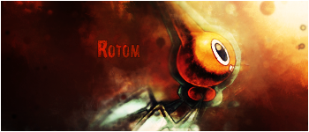
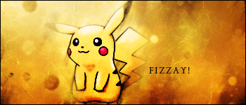
I noticed that most of your older works have thicker borders, which I think was too noticable especially the white borders. I think it's a good thing you make them thinner now. It's very clear that you have improved upon your graphics greatly with the more recent ones, in particular the smudge ones. To be honest, I am not really into smudge banners, but yours are the very few that I really like. The Rotom one is the best one there, but my personal favourite is the Hilda/Hilbert/Victini one. I also think your Secret Santa one is a great one too. I can't say I'm much of a fan of those kinds of games and I generally dislike pop-out images, but I think the way you used the effects around the image to express movement is quite nice and the use of the text textures are great too. The Leafeon banner is my favourite of the whole lot - the colors are very well suited, text is great and I just love the way you made it.
The only let-down of your most recent banners is the Vulpix one. Parts of the image look like they are disappearing and not in a good way. Also, there's a very strange texture on Vulpix's chest - I don't know what you were trying to do there. I just don't think that the picture really fits the smudge technique that you have in the rest of the banner. It's clear that you like making smudge banners, but I think you should be selective in terms of what images you use for them - some work, but not all pictures look good with a smudge background. Of course, this is coming from someone who's not really a fan of smudge banners so that might be a personal bias.
Anyway, you mostly do great work.
Thanks for your comments ^^. And yes, I never use a 2px border anymore, only on text sometimes, but never at 100% opacity.
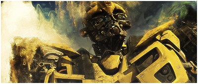
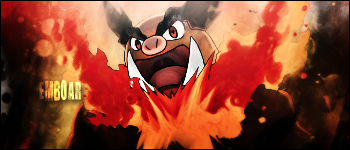
Well, I used a completely different style, since to be honest, I really didn't like my banners anymore. So instead of using textures and such, I decided to mess around a bit with the smudge tool, and also use a dozen of new techniques to make the banner look better. I actually really like the Vulpix one, and the Rotom one was made the same way.
And everyone seems to like the Leafeon banner the most

. To be honest, it was made in 15 minutes. But I really like the simple effects on that one actually. Thanks again for your C&C.
In my opinion, your Leafeon banner is the best banner of your's I've seen (which is saying something, considering over a third of SPPf uses your art).
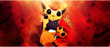
I know your Smile banner is a real Smudge banner, but I think it's a little too smudged.
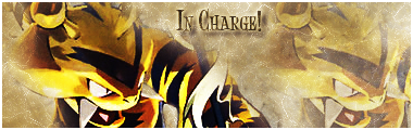
Also, to me, the dimensions of some of your banners are a little odd. I think you should stick with dimensions that are similar to your In Charge! banner (which I noticed you've done with some of your more recent work).
Overall, very nice banners.
Thanks, that Leafeon banner was made in 15 minutes though, but I thought it really came out good too.
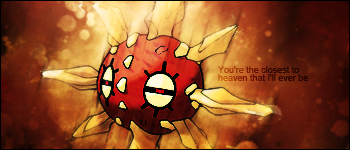
That Vulpix banner was the first banner I made using a dozen of new techniques, so I think I overdid it a little. But I still think it's better than my Rotom banner though, I like how colorful it is ^^.
And most of these banners were requests at my shop, so I make it in the size they request. Which banners do you think have odd dimensions?
Thanks a lot for your C&C.
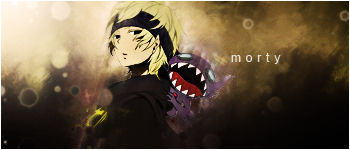
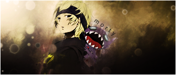
Edit: Made a new banner, wasn't sure about the text though.