• Hi all. We have had reports of member's signatures being edited to include malicious content. You can rest assured this wasn't done by staff and we can find no indication that the forums themselves have been compromised.

    However, remember to keep your passwords secure. If you use similar logins on multiple sites, people and even bots may be able to access your account.

    We always recommend using unique passwords and enable two-factor authentication if possible. Make sure you are secure.
  • Be sure to join the discussion on our discord at: Discord.gg/serebii
  • If you're still waiting for the e-mail, be sure to check your junk/spam e-mail folders

Crimson's Graphics

Alfred Jones

Cryptic thoughts
crimsondarknessfusion.gif
Welcome To
crimsondarknessfusion.gif

Flyawaywithme-2.png


Hello, and welcome to my Graphics thread. Here I will be posting my fail noobish banners. I use GIMP to create my banners and well, I am fairly new at it so please be nice.

EspeonBanner.png

Espeon

EspeonBanner-1.png

Espeon V2

Smug.png

Snivy

Smug1.png

Snivy Version 2

Dreambig.png

Umbreon

Flyawaywithme-1.png


Comeatmebro.png


Userbar.png


merryxmas-1.png


Winterbanner.png


Zekrombanner.png


Milotic1.png


Darkness.png


Foxy.png

Credits of the reshirom fusion go to LunGhost
 
Last edited:

briguin

Dr. Geek
Pretty cool. :cool:
 
Your work is pretty good. A lot better than the stuff other people come up with. The second one has very decent flow, but because it pops-out, it lacks in depth. I don't really like pop-out that much, but if you get good at it, you might be able to work around that handicap. The fractal work looks pretty nice and goes with the simple design but it's slightly too sharp. Do you see those little speckle-like dots? That happens when you oversharpen, it can give a piece a nice old vintage style but I don't think that was your intention. If you didn't oversharpen, just freehand blur the parts that have that kind of noise.

Also, do you see the edges of your Snivy? It's slightly pixel-like, you should try to come up as to how to get rid of that, as it looks strange and actually sort of separates the render from the fractal and the rectangle shape as opposed to making your render blend in with them. One way that works is blurring or smudging the sides to make it blend in, but it doesn't work quite as well with renders that pop-out.

Text placement is something a lot of designers struggle with. But the way to learn is to look at the works of others (most preferably good designers; DeviantART and such.) and try to find out how they place their text and how you should be placing your text, it's easier to understand that way.

Keep on improving the concepts and overall quality of your work. :p
 

kyogreblue3

take a byte
mmkay, KB3 is in the hou-se!
Let's see your works here, Crimson. yeah, I was eventually gonna check sooner or later
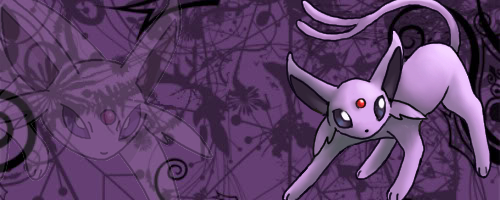
 :p

Espeon Banner
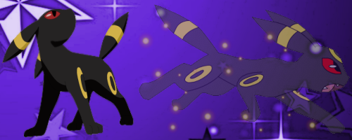
The Espeon on the left, the one that's fading, is a nice effect; an over-used effect for most graphic designers lol but still epic anyway xD
The Espeon on the right, however, could step a little to the left . . . there's just some uncovered space there.
The BG could have been . . . I dunno, less flower-ish? And you could add some effects to the BG, too, like C4D's
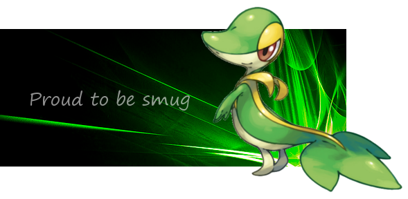
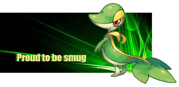
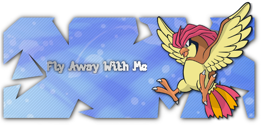
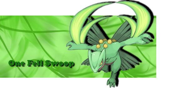
Snivy Banners
The second one looks better IMO, the font fits more with Snivy that it's two colors; green and yellow xD
I seriously do not get the Snivy craze that's going on :/
Why can't it be Typhlosion?!?
Anyway, like pupin said, it has very nice flow coming from the background ^_^
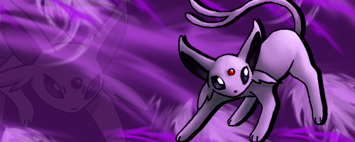
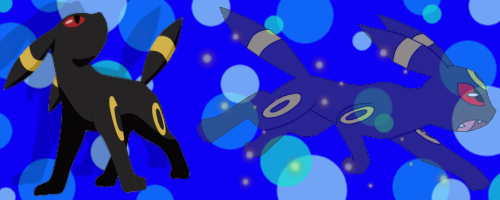
Umbreon Banner
Same comments as Espeon banner

~~~~~~~~~~~~~~~~~~~~~~~~~~~~~~~~~~~~~~~~~~~~~~~~~~~~~

Overall, they're decent for a beginner. Try following some tutorials. There's some high-quality tuts here. Go to the Beginners section of the tutorials xD
 

Alfred Jones

Cryptic thoughts
Heyy KB3 thanks for stopping by~

With the Espeon banner, I was going to put some text in there, but I thought it looked better without the text so that's the reason for the space.

Newb question. What's a C4D?

Nya, I love Snivy, and wanted to try to make a banner. But I will make a Typhlosion one soon I promise!
 

kyogreblue3

take a byte
Intro Banner
Typhlosion = win
The font you used for 'fiery', you HAVE to tell me the name.
Your typography was good IMO
Ha, I see you put a Gardient Flare/Lens Flare in Typhlosion's mouth xD
You might want to try the "Yelling Tutorial" on guildinn to complete the whole beam effect
Typhlosion could've been extracted/rendered better, there's some pixels here and there. Remember to use the fuzzy wand/rectangle select/free-form select tools.
You could've made the banner a bit smaller, because there's a huge, empty gap between Typhlosion and the text.
The BG kinda looks like you used a little Gaussian Blur, did you get it like that or did you add the Blur?
Here's the problem with pop-out banners: you have to clean up the lines. There's some of them near Typhlosion's feet and the upper left corner
 

Alfred Jones

Cryptic thoughts
Oh the font I used was called John Handy LET Thin
Yeah I did put a lens flare in his mouth, and used the spark brush to give it the illusion that he's about to launch a flamethrower. Actually I was thinking of the episode 'Charizard Chills' when I made it because that's how Charizard launches it's flamethrower in that episode.
I'll check it out when I have the time thanks.
I did edit the banner so I hope it looks better, I used the blur tool to blend him in better. I used around 50% opacity so it wouldn't be too blurred.
I moved Typhlosion and the text closer to the center, so I hope that looks better.
The BG I blurred, because I wanted the effect that in some photos the bg is blurred and there's an object that stands out.
Lol with my banner in GIMP I didn't see the lines until I posted it up on the thread.
 

kyogreblue3

take a byte
Haven't checked this place out in a while :p

New Banners!

Dreambig-1.png

Umbreon V2

Buizel.png

Buizel, request from a friend

Buizel2.png

Buizel without purple text

Bubbles and Umbreon? o.0
Bubbles is solely something I would've done with Water-types.
Umbreon deserves something . . . . dark

You have some problems with transparency on the Buizel banners; there's practically a black strip at the top of the banners.
The good this is, though, is that you've pretty much mastered focal points
The drop shadow on the purple text is a nice effect ^_^


This one's great.
But Sceptile's blades have some random pixels here and there; try rendering.
It gives great practice with the pen tool.
The drop shadow is great here, too, but try some other great effects.
You never know when things such as pixelate, motion blur, and Perspective can come in handy ;)
 

Alfred Jones

Cryptic thoughts
With the Sceptile one it was really frustrating to get rid of those pixels onn the render, it took a couple hours just to get it right and it still wasn't enough to get rid of it.

The Umbreon one was just to try for the Buizel one, I wanted to make a nice BG for the Buizel one so I messed around with my Umbreon one.

The Buizel one I know I made a mistake with one of the layers, it didn't show up until after I loaded it onto PB and onto this site that I noticed my mistake and I had closed down GIMP by that time. My friend likes it none the less though.
 
Top