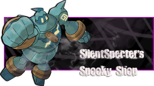
• Hi all. We have had reports of member's signatures being edited to include malicious content. You can rest assured this wasn't done by staff and we can find no indication that the forums themselves have been compromised.

    However, remember to keep your passwords secure. If you use similar logins on multiple sites, people and even bots may be able to access your account.

    We always recommend using unique passwords and enable two-factor authentication if possible. Make sure you are secure.
  • Be sure to join the discussion on our discord at: Discord.gg/serebii
  • If you're still waiting for the e-mail, be sure to check your junk/spam e-mail folders

Crimson's Graphics

kyogreblue3

take a byte
Legendary Guardians
That one is a mix of silver and gold, eh? xD
Nice 1px stroke around the text, too ^_^
The only real problem is that the text could've been schooched over to Ho-Oh's side a bit :/

Hypno and Children
LOL, reminds me of my ol' Hypno on SS :3
The 'now you'll stay with me forever' text could've been under 'Little children, you weren't clever'.
Along with that, the focal could've been schooched down a notch, too.

Drifloon
Nice swirly M's there xD
ah, Drifloon . . . bringing memories of Pokemon Ranger 2 :3
Speaking of Drifloon, it could've been moved to the right a little, it's a bit too close to the text
I really like your use of brushes, though ^_^

Blue Avatar
That black border is just . . . meh, it looks out of place, too.
Plus the whole avatar itself could've used pizzaz, think of avatars as mini banners.
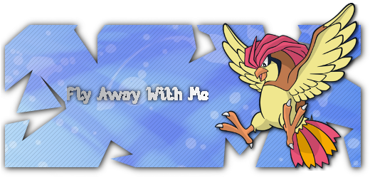
Nova Travels
Those . . . bubbles . . . are really messing up the whole thing :(
A bokeh effect would've looked great in the BG, but over the Pokemon it looks wrong and horrendously messes up the banner
 
Last edited:

Alfred Jones

Cryptic thoughts
Legendary Guardians: It's just the hollowed out Pokemon font, I was really nitpicky on making this banner, so I wanted it to be balanced. I got mad at it so many times just to get it right.

Hypno: It was a request, the text was requested to be placed like that.


Driffon: Yet another request. Hard to decide on what I wanted on it, and how to make it.

Blue Avatar: Request again, I ended up overbrushing it the first time, so this is just a simple version of it.

Nova Travels: A what effect?
 

kyogreblue3

take a byte
Nova Travels: A what effect?

sorry for replying real late, bro >.<
this is an example of a bokeh effect


Golurk
I have a Golurk in my B/W team and named it Exorcist :3
no, I don't read the manga
Anyway, the only thing that bothers me, and it bothers me A LOT, is the text that's ON the border.
It just looks a bit wrong and . . . misplaced

Victini
Very good use of the Vector Arrow brush, I am also guessing the white bar the text is on is from one of crazykira's brush sets?
. . . Victini could be a moved a little to the right

Flareon
'Tis a pity that Flareon can't learn Flare Blitz >:-(
Some of the red brush you used is cut off
 

kyogreblue3

take a byte
You've got a style going on, bro ^_^ Good for you

I <3 your extracted signatures; the Ninetales one with the mist is soooo awesome :3
FIRE POWER~

man, you have so many awesome brushes ;_;
I'm gonna stick to tech from now on, tho xD
 

Alfred Jones

Cryptic thoughts
Thanks, getting better each passing day.

I just started Extracted Signatures, and I like the way they come out.

I just looked online for some brushes, random ones.
 

~Light

Well-Known Member
I really really like the Ninetales Extracted Signature ! ^^

You're making me want to try these again :p
 

kyogreblue3

take a byte
eh, the BG in the Mario and Luigi banner doesn't really match; doesn't really go with the flow
I mean, it's gray . . . and pretty drab

Although the Darkrai extraction is great :3
The brick in the back is a nice effect, and so is Darkrai's shadow
 

Alfred Jones

Cryptic thoughts
Well I was having some problems trying to figure out what colour to use for the MArio and Luigi Banner, so I went with a neutral colour.

And the Darkrai one, I was playing with shadow's and stuff, wanted to make them look better instead of just having them behind the character.
 

kyogreblue3

take a byte
Nice texture :3
I like the simple style, too.

But you could have moved Zekrom a little up, to hide the blue spot on the back of his . . . head(?), because it kind of distracts you.
I mean, blue on shades of black stands out a lot xD

I KNOW THOSE BRUSHES!
Are they Leilya (IDK) Tech Brushes from dA?
 

aurasageluke

AuraSage
I opened my shop, but I'm not as good as you, bro Lol

I made a Linoone Banner, involving one of the mascots of my shop, Steven the Linoone. When it's done, I'll show you.
 

Alfred Jones

Cryptic thoughts
Update!
(oldest to newest)

haracterappearance.png


ZZ.gif

fail animation

Winterbanner.png


GIMPfragbanner.png


So I figured out how to make fragmentation banners in GIMP, got waaaaayyyyy too excited and made that ^
 

~Light

Well-Known Member
haracterappearance.png


This is a pretty good banner, with a simple background that fits the render. But I'd just do it with normal borders.

ZZ.gif


I don't know what animation you were trying out here? xD

Winterbanner.png


This is also a pretty good banner, just try to use some different shades of the blueish grey to make it more interesting. Text isn't that readable too, try a border with 20% opacity or something like that :)

GIMPfragbanner.png


Try putting another image in the background to make it more interesting. Also what's the blue border you have in some places?

Anyway, it's a good first try ^^. I hope I helped you a bit :)
 

Alfred Jones

Cryptic thoughts
For the first banner, I was just playing around with rounded corners and shadows.

Zekrom Banner: Don't get me started on it, Zekrom was just supposed to stay in place and the background behind him was supposed to flash shades of grey. This is sadly the end result at my attempts at animating.

Suicine: Okay, I'll try that

Pidgeotto Frag: I was going to put another image in the BG, but it wasn't working for me so I just started with something simple. The blue border, on the otherhand, is just a mistake.

Update!

Userbar.png

First ever userbar

Flyawaywithme-1.png

Updated fraggy sig
 
Top