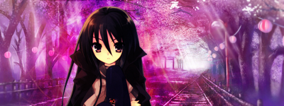
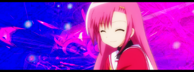
Toyosatomimi no Miko
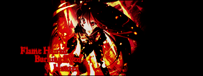
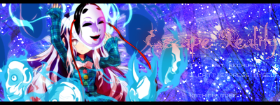
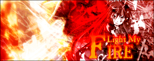
炎髪灼眼の討ち手
So now that I'm back into graphic making, here is a thread.
Of which in I will post.
~*~WARNING: The majority of these are Touhou/anime, so if you happen to have a nice hatred of these then I don't highly recommend looking at all of them.~*~
+-+Adding on to that, THIS IS NOT A PLACE FOR YOU TO BASH MY INTERESTS. That's not what this thread is here for - it's for commenting on my rectangles. This is also not a request thread. I will not be making these on request until I get used to my new schedule. +-+
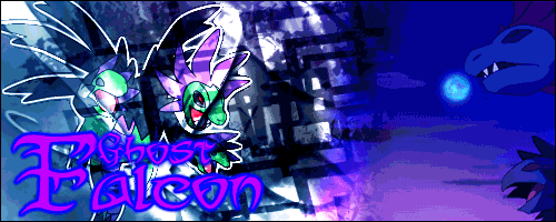
You are free to use any of these, but please include credit to me.
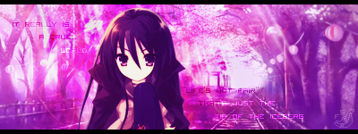
These are not all of my graphics, just the most recent. And they're not the best, as some are a bit older than the others. Some I'm not proud of at all >.>
So let me stop rambling and start with the images!


 ~*~DISCALIMER: I do not own any of the images/renders/effect (C4D/fractals)/wallpapers used. Only thing that belongs to me are the entire graphics. By that I mean those quadrilaterals on this page.~*~
~Smoke and I are the same person, if you're wondering about the watermarks. Smoke_Wolf is my username on myanimelist, so don't freak.
FrostStorm was my old username. As such, FS.~
--Last Update: 9/22/13 10:00 PM--
I'll let you get on with your lives now.
Of which in I will post.
~*~WARNING: The majority of these are Touhou/anime, so if you happen to have a nice hatred of these then I don't highly recommend looking at all of them.~*~
+-+Adding on to that, THIS IS NOT A PLACE FOR YOU TO BASH MY INTERESTS. That's not what this thread is here for - it's for commenting on my rectangles. This is also not a request thread. I will not be making these on request until I get used to my new schedule. +-+
You are free to use any of these, but please include credit to me.
These are not all of my graphics, just the most recent. And they're not the best, as some are a bit older than the others. Some I'm not proud of at all >.>
So let me stop rambling and start with the images!
~Smoke and I are the same person, if you're wondering about the watermarks. Smoke_Wolf is my username on myanimelist, so don't freak.
FrostStorm was my old username. As such, FS.~
--Last Update: 9/22/13 10:00 PM--
I'll let you get on with your lives now.
Last edited: