• Hi all. We have had reports of member's signatures being edited to include malicious content. You can rest assured this wasn't done by staff and we can find no indication that the forums themselves have been compromised.

    However, remember to keep your passwords secure. If you use similar logins on multiple sites, people and even bots may be able to access your account.

    We always recommend using unique passwords and enable two-factor authentication if possible. Make sure you are secure.
  • Be sure to join the discussion on our discord at: Discord.gg/serebii
  • If you're still waiting for the e-mail, be sure to check your junk/spam e-mail folders

Frozen Melancholy Graphics.

Liltwick

Just your Sleepy FIzzy Mod
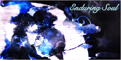
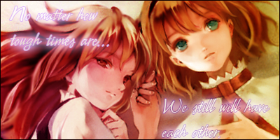
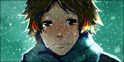
Hey guys, it's Lost here! In this thread Ill be posting any banners/avatars I make from now on! I find any C&C would be welcomed. Also, a little info. All my banners are either 400 x 200 or 600 x 200. My avatars are either 100x100 or 50x50. So anyways, I hope you enjoy them. Also, a disclaimer: I do not own any works of art used in my banners/icons. Credit is due to those who made them

First Batch:
Fandoms: Touhou & Vocaloid

chainedprayerscopy.png


An edit of ^

chainedprayerscopy.png


letitsnowcopy.png


the text here means "Let it snow"

faithcopy.png


coupdegracecopy.png


leiav.png
 
Last edited:
one important thing is to not be afraid of contrast. it's fine if the banner is not a single colour or brightness. i'm telling you this because most of your banners are looking flat - lacking depth - when the stock images imply that there should be some type of depth.

example 1 look at the trees, they're in the background. if you blur and/or darken it, you'll have a nice depth. (it's a simple and easy way of achieving depth)
example 2 you have brightened it so much, that the nice contrast between the red and blue dissapears. i don't fully unterstand colouring myself but i do know that generally speaking red is warm and blue is cold and that you have, by brightening it, lost that. also, darker spots that make the red 'pop out', like the dark hair of the girl, have turned blue, what i think is an important reason why the colours in your edit feel imbalanced.

another important thing is to not slap on text. putting in extra time to make your text feel natural and complementary to the rest of the banner can make your banner look that much cooler. a good tip is to work with the overrall direction of the banner, 'the flow'.

another thing you might be interested in is the rule of thirds. (google it if you are)

don't take my word for anything i said, what i posted here only comes from my personal limited experience. i don't claim to be an expert, or knowledgeable, or pro, or even anything at all.
 
They're not bad. Really the biggest problem is the lack of a focal point in them. The render is there, but there's nothing to draw the viewer's focus to the render. More warmer and brighter colors (or just brighter in general if warmer colors aren't an option) should be used closer to the focal point of the tag and in general the render could stand to be a bit sharper. The text is also kind of haphazard in the last two. Works rather well in the third one though.
 

Liltwick

Just your Sleepy FIzzy Mod
Alright, tried out some of the advice I was given

Fandoms: Persona, Touhou, Pokemon


If anyone wants to use my banners please give me credit.
 
Top