LuckoftheMoose
Moosalicious
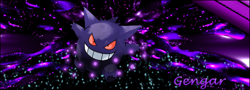
"Gengar" - Made by LuckoftheMoose. Please don't rip. First creation of digital art after a long hiatus. I'm happy how it turned out, and decided to share it. Feel free to comment.
Try removing the text and see if it looks any better. My bet is that it will be.
The shape in the foreground, the silky dark purple shape, looks erased over and just assuming the shape was how it was going like it is in my mind, it would have added even more cool depth if you made it go 'behind' the gengar. And if it doesn't work, I'd just take a different shape (C4D, whatever). Also, throw in some more of that cyan on the underside, it looks really cool.
The fractals add nice depth, but look over-contrasted. I like it though.
I think overlaying a grunge brush background would give the plain black background some texture and depth.
The font doesn't work with it, definitely change that. And some cyan undershades as above poster suggests could add a nice contrast to it.
I do like it, just offering critique.
")
Thanks for your critique, it is heavily appreciated. I have helped several users on many other forums with my own critiques, and always appreciate any kind of constructive criticism. I enjoy telling people not only what they can improve, but also what I like about a piece already, it really helps someone expand off of their creations.
It is a bit over-saturated, but I thought it added an amazing look and highlight to the piece as well. And that is what I was going for with those fractals, thanks for taking notice ^_^
I love that idea of a grudge brush background in this work. Do you have any link suggestions to some already made ones, not too sure on how I could custom make one myself in that style. I wanted to have a bit more of a background then what I had but there were several complications on getting the fractals to appropriately get cut out and go well with the background. In the end I could have tried fading it which I realize now and could possibly work, but I was on a timed schedule for this piece. I do look forward to improving on this work though especially with this suggestion, and also this information helps with my further development.
I'm normally alright with text but wasn't sure necessarily what to do with this one. Any type of font recommendations? I kind of enjoyed the font itself, but was not sure if the effects fit well, and the color and placement were correct. In the end it was to help cover some of the negative space beneath him.
Thanks! It truly means alot, and this is probably one of the best critiques I have seen for anyone in quite sometime.
Also, the only 2 things I used that were not custom made by me was the Gengar and the silky purple shapes to the sides. I did, however, not leave them as is and added several effects to the both of them to change it up a bit. The rest was done by my own additions, and I tried to keep it like that for most of this work. Just felt like making a more "home-made" banner over a "semi-homemade" one with this work, for my return from my hiatus.