ANYONE CAN VOTE
This week's challenge was to make a new banner for the GWSC
Everyone has 1 vote to use!
The votes will be tallied on Monday and the winner will be announced in Week #86.
Note that this week you can give 1 vote!!
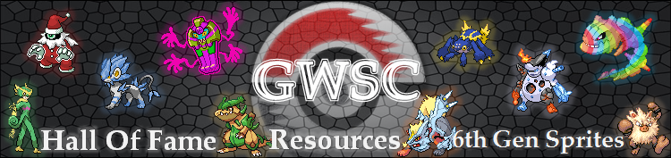
9dragonbreed
noobiess

Ryger Vandell


Shiny Swalot
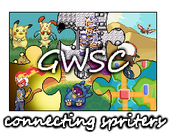
Skarm(Tm)

Happy voting!
This week's challenge was to make a new banner for the GWSC
Everyone has 1 vote to use!
The votes will be tallied on Monday and the winner will be announced in Week #86.
Note that this week you can give 1 vote!!
9dragonbreed
noobiess
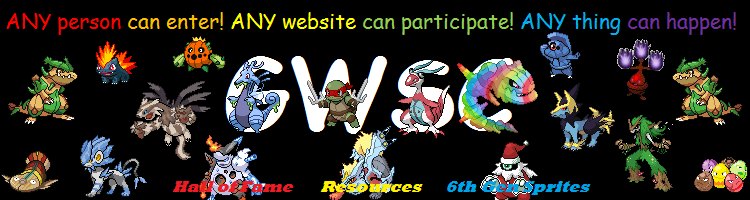
Ryger Vandell
Shiny Swalot
Skarm(Tm)
Happy voting!
