• Hi all. We have had reports of member's signatures being edited to include malicious content. You can rest assured this wasn't done by staff and we can find no indication that the forums themselves have been compromised.

    However, remember to keep your passwords secure. If you use similar logins on multiple sites, people and even bots may be able to access your account.

    We always recommend using unique passwords and enable two-factor authentication if possible. Make sure you are secure.
  • Be sure to join the discussion on our discord at: Discord.gg/serebii
  • If you're still waiting for the e-mail, be sure to check your junk/spam e-mail folders

Have a pic that desperately needs critiques, topped off with pencil shavings.

Synthesia

Rookie Trencher
It's good for you, children.

Anyway, since my last posting of art was a total bust, I may as well try again.
This is a doodle of a certain Alice in Wonderland, drawn during school, on the back of a Certificate of Participation, which explains the bold lettering in the background.

http://i46.*******.com/iz6aug.jpg

I am honestly somewhat proud of this, but I desperately need critiques.
Desperately.

Hope you enjoy.
If you'd like to see more art, don't hesitate to ask. c:

And I have dA.

Older Art -

http://i40.*******.com/2450mmw.jpg
Just some Roxas art.
Personally, I think his body is too small.

http://i44.*******.com/wjc9z7.jpg
Here's a picture of Green and his Charizard.
His normally awesome hair now looks weird.
 
Last edited:

Moog2

Must stay awake...
Holy Crap, you can draw! That's freaking amazing! I love it! The girl looks particularly good. I'm very impressed.
 

Synthesia

Rookie Trencher
Wow, thank you very much. c:
 

Kaiserin

please wake up...
It looks good, for what can be accomplished in only pencil without getting eye strain or driving yourself mad from detail-attention overload. I do like the small, Wonderland-y touches you added in -- the odd pieces of scenery and the uneven landscape, in particular. In a broad sense, I think the details are very nice.

The anatomy on Alice is sort of wonky, though, and is the one thing that stands out the most to me in terms of "this isn't right". Her hand is a little out of proportion with the rest of her body; it's a little small, and the fingers don't look like they have much volume to them, like she's almost anorexic. The arms are also waaaay too long, and the elbows should've ended a lot higher up. To be fair, it was probably a difficult pose to figure out, but if you took her sleeves off and put her back upright, her hands would probably reach to her knees -- on a real human, they fall to just below the crotch area when down at someone's sides. So I think her elbows being up off the ledge to look more like she's bending with her wrists tilted up just a little bit would look better. (Also, I suspect her waist might be a tiny bit high up, unless the dress is the type that's supposed to bunch at the end of the ribcage as opposed to the waist proper...)

...On the other hand, I really like her expression, though. It's not especially detailed or anything, but just... something about it strikes me as very delicate and gentle, which is true to Alice's nature, I suppose. But yeah, props for being able to do that much, because I know I personally with my endless patience for traditional mediums (ha ha, you can hear the sarcasm through the toneless internet) would never have lasted long enough to get even just Alice and the White Rabbit done.
 

Synthesia

Rookie Trencher
Hm, I see.
I will definitely take what you said and use the advice (or, at least, try to avoid them). I do need work on anatomy. I agree with what you said about the arms being too long and fingers looking ... weird. I can see that now clearly. c:
Thank you very much!
 
Nice drawing!
Although, you may want to practice on elbows. The girl's elbow is..like...bent? Lol, I don't know how to say it. :p
Its all good to me in my eyes though. ^_^
 

Synthesia

Rookie Trencher
@Spite
Thanks.
I'm sure you are not a talentless loser!
I'm trying to think of something inspirational right now ...

@Katie
Thank you. c:
Hm, I will stare at the elbow until I see how to fix it. c:
 

absolalone111

Well-Known Member
Really like it, and would really like a link to your DA, the only problem i have with it is the length of the arms, It looks asthough if she wasn't tickling pikachu then she would look like slenderman.
 

aggiegwyn

Well-Known Member
Well, since the arms and hands have already been mentioned, I'll talk about the other things.

First thing I'm going to say is, I really like the face. It's a nice, soft expression which is really well portrayed, considering you used such simple design. Well done, bravo.

However, there are some things to work on. I would highly suggest studying anatomy and clothing. The problems with the anatomy have already been mentioned, so I'll just mention the other things. The way her dress seems to maneuver around the body seems loose. However, on the waist it seems like it sticks to her stomach for a while before flowing out, and I don't think that's what you were going for. Gravity pulls downwards, so even though while standing up straight the dress would appear to flow that way, in this case, it wouldn't. So, the way to fix this is actually very easy. You take the part just under the belt and draw the line do that the dress falls directly down. Now, I also see that she's standing before that stump, so you might want to have part of her dress sit on it or have it bend back from the surface.

This is mainly me being nit-picky and you may not even know what I'm talking...but if you did, I hope this helped you understand how....dresses worked, I guess.
 

PokeRemixStudio

Well-Known Member
Here's a tip for these sorts of pictures that involve a distant background: creating a sense a depth will make it much more appealing for the eye. How does one generally do that? By giving the foreground objects much contrast while giving the background less contrast. It indicates presence of atmosphere which makes it easy to see at a glance what's near and what's far.

A real-world example:
landscape.jpg
You can definitely see it in effect here: the mountains in the background adapt the tone of the sky more heavily and their shapes become less visible due to a decrease in contrast. Meanwhile, the objects up front are vibrant with lots of contrast.

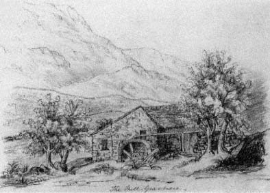
A pencil example:
ft1t1nb1dd_00000.jpg
In this example, color is not a factor, but you can still see the values (lights and darks) following the algorithm. The mountains' strokes are lighter than those of the house.

For your pencil drawing, all you would have to do to achieve this effect is make the background more lightly drawn the farther back in depth the objects are intended to be (that castle will want to be much lighter), while the foreground objects, probably the fence and closer, are left as they are.

I hope that helps. The values-to-depth correlation is something you'll always want to use in drawings with landscapes, and it shouldn't be too hard to incorporate. I just wanted to critique that one thing because it's pretty important and has a big impact on drawings, but nobody had brought it up.
 

Synthesia

Rookie Trencher
Just want to say thank you for taking the time to critique this and help me improve.

@PokeRemixStudio
That helped me a lot.
More than you'll ever know, lol. I'll try my best to incorporate that into any future drawings.
 

Kaiserin

please wake up...
Just checked back and looked at your two new drawings. I gotta say, I really do think faces and facial expressions are your strong point, whereas the aforementioned arm proportions and the way clothing drapes are your weaknesses for the most part. The detail on Roxas looks really great, though again, the arms are very long. On a typical person, the elbows reach around the end of the ribcage and the hands fall just below the crotch area when set at the sides, so that might be a good thing to keep in mind, and start thinking about when you're doing a drawing where you can't quite tell if they're too long or not. Just visualize where they'd fall if the figure you're drawing rested them at his/her sides.

Another thing that's become a little more apparent in the two newer drawings is, again, the flatness of the hands. I mentioned before that your fingers tend to look very twiggy, and lord knows complex structures like hands are the hardest part for most people, but it helps to keep in mind that the palm is not entirely flat, and neither is the backside. Plus, the fingers have padding on them, and are divided into three jointed sections (even the thumb, I think, though the lower part helps it bend inwards as opposed to straight down like the other four digits). Exaggerating them too much will make them look really weird, but not doing enough makes them look flat and equally weird. Takes practice, though, since hands really are a lot of detail in such small appendages. (It does, however, look like you have the approximate size they should be about right, even if your fingers are a bit long still.)

I think with Green's hair, it helps to remember to do the thing you did with Roxas, which was to add layers and give the illusion of depth. The way it looks now, he appears to have no back of the head, or it's very short and flat; it might be better to draw a sketchy row of spikes across the top of his head, and add a few layers and wisps to that line of hair to make it seem less one-dimensional. The clothing folds on Roxas look a bit more accurate (even though there are very few; it's because he has very baggy clothing, though), but it's not horrible. I've seen worse... like people trying to add random lines everywhere and hope it starts to look like a fabric drape at some point, and completely overdoing it every time for that reason.
 
Uhm, wow! You can really draw!
Hm, I just noticed, something you need is shading. c:
I think that's it..lol beside the arm thing. If you measured that arm, it'd be really long.
 

R055

Rocket R055
I will not critique your Alice, because I have a hard time drawing people.
HOWEVER. I spent 2 years of college thinking I would become an architect, so I did LOTS AND LOTS of nature drawing my first semester. Unfortunately it looks like you suffer from the same condition that most novice artists suffer from. You draw 2 dimensionally and you draw what you think things SHOULD look like, not what they actually look like.

Example 1: Your dark castle in the back ground -- Its bottom is flat. This is not right. If you saw a great Gothic style castle in the distance, it would not look like that. Castles have layers of towers and they are built on hills so that they have the upper hand in an invasion. Building on a hill is difficult, you have to adjust your structure to fit the contours of the hill. So next time you draw a castle, try to have the 2 end towers dropped down slightly from the walls that you would draw in the middle

Example 2: Your stump -- take a round, circular object (I had a round drink coaster in front of me) and put it on a table. Then step back. Observe how the perfect circle turns into a perfect ellipse. That's how you should be drawing things like stumps. When you make the tops of your stumps have harsh corners when the sides meet the top, you lose so much of that 3 dimensional quality that I know you were trying so hard to achieve.

Final notes: Finally I just want to challenge you to try something. When I was assigned blueprints to draw (Plans, sections, elevations, axons) my professor would constantly stress how important it was to use line weights. Meaning, things that were closer to you were drawn darker and sharper than things farther away. I hated the constant nagging about this, but once you master this, it is like the cherry on top to making your drawing look AMAZING.


Now I just want to drop this off too. You are a very talented artist. Keep up the good work, and take the advice you have been given to heart. If you do, you will only get better and better. Taking advice and learning is how we become better artists. Can't wait to see what you can do a year from now! Good work!! :)

-Daniel
 

Foxyvulpixie

thug life
Hey, Syn dearie <3
About Alice, her proportion could use work. I feel like her hand is too big and her fingers are too long (also the arms). And I think the backround looks too rushed (you could have added more details there). Such as the clouds and the clock.
But I adore your shading and detail <333
 

orochi

Well-Known Member
work on atonomy sweetheart. learn to draw everything so that your characters can have really detailed backrounds. fill up the entire page and work on proportions. try coloring in your pictures (dont be afraid, i sometimes im like that when i ink a sketch, i get nervous to color it in cause im afraid ill mess it up:) overall i like your style of characters. now work on the hard parts;)
 

Fire Ranger

Power Ranger Trainer
Like others have said work on your anatomy. Look on Deviantart for tutorials, Youtube helps also. Just keep practicing and you'll get better. :)
 
Top