• Hi all. We have had reports of member's signatures being edited to include malicious content. You can rest assured this wasn't done by staff and we can find no indication that the forums themselves have been compromised.

    However, remember to keep your passwords secure. If you use similar logins on multiple sites, people and even bots may be able to access your account.

    We always recommend using unique passwords and enable two-factor authentication if possible. Make sure you are secure.
  • Be sure to join the discussion on our discord at: Discord.gg/serebii
  • If you're still waiting for the e-mail, be sure to check your junk/spam e-mail folders

Jacks Mannequin's Sprites *Crit Please*

How are my sprites?

  • Awesome

    Votes: 1 4.0%
  • Really Good

    Votes: 1 4.0%
  • They're alright

    Votes: 5 20.0%
  • bad

    Votes: 10 40.0%
  • Terrible

    Votes: 8 32.0%

  • Total voters
    25
  • Poll closed .

Jacks_Mannequin

OFFLINE FOREVER
Hi I'm Jacks Mannequin but you can call me Jacks
I freely accept constructive criticism
I will not accept:
"Wow, Your Sprites suck"
or
"Worst Ever!"

I will accept:
"Not bad but you can improve them by..."
or
"Absolutely Terrible but should keep working on them"

Examples
scizor.png


Laprass.png


pz.png


Gastly.png


Treeko.png


onix.png


regice.png


leafeon.png


dpmfa175.png


dpmfa001.png


386.png
 
The colors are way too dark. You should really lighten them up. You fusion is too copy+paste, try to blend the head to the body, take more than just one part from each pokemon. Keep on spriting and hopefully you will get better.
 

klnothincomin

Kyogre ate Leafeon.
They are not bad, but maybe you should have a better choice of colors. A black bulbasaur recolour could be better, like a light gray shade of the black and a darker shade for the shadows. Black is not only just the color black, it includes shades and lighting, see houndoom for reference ^^. Your Lapras recolour is a good example of choice of colors and shades.

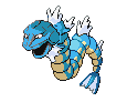
When fusing sprites, make sure you recolour all parts and colors of the fused parts with the base, or they would become less realistic such as your onix and gyarados fusion. You recoloured its head, but the lines are the same colors as before.

Other than that, you have alot of room to improve, keep spriting =D
 

Fused

Shun the nonbeliever
okay, well, first off, when you recolor, remember two important things: Never, ever, ever, for the love of everything, ever use Default MS Paint Colors. They're too bright and eye burning. Also when you recolor, remember to recolor every part of the sprite. We can still see a lot of the red on your blue Scizor. So try to work on that. And try making your own color pallettes instead of using Paint defaults.

The same goes for fusions. On your Onix/Gyarados, we can still see some of the purple-grey from Onix. Also when fusing, it's important to scratch. It looks like all you did was take Onix's head and put it on top of Gyarados' and therefore you cans till see part of Gyarados and it just doesn't have a good result. On the Pichu/Gastly, you did the same thing. you just erased Pichu's body, took the smoke from Gastly, and stuck them together. The bottom of Pichu's head should have an outline, and you probably should have recolored them to make it look more professional.

I strongly advise you to look at the Tutorials stickied to this forum. they will help you quite a bit. Good luck!
 

Alder

Come at me bro
First POst!
EDIT: Or it was, until three others posted by the time I got my post typed...


Alright, oen by one:

Scizor is not too bad, but you need to recolor the outlines. See the red? Get rid of it with a darker blue. Same with, well, most of these.

The Lapras needs more than just its spots a lighter shade of pink. It looks liek you just made every blue a magenta color except the spots, which you colored a pink that's too light. It contrasts too much, and the only shading on Lapras is on the stomach.

Porygon-Z is pretty good, considering. I just can't tell, but I hop that the black isn't just one shade. Then it woudl ;look too flat. even black needs shading.

Pichu/Gastly is probably one of the most lazily-made and careless fusions I've ever seen. You took Pichu's head and put it in Gastly smoke. You didn't even fix the outline on Pichu's neck so it actually looks like a floating head--you didn't even bother recoloring the head! I woudl suggest scratching a head, but if you can't scratch too well--which I understand, neither can I--then recolor it, perhaps SCRATCH small parts, like fangs or Gastly eyes, and there.

The Treecko is interesting, btu if you weren't going for a flat look then you failed. The red and blue contrast too much, and if you were going for a devamp, then one of those needs to be changed to a darker or lighter shade of the other one. If you weren't going for a devamp, then same thing, and change the white to an even lighter shade of the same color.

Onix/Gyarados needs work. Badly. All you did was remove the horn, color it blue and paste Onix's head on a Gyarados. You need to practice fusions more. First off, use more parts of Onix, maybe replace some of Gyarados' body sections with rocks. Maybe even scratch some! And keep the horn.

Regice is good. looks like rubies. I liek it.

Leafeon isn't bad, either. You need a much darker outline on the tail leaf, though. Lighter doesn't work.

Togepi is pretty good, I think there's a little shading problem with its head.

Bulbasaur...doesn't work. Black needs shading, you can't just have it one straight color. And the bulb--the lower you go it should get darker, not lighter.

Deoxys...NO.The only shading is on the head and hand. Shade the rest of it.

Basically, your fusions are rushed and unprofessional, and some of your recolors need shading. Also, don't use MS Paint default colors.
 

Alder

Come at me bro
It's really good! Glad to see you're improving already. Keep up the good work!
 

klnothincomin

Kyogre ate Leafeon.
The new sprite is improved, but why is the outline only in one shade of dark pink? Sprites have a dark shade or two shades of the pokemon and black outlines also for the shaded parts of the pokemon.
 

Alder

Come at me bro
Oh yeah...there does need to be at least some black outline. But not too much. On the darker-shaded parts, black outline. On the lighter-shaded parts, use a darker shade of the color you used in the sprite, but not a shade you've already used. Make it darker.
 

Peter Quill

star-lord
What do you want us to rate them as? Fusions Recolours?

Anyways all your recolours seem to use the default colour that you would find in MSPaint, and mixed together they look rather eye stinging. And the Pichu Ghastly Fusion didn't have alot of effor put into it, all you did was placed Pichu's head.

Use the eyedropper tool on MSPaint and get some colours that aren't eyes stinging. And yeah Eye stinging is not being rude sorry if you think so.
 

Jacks_Mannequin

OFFLINE FOREVER
ok i tried to take ur advice on the outline so here it is
unown.png

its not tediursa

Moogles i want you to rate me on recolors if you would
 

Peter Quill

star-lord
ok i tried to take ur advice on the outline so here it is
unown.png

its not tediursa

Moogles i want you to rate me on recolors if you would

-.- I did already.

Also that isn't outlining practice. It's just another recolour, the purple brown thing still looks pretty eyestining/ugly.
 

Dapuff

Well-Known Member
your recolors remind me of my VERY old self, dorgeting to recoler the outline.
 

pokeman95

back,stornger,better
not to be mean i just dont like them
 

Jacks_Mannequin

OFFLINE FOREVER
OK...
I tried making something from 95% scratch
I know its not very good but I need to know if i is a good start
scizornt.png

go all out on it
 

pika3

Snowball attack, go!
OK...
I tried making something from 95% scratch
I know its not very good but I need to know if i is a good start
scizornt.png

go all out on it

Ok this thing is werid. Does it have arms? It isn't bad, but I don't get what it's supposed to be.

Your others stuff isn't good. Your Color are much too dark, and your fusions are too C+P-ish. If you work on scratching parts onto other pokemon, and lightening your recolors your work would be much better.
 

pika3

Snowball attack, go!
Sure thing.
I will check back to see when you put new stuff up too.
 
Top