-
Hi all. We have had reports of member's signatures being edited to include malicious content. You can rest assured this wasn't done by staff and we can find no indication that the forums themselves have been compromised.
However, remember to keep your passwords secure. If you use similar logins on multiple sites, people and even bots may be able to access your account.
We always recommend using unique passwords and enable two-factor authentication if possible. Make sure you are secure. -
Be sure to join the discussion on our discord at: Discord.gg/serebii
You are using an out of date browser. It may not display this or other websites correctly.
You should upgrade or use an alternative browser.
You should upgrade or use an alternative browser.
Jun's art V.2
- Thread starter junpearl63
- Start date
TheLupineOne
I'M GETTING WHITE.
Heehee, I'm in VietNam right now actually xD
Jun did this on the plane x3
I'm liking the "Ditzy" look in the eyes there.
junpearl63
their rooms
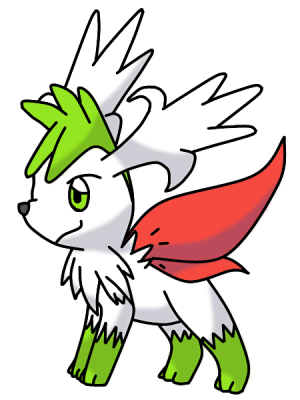
Thankie guys :3 Jun was really lazy, because Jun is at home and Jun was having fun with friends and family, so the new year pic project has been ruined  Still going to color it though, but not now.

Pretty simple eh? Heehee...
Still going to color it though, but not now.
Pretty simple eh? Heehee...
junpearl63
their rooms
Yup, I did xD it has been ages since Jun last draw anything (was in bad mood)
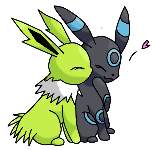
This is Jonghyun the shiny Jolteon, and Key the shiny Umbreon. Both of them are mine, and based on K-pop idol, Kim Jonghyun and Kim Kibum (stage name: Key) of SHINee (boy band)
They're both male, and I have no problem with that >
This is Jonghyun the shiny Jolteon, and Key the shiny Umbreon. Both of them are mine, and based on K-pop idol, Kim Jonghyun and Kim Kibum (stage name: Key) of SHINee (boy band)
They're both male, and I have no problem with that >
junpearl63
their rooms
They're cute, aren't they? I love them too xD Next will be Minho the shiny Flareon and Taemin the shiny Espeon :3
junpearl63
their rooms
Aww, it's because I don't have Shiny Leafeon and shiny Glaceon yet...I have 5 shiny Eeveelution, which formed SHINee boy band, so I don't think it's nessecary for me to get Leafeon and Glaceon. They're Onew the shiny Vaporeon (the leader), Jonghyun the shiny Jolteon (Bling Bling Jonghyun), Key the shiny Umbreon (Almighty Key), Minho the shiny Flareon (Flaming Charisma), and Taemin the shiny Espeon (the maknae)
junpearl63
their rooms
Thanks family <3 Jun has recovered though. Jun has bad health you see....
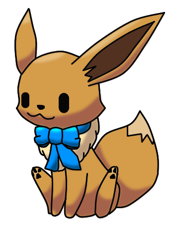
Since no camera, no drawing, Jun has been practicing to draw with MS Paint again And I skipped the shading part because I was lazy.
Since no camera, no drawing, Jun has been practicing to draw with MS Paint again
And I skipped the shading part because I was lazy.junpearl63
their rooms
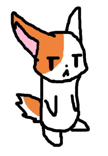
Yeah it's so annoying >_< my mouse sucks big time....
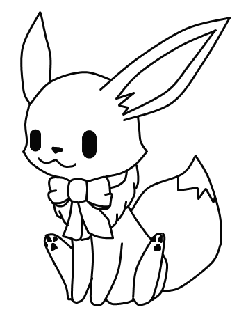
It's just a lineart, I will color it tomorrow. Read description in Devianart, I put the link....
It's just a lineart, I will color it tomorrow. Read description in Devianart, I put the link....
junpearl63
their rooms
Hai sister in law ^^ Yeah, annoying mouse suck >
Read description....
Read description....
your art is all right, but i think that you need to work on your lines and shading; i suppose i will take the most recent artwork you've posted and use them as examples to point out flaws. i will take a moment in photoshop to circle major mistakes because i can not properly convey my thoughts as plain text without producing fat blocks of text.
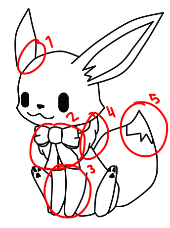
the first mistake is the placement of the ear. it is too far to the left to be considered proportionate; as if it was born with a messed up chromosome karyotype and therefore recieved uneven ear placement.
the second mistake is quite major as bows do not fold like that. on the sides of the loops there is this tiny fold and it looks more like a cameltoe and bows do not fold like that, normally. and below, where you tried to show that the bow's um loops were... loops, that line didn't really need to be there. also the loose ribbon on the right side is very different from the one on the left side. if the one on the left side is folded or something you did not properly convey it.
the third mistake is the positioning of the belly in relation to the positioning of the front limbs. the front limbs are quite choppy and blocky and i'm sure this is intended though it looks sort of strange but anyway the belly sticks out too much and is far too pointed. its body looks disproportionately skinny and the left arm appears to come from nowhere because there is not enough body to support it. (does that make sense?)
the fourth mistake is the mane. i really don't think fur is supposed to look like that. i'm not sure how i should describe this so i will leave it like this hoping that you get what i am typing.
the tail is fine except for the tip where eevee's tail turns white. it is a bit to straight and jagged. it would be nice if it was curvier and had more form and looked more like fur rather than... flat lines done with a ruler on a piece of cardboard.
as for your shading, if you are going to use only two-three flattish shades, please don't make the transition smooth and cell shade instead, because i think it would look better that way. also try not to make your lines black all of the time because for a cutesy art style that is blocky like what you are trying to do, it just doesn't really mesh.
please continue to work hard.
edit: oh you updated while i was typing. i'll add that the colours on your eevee leak from the lineart a little and your art style is obviously not intended to have a sketchy and unfinished look. also on its face, there's a little bit of lighter brown between the darker brown and the lines. it makes it look like a flat formed badge rather than... well, a head.