• Hi all. We have had reports of member's signatures being edited to include malicious content. You can rest assured this wasn't done by staff and we can find no indication that the forums themselves have been compromised.

    However, remember to keep your passwords secure. If you use similar logins on multiple sites, people and even bots may be able to access your account.

    We always recommend using unique passwords and enable two-factor authentication if possible. Make sure you are secure.
  • Be sure to join the discussion on our discord at: Discord.gg/serebii
  • If you're still waiting for the e-mail, be sure to check your junk/spam e-mail folders

Kamionero's Sprites

kamionero

Well-Known Member
Hello everyone, I just wanted to post some of my finished pokesprites and some works in progress to see what the community's opinion is. I'd love some C&C to help me improve my spriting since i just started about 2 months ago :p so any feedback, no matter how basic you think it is, will be much appreciated. I'm focusing on my scratch sprites cause thats where i need to improve the most IMO, but I will add some retypes and recolors and whatnot once in a while.

Also worth mentioning, I am terrible at making names, so feel free to suggest some haha.
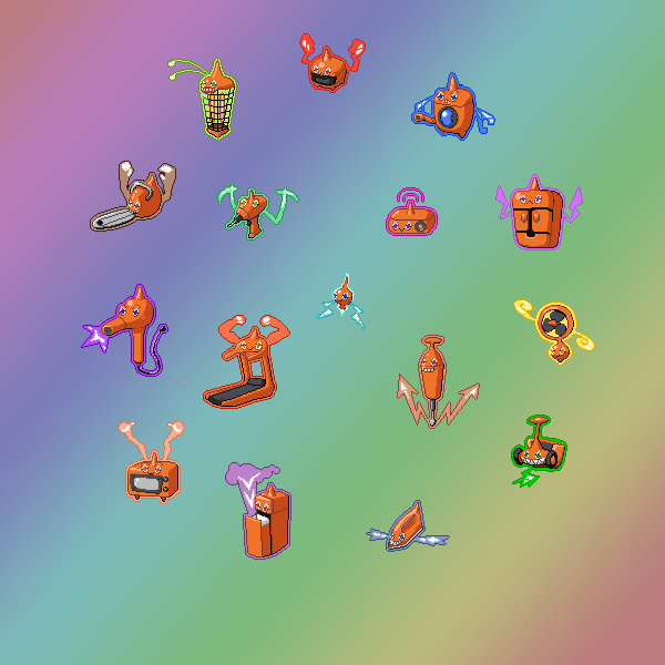
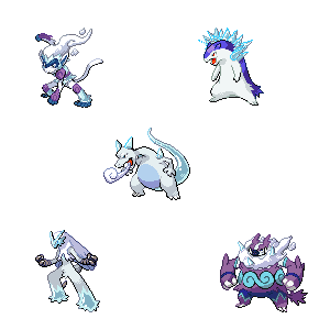
Ice Type - Permapup
Cubes.png

Evolution: Snowrus
Icy2.png


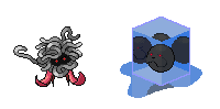
Poison Type - Cultri (2 forms, stopped and reactionary)
TestTube2Forms.png

Stopped forme- High defense, low SP Attack
Reactionary forme- High SP attack, low defense

Flying Type - Pulcinilo
HUEVOS.png

Not sure if Masked or Cracked version is better... opinions?

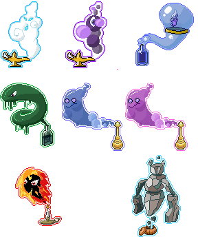
Poison Type - Poison/Fire Type - Fire/Poison Type evolutionary line
Oils.png


These are my ideas for legendaries: The genies. Legendary Pokemon hidden in items that come out.
Ginnies.png

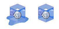
Flying - Dark?(just an experiment) - Water
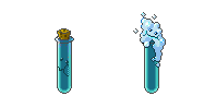
Poison - Psychic (Male/Female)
Fire - Rock

Im pretty happy wih the Flying, Poison (especially the bottle! :p) and Rock. Psychic I think is close but needs more details...
Water needs work... but frankly im stumped... it just doesnt look right to me... might restart from scratch with a new idea (keep the bottle tho lol). Suggestions?

Edited Fire. Now Im much happier with the fireball... but now Im conflicted about the glow outline... I like to keep my genies constant, so they all have the "lamp aura" however... Fire being engulfed in flames... the aura looks a bit redundant. What does the ppl think? Keep the aura or ditch it?

----------------------------------------
works in progress:

Dark/Rock - Cyprye
Nightmare.png


Water/Ghost - Abormonea
SeaCucumber.png

-------------------------------------------

Finally, just for fun, I'm doing a dark/shadow version of several pokemon
DarkDugtrio.png
DarkPikachu.png
Darkscopy.png
Darks2.png


Dont forget to add ur 2 cents! all feedback is much appreciated!
 
Last edited:

Ilan

Well-Known Member
I like the style it is amazingly done though not really fit to the pokemon sprites those are really good desingns.
cracked is better in my opinion
 

-Raiga-

Well-Known Member
The place is freaking dead, nobody can get a comment in any of their sprite threads.

Design-wise, many of the pokemon you've made have great concepts, although I feel they are a little simple. Such as Pulcinilo(I like unmasked version better), its just an egg with wings, when perhaps you could do more with the cracks in the egg, or give it more of a face.

Spriting-wise, you kind of got your own style going on, so its hard for me to judge. Linework shading is probably the biggest thing I could mention to improve on, as ones like snowrus who have all black outlined bodies could get some light tones near the lighter parts of it. But I'm not all that good with outlines so I can't specifically pinpoint what needs to change and all that.

Keep up the great work though!
 

BynineB

Wielding Übersaw.
I can't really agree with the comments posted thus far. All of these are very geometrical and boring designs. Cultri is a tube with a face, there's a black pile of sludge with eyes (at least Grimer has hands and a mouth), Permapup and Snowrus are both just blobs... as a matter of fact, most of these look like blobs. Try making one based on an animal, and give it anatomy.

In terms to spriting, your outlining needs major work - like I said, geometric. Better shading is a more minor detail but it should be addressed as well.
 

-Raiga-

Well-Known Member
I can't really agree with the comments posted thus far.

My post didn't mention basically everything you posted?

They said they just started 2 months ago, and these are far better than most people of that time.

And personally, blob or not, I'd rather see these then a hindenburg evo of driblim or a mix/mash of 13 pokemon for the trillionth time.
 

kamionero

Well-Known Member
Thanks everyone for the feedback! The main reason my sprites so far are very geometric is cause since im a beginner, out of all my prototypes that I tried to do, the only ones that are presentable are the more geometric ones.

Interestingly I started doing different type Rotoms pretty much for practice and I see what u guys mean about the lines being all black. I didnt really understand how the outline colors in the pokesprites worked but i think i finally figured it out.

Still trying to figure out the Pokestyle hahaha. I think i need to do some edits and less scratches to kinda get a feel for it.

Also, -Raiga-, I got this Hinderblim sprite... hahahaha

EDIT: just figured id post this since it was made haha. These are my Rotoms. I made them just for fun and practice, especially in outline shading. Some are clearly lazier than others hahaha... I just wanted to experiment w different shapes and forms while keeping the texture the same (no fur, liquid, etc) as an exercise.

ROTOMS.png


Bug Zapper - Signal Beam
Chainsaw - Foul Play
Hair Dryer - Draco Meteor
Television - Explosion
Trash Compactor - Gunk Shot
Iron - Meteor Mash
Jackhammer - Earthquake
Radio - Psycho Boost
Drill - Stone Edge
Treadmill- Focus Blast
 
Last edited:

kamionero

Well-Known Member
Another practice exercise that ended up being really fun, expansion of the Elemental Monkey Family

Pans.png
 

kamionero

Well-Known Member
Gen 1 Starter retype

RetypeStarters.png

Plastoise, Freezard and Dirtsaur :p
 

-Raiga-

Well-Known Member
Blasoise is a little on the simple side, but I think the other two are really well done. Charizards tail looks especially cool(no pun intended). And while maybe you could still do something with venusaur's back, it looks very earthy right now as is.

Keep it up!
 

Bert

Untitled
The Venusaur is fantastic, but the other two are rather meh, like you didn't put half the effort in that you did on Venusaur. Very nice work on that one.
 

kamionero

Well-Known Member
Thanks so much for the critique guys!!! hahaha I think its painfully obvious that i like to play with textures and effects a lot more than i like to design or think out pokemon hahaha.

Also, interestingly enough, the venusaur was the last one, and 100% improvised haha. The blastoise was the only trully planned one... which I think means I have a sucky imagination when it comes to design... so i am better off relying on improvisation and playing it by ear hahaha!
 

-Raiga-

Well-Known Member
Eh, I find it works better doing it half and half, by that I mean plan something the best you can but don't be afraid to improvise while doing it.
 

kamionero

Well-Known Member
Some more stuff:
BellosomPig.png
FusionMedit.png
Vespizard.png
FusionLucarioZekrom.png
ArceusDitto.png
FusionHitSci.png
fusionBatRish.png
Fuzion3.png

Venomoths.png

Water Dugtrio Poison/Melty Voltorb Water Gengar Ethereal ghost Arbok
waterDiglett.png
PoisonVoltorb.png
ClearGengar.png
ClearArbok.png
 

noobiess

6 different pokemon
The rotom forms and the pan-pokemon looks awesome :)
Panfowl and the jackhammer are my favorite.
But for the jackhammer: I think the msile is a little too wide...
 

kamionero

Well-Known Member
Practicing and playing with my ice-testures i decided to complete the set:
IceRetypes.png

And for Sh... and giggles made description for these Bizarro World pokemon:
Coolape (The mountain monkey pokemon)- A very agile monkey that lives in the freezing peaks of mountains and teaches martial arts to those who seek him.
Typhreeze (The flash freeze pokemon)- It attacks with intense cold. Can reflect light on his icy skin to blind opponents.
Chillyzard *formerly Freezard* (The Icy Breath Pokemon)- His cold blood cannot be heated by any light or flame.
Glaiceken (The Snow Owl pokemon)- It tracks slurry on his feathers to deliver devastating freezing hits.
Boarfrost -after hoarfrost- (The Deposition pokemon)- Grows a spiky ice beard that cools the air around it creating a puffy cloud around his chin.

Some random fusions (not really that much effort into these, just made to have fun and keep a thread on diff. forum going)
FusiKangBlastoise.png
FusionTentasnore.png
FusionTornadusQuilava.png
Fusionant.png
FusionNose.png
FusionMammo.png
FusionLickatina.png
FusionRayquazaWeev.png
FusionGlaceonArbok.png
FusionAbsol.png
FusionGhosts.png


Finally, in a diff forum there was a contest to make a pokemon who represents "Ghost of Christmas Past"
PenguinGhost.png

An old timey, dusty texture ghost of a penguin. Logical.

Right now im not shooting for conceptual greatness w my spriting, I just wanna play with textures and shades and shapes and colors to sort of figure out basics.

Clearly, i am having a ton of fun with ice at the moment... ive done goo and some rock... next i think i wanna tackle fire... iz' gon' be hard...

Any Critique, feel free to dish out. Even if u think its super obvious and basic do tell because im still fairly new and laggin behind on some basics.
 

Electricbluewolf

*pours beans down the waterslide*
I'm not a fan of Chillyzard. I think as you have removed the wings, the head and neck look to long. It also looks like the head is lunged forward a bit too much. Maybe try adding icey wings and moving the head, or just re-align the neck a bit.

I love the re-makes of rotom- the radio and drill look so well done, and I like how you've put the "lightning bolts" under the drill. The only one that needs a bit of work is the chainsaw one (I think it's a chainsaw anyway XD) The perspective looks a little odd.

I think the penguin is well sprited. The shading is spot one, the only real thing I saw wrong was the hat - the neon purple kinda drags the attention away from the main piece.

Keep up the good work n_n
 

Bert

Untitled
The Ice type Typhlosion and Infernape are really well done, with good coloration on the latter and flawless scratching work on the former. The others are 'decent' but Blaziken's feet have some trouble, with the outline-ish thing being alot lighter than the fill.

Your fusions are surprisingly good, even more so because you stated you didn't put that much effort into them. The Gangaskhan/Blastoise is fantastic (though its ear is strangely colored) and I LOVE LOVE LOVE the Squirtle inside it. Genius move! :D Overall most of them are actually really cool ideas (I mean, REALLY cool, like that Sableye golem or Tentacruel/Snorlax) which could be amazing sprites if you put all your effort into them :). Tbh I wish I had come up with those ideas since I'd probably be putting hours and hours into making them work. On the Aggron/Mamoswine e.g. I'd really love to see its horns become a scratched adaptation of Mamoswine's tusks. That'd be SO awesome.

They're not all as good though, some are rather lame copy/paste jobs (Weavile/Rayquaza lol) and that Giratina is ultimately just a promoted recolor but sure, if it's only meant to practice your technique then sure. I can see a lot of good things coming from you in the future :).

On your encased ice blob thing, I have to say that it's a great concept and I actually like the spriting work with the mirroring thing etc.. But since other people suggested it, if you want more pokemon-ish ice I'd take a good look at Regice and making your cube shine a little more. Like it reflect some intense light. Remember, ice usually has a lighter color than water (in your freezer anyway, that is) so try to change that :).

Overall, this is an absolutely friggin' good job.
 
Last edited:

kamionero

Well-Known Member
Thanks for the CC Bert! the thinig w Blaizeken's feet is that they are supposed to be made of blocks of ice, so the edges are lighter cause the light passes thru but the center of the ice is darker. Does that make sense?

Some fusions are very lazy, hahaha the Giratina for example. Actually, most of them are like Kahngestoise's ear lol... i messed that up but was too lazy to fix. And to be fair, I didnt come up w most of them, lol they were given :p

The ice cube guy's colors and texture are actually based on the CD item sprite... lol. I thought the sprite looked super cool so i wanted to do a poke based on it. I might redo the whole concept as a jelly cube... lol...

BTW, id love some suggestions on how to improve the Rock, Fire and Poison Genies, any ideas for improvement?
 
Top