• Hi all. We have had reports of member's signatures being edited to include malicious content. You can rest assured this wasn't done by staff and we can find no indication that the forums themselves have been compromised.

    However, remember to keep your passwords secure. If you use similar logins on multiple sites, people and even bots may be able to access your account.

    We always recommend using unique passwords and enable two-factor authentication if possible. Make sure you are secure.
  • Be sure to join the discussion on our discord at: Discord.gg/serebii
  • If you're still waiting for the e-mail, be sure to check your junk/spam e-mail folders

Karin's Icons and Graphics ~ !

Cassiel

Goddess of Mischief
Just showing off my graphics of coloring... I'm still kinda amateur-ish at graphic designings *isn't able to make a proper sig, lulz* So.. I only have icons to show ;;

&& Lion King
tlk-12.png
tlk-15.png
tlk-13.png
tlk-2.png


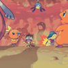
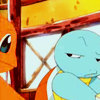
&& Pokemon (Some of them are old and new lol)
pmd01.png
pmdred02.png
pkmn002.png
pkmn-pmd05.png

Mikuri4.png
Mikuri6.png
shinycharizard.png
lucario.png


&& Misc Anime and Manga
g007.png
cg11.png
hitsu1.png
smuggylalmirch.png


If you wish to see more of my icons, visit my graphic journal at lj~ ;D
 

Glajummy

Why so S E R I O U S
Your avatars are rather simple, but in a nice way. They could be better, but I wouldn't call you a bad graphic maker or anything like that. Also, can you tell us what graphic making program you are using?
 

Renami

Benevolence
I see you have improved on your coloring. *wonders how you got used in channel mixer lol*
 

Shana_miku

Simplicity♥
They're nice! Good works Ruby Moon! ^^
 

PurpleMew

no promises
Hey Karin;

I love the colourings on the pokemon icons and the rest are just awsome.
Your cropping skills are kinda shabby though and could be improved.
Everything else is fine.

And why don't you show the tuturials for them or some of them ?
 

Cassiel

Goddess of Mischief
I see you have improved on your coloring. *wonders how you got used in channel mixer lol*

Channel Mixer made everything better, lulz XD

Hey Karin;

I love the colourings on the pokemon icons and the rest are just awsome.
Your cropping skills are kinda shabby though and could be improved.
Everything else is fine.

And why don't you show the tuturials for them or some of them ?

Yeah, and I'm trying to improve my cropping, especially on the screencaps of anime ;;

Thanks for the compliments, everyone ~ For the tutorials, I'll try to post them when I could.
 

Warfare

liverliverliverliver
From each of them, I see some icons that are too muted. You should sort of contrast it more with a little better coloring or fixing the Brightness/Contrast levels.
The lighting on Wallace's hand is really weird. It doesn't belong there, IMO.
You see how there's a rock under Simba and Zazu in one of those icons? It's a little distracting, and I'd make an attempt at editing it out (hence why I did it on mine
bidoofmi3.png
). Icons aren't just about putting in some enhancement to fix the images' colors.
Overall, I say these are pretty. You have a nice perspective and do nice cropping on the images for the most part. You certainly know most of what you're doing.

Also, I'm wondering if I can get a tutorial on 1 from the Lion King from this. /shot
I see you have improved on your coloring. *wonders how you got used in channel mixer lol*
You have to balance the R/G/B or at least use additional things to fix it in the end.
 

Northern Lights

[BritishSarcasm]
I rather like these icons, becuase usally people put too many effects on such a small graphic, but these are nice and simple, but not plain simple, try adding some textures, or some designs on them to make them a little more appealing
 
Top