-
Hi all. We have had reports of member's signatures being edited to include malicious content. You can rest assured this wasn't done by staff and we can find no indication that the forums themselves have been compromised.
However, remember to keep your passwords secure. If you use similar logins on multiple sites, people and even bots may be able to access your account.
We always recommend using unique passwords and enable two-factor authentication if possible. Make sure you are secure. -
Be sure to join the discussion on our discord at: Discord.gg/serebii
You are using an out of date browser. It may not display this or other websites correctly.
You should upgrade or use an alternative browser.
You should upgrade or use an alternative browser.
L i g h t.
- Thread starter Utopian
- Start date
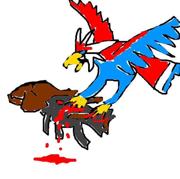

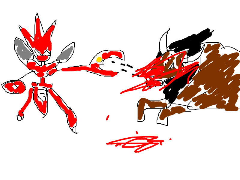


Lovely Therians my friend!
thanks ex :]
Your renders are very blurry. Create depth by sharpening and blurring.
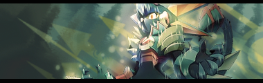
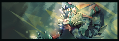
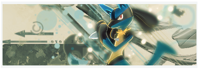
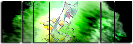
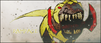
I think the flow is boring, it's just straight lines to indicate the direction. You see the cloudy effect on the claw of the Thundurus in your signature? That's great natural flow of the render, you should have used it.
I feel like pointing out that most of your signatures have a very obnoxious light source. A little shading to create a contrast goes a long way, it'll make a little seem like a lot, you really don't need that much lighting.
But I actually appreciate what you've done so far. The Kisame one in particular definitely has a style I'd love to see more of.
Your renders are very blurry. Create depth by sharpening and blurring.
I think the flow is boring, it's just straight lines to indicate the direction. You see the cloudy effect on the claw of the Thundurus in your signature? That's great natural flow of the render, you should have used it.
I feel like pointing out that most of your signatures have a very obnoxious light source. A little shading to create a contrast goes a long way, it'll make a little seem like a lot, you really don't need that much lighting.
But I actually appreciate what you've done so far. The Kisame one in particular definitely has a style I'd love to see more of.
hmm i never tried to sharpen it, i'll try that thanks (and i do blur)
yeah im still working on this flow thing, and what do you mean on my thundurus sig ._.
i would answer the next response in a non-noobish way if i could. idk how to shade.
and thanks man, i was just messing around with Kisame

What he means is that the trail of cloud coming from Thundurus' hand creates great flow naturally, you shouldn't made that the flow of the banner rather than the whole render.
Shading 101 - the Basic thang.
To shade, use a feathered black brush, and set to soft light. Lower the opacity if necessary.
Shading 101 - the Basic thang.
To shade, use a feathered black brush, and set to soft light. Lower the opacity if necessary.
hmm i never tried to sharpen it, i'll try that thanks (and i do blur)
When using the Sharpening tool, something like 25% strength usually does the trick. It differs though. But it's pretty precise, sometimes I find that that one percent makes all the difference.
yeah im still working on this flow thing, and what do you mean on my thundurus sig ._.
I was just saying that establishing flow by using straight lines when you have wavy flow (the cloudy part of the claw) doesn't look too great. Something of a wavy effect to go with the claw would be cool.
That said, you shouldn't look too much into it. As I said, I am a fan of the Kisame one and that one has some flow going on and I think that improving the way you established the flow in that would be a good way to experiment.
idk how to shade.
I use a soft black (or dark colour) brush (something around a 100 pixel radius) around the parts i want darkened, then lower the opacity of the layer i brushed on until it looks like i want and erase the parts that look bad with a smaller soft brush.
that's what i do/think is a pretty decent way to go about things.
Azure Wolf
Well-Known Member
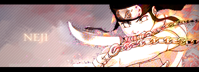
Easy on the blending styles on your text. Obvious outer glows, drop shadows don't look too good.
TeamRocketGrunt
WobbWobbWobb Wobrudo
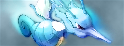
Your works are beautiful. For example, the Kingdra ones, ones like that without text, just beautiful art.
So...are you using cs5 or what?
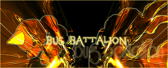
Kingdra is my favourite banners, very simplistic but great flow, lighting and colours - Don't change a thing.
The endless banner again has great colours and lighting but the render lets you down a bit on flow. Text is a bit unnecessary too.
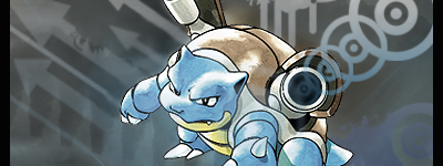
Blastoise banner is too big and too dull, me want more pwetty colours. I like the use of the vector brushes from the cannons though, very creative.
Your new stuff is miles better, keep it up.
Kingdra is my favourite banners, very simplistic but great flow, lighting and colours - Don't change a thing.
The endless banner again has great colours and lighting but the render lets you down a bit on flow. Text is a bit unnecessary too.
Blastoise banner is too big and too dull, me want more pwetty colours. I like the use of the vector brushes from the cannons though, very creative.
Your new stuff is miles better, keep it up.