• Hi all. We have had reports of member's signatures being edited to include malicious content. You can rest assured this wasn't done by staff and we can find no indication that the forums themselves have been compromised.

    However, remember to keep your passwords secure. If you use similar logins on multiple sites, people and even bots may be able to access your account.

    We always recommend using unique passwords and enable two-factor authentication if possible. Make sure you are secure.
  • Be sure to join the discussion on our discord at: Discord.gg/serebii
  • If you're still waiting for the e-mail, be sure to check your junk/spam e-mail folders

.::LV's Banner Gallery~Banners & Wallpapers that I've made are on showcase here!::.

Light Venusaur

Konoha's FMA Ninja
Since my other thread is lost in the mountain of other threads, I decided to make a new one.
This is where you'll find all of my banners that I've made so far to date....rangeing from contests to requests & so on.

I use GIMP....so if you also have GIMP & willing to take on someone who wants to get better.
Plz send me a VM/PM saying that you've added me to MSN. (as I realy want to learn how to do things that I can't do at the moment (IE: Smudging & blurring)).


.::Contest Stuff::.
WBC83.png
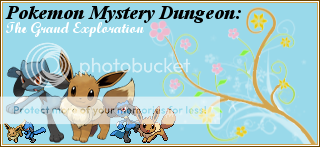
~Current one (WBC #83)
WBC84.png
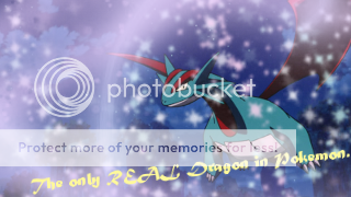
~Current One (WBC #84a Banner)
WBC84avvie.png
~Current one (WBC #84b Avvie)

.::past Contest Banners::.
Colorful.png

WBC78.png

WBC77.png

Banner-Contest3.png

Banner-Contest2.png


.::Shiny Pokémon Banners::.
Shinys_Chibi_Muffin1.png
~v2
Shinys-Jolteon_Jorden1.png
~v2

.::Requests::.
Banner-Zozo1999.png

Banner-sharingandac.png

Banner-MegamanXD.png

Banner-Lazaruskun.png

Banner-Shadelons_Dark_Corner.png

Banner-piplup234.png

Banner-Richkids_Trading_Center.png

Banner-IXsFanart.png

Banner-Cui_Chan.png

Banner-Spartan061.png

Banner-Greenjerre.png

Banner-TheLupineOne.png

Banner-Viridians_Yellow.png

Banner-Viridians_Yellow2.png

Banner-Viridians_Yellow1.png

Banner-Ninzo.png

Banner-GalladeRocks.png

Banner-Onemuri_Pikachu1.png

Banner-Withdrawn_Trainer.png

Banner-Rangeet.png

Banner-blackness777_non-split.png

Banner-Zoroark.png

Banner-Espeon.png
~This was a quicky
Banner-Abra.png


.::B'day Card (banners)::.
Bdaycard-Juliacoolo.png

Bdaycard-Sonicyellow.png


.::Avvies~GPX+ Style::.
Avvie-.png
Avvie-Slowking.png
Avvie-Shiny_Ponyta.png
Avvie-Contest2.png
Avvie-Contest1.png


.::Virtical Banners::.
Shiny_Seaking.png
Banner-Contest1-1.png
Banner-Giratina_and_the_Sky_Warrior.png
Banner-Grass_Arceus.png
Banner-Contest1.png


.::personal Banners::.
Banner-PPCv2-1.png

Eeveelutions_Club_v9.png


.::Other Stuff::.
Banner-Team_Eeveelutions_Workshop-s.png
~Plz put this in your sig if you've requested stuff from me :)
Zoroarkcomplete.png
~Zoroark Poké Doll Tag (My style)


.::Wallpapers::.
I'll edit this when I find my winning one
Contest-Wallpaper-Shaymins.png
 
Last edited:

KingArmag

King of Armageddon
Hey LV! These look great, as always! But, in the Dragonite Banner, you should switch the pixel-over and the sprite, because it doesn't look right with its tail cut off... :D

I really like that HGSS banner!
 
The whole thing is a bit too flowery and ornate IMO. I don't particularly enjoy the long strings of branches in the backgrounds, makes everything seem a bit cluttered. But still good overall.
 

Shadelon

Lord of Darkness
You clearly don't know great art when you see it. LV is the best artist I've ever seen, here or beach. I would go to her for all of my banners, avvies, etc.

The flowers are apart of her style, and apart of what makes her a great artist. And I don't think she'll change that just cause you don't like it.
 

NovaStar

█ ▄ █ ▄
Sorry to say but I agree Lawliet. It does seem cluttered and you somewhat overuse the floral and snow brushes. What I would recommend is to download some more brushes and font and you'll do good. Also, as a side note try to work on having some flow in your banners to fix with the clutter

Here's some more font for you to choose from:
http://www.dafont.com/
And here's some brushes:
http://www.brusheezy.com/
 
^And I agree, I agree so much with the things you said.

But its not always the case that brushes and text can make the work better. Her composition is poor and the balance with her work is shakey. She needs to learn how to arrange the image in the proper way and work with them otherwise it'll look like a mess.

You clearly don't know great art when you see it. LV is the best artist I've ever seen, here or beach. I would go to her for all of my banners, avvies, etc.

The flowers are apart of her style, and apart of what makes her a great artist. And I don't think she'll change that just cause you don't like it.
Changing will make her improve more. Not because "we don't like it", its just for the better. Theres no need for you to say that.

She does need to change only for the better and stop feeding her with sugarcoated words. It may look good, but for the better of art she needs some improvements so her good work she has now will be better than what she has right now. Not all the time the flowers and swirls will work with anything she do. Lets say she has to work with something that doesn't involve with it, since her style is like that, its an unfortunate thing for her not to experiment or do other things.

---
Your work is good as your reference. Some of your reference is good, most are not so good. Followed by with the cut out of your images. Its not so clean and it makes it look like you literally slapped an image there, place in a background that is "good", brush and crappy text.

The placement of typography is bad. You need to ask yourself if you want the picture being the focus point or the text. But, if you want the text being the focus point. Let it be by not doing something plain, dull, etc. No one wants to look at it if its not so good with the apperance. But type is everyone's problem in making graphics.

Now if you ask for my opinion about this, LV, overall. Your work is just okay, not really my cup of tea. I see your originality with your work, you can keep some of it, but use it in a proper way, followed by something slightly different and mess around with some new things to keep your work improving more. Theres a lot of potentials for you, working extra hard with some inspiration can help you.

You shouldn't keep on hearing, "Yeah it's good! Don't do anything else!!" Its bad because you just have to push yourself a little more to see what you can really do with your stuff.
 

Light Venusaur

Konoha's FMA Ninja
Thank you to the both of you.
Keep in mind, these are free too use (exctp the one's that have been requested from my shop) :)
 

Light Venusaur

Konoha's FMA Ninja
^Thanx for the tip.....I'll try it with the next banner (wether it's a request or contest), I'll keep your help in mind.
 

Mr. Joker

keep calm & carry on
Woah. First of all, I am no graphic expert, but these... need major work. I am not trying to be mean here, but they really do. Also, GIMP isn't the best for graphic making. At all. I use Paint.net and they turn out okay, better then GIMP at least.

irl pictures- DO NOT USE THEM WITH AN ANIMATED IMAGE, that is your first mistake. The pokemon do not blend in with the backgrounds, and unless it is a more realistic pokemon art, they never will.

Brushes- You overuse them way to much. They don't blend in.

Color- Your colors in your banners are way too generic and most of the time don't blend together, You need to have good color picking skills to be a graphic maker, even I know that and my banners are sucky.

Textures- you need them desperately.

Your semi-transparent banners- Stop making them. Please. The transparency is not needed in them.

That's all the advice I can give you, may the lord save you.
 
Dude he's talking rubbish, gimp is widely considered to be better than paint.net. However your banners need work.

Blending- at the moment your images dont blend into the banner, they're just kind of slapped on. Try adjusting some of the transparency to blend the image in.

Use of Images- NEVER put a pokemon tcg image on a photo background. just NO.
In fact I wouldnt put any kind of pokemon on that background unless you're going to cover it up with shading and light but I'd still stay away from it. In your Journey banner, the image doesnt fit at all with the background and one of your characters is cut in half, never use an image that cuts out half of the main focus point. And for the love of god never use sprites in a banner!

Bakcgrounds- make them more abstract!

Use of Text: Text isnt always needed, you don't need to put it any every banner. If you feel it doesnt fit don't use it. I would also consider re-thinking you're choice of fonts at times.

Sharpening: Use it more, some of your images (especially the old style journey) are just completely unfocused everywhere I look and that means I have nowhere to look.

One thing somebody told me recently is to not start abusing brushes, a bit late for you but STOP ABUSING BRUSHES! You have way to many of them.

I agree with Mr Joker. The use of transparency in your banners is uneeded, i cant give you any advice just stop it.

Thats all I can say for now. When cieux gets around to commenting here, may god have mercy on your soul!
 

ShinySandshrew

†God Follower†
[IMG139]http://i960.photobucket.com/albums/ae81/LV9_2009/Banners/Banner-Espeon.png[/IMG139]
[IMG139]http://i960.photobucket.com/albums/ae81/LV9_2009/Banners/Eeveelutions_Club_v9.png[/IMG139]

I think that these are my favorites. I would agree about what some are saying about the transparency. But I don't see what the problem with putting sprites in a banner is.

Even though there are some that need a little work, I would say that most of them look very nice. Keep learning and keep practicing!
 
Last edited:

Northern Lights

[BritishSarcasm]
Actually, to all those having rivalry over the best program - Photoshop in the hands of a novice will not necessarily create a better graphics piece than a master using GIMP or Paint.Net.

Now, i have seen many Gimp users producing banners displaying more skills than these banners, that's just a statement of fact i'm afraid.

You clearly don't know great art when you see it. LV is the best artist I've ever seen, here or beach. I would go to her for all of my banners, avvies, etc.

The flowers are apart of her style, and apart of what makes her a great artist. And I don't think she'll change that just cause you don't like it.

blantant worshipping won't help her improve either, and if you admire her works that much then surely trying to get her to improve her skills should be one of your priorities, otherwise you're not helping.

You use the same effects and floral brushes as many have said, and yes, while this may define a "style", it is far too repetitive, as it is somewhat evident on EVERY one of these banners, after a while it just becomes boring and predictable. Branch out, use different types of brushes, work on making your own backgrounds to use, which would ecentuate and emphasise the theme of the banners. You also lack focus in many of these banners, covering them up with the brushes which you tend to use to death.

Next thing is the text, this is probably one of the things that most graphics artists have problems with - good typography aritists on this forum include Warfare, Cieux and Skiyomi - you're text tends to be matt colour and usually the same font type, again you should expand your font and colour/tone range, and when making banners you should keep in mind what looks good aesthetically, avoid clashing colours and patterns, and MAINTAIN THEME.

That's all I have for now, unfortunatly without better knowledge of GIMP itself i can't offer any more critique on Colour manipulation or working on tone.
 

Light Venusaur

Konoha's FMA Ninja
Actually, to all those having rivalry over the best program - Photoshop in the hands of a novice will not necessarily create a better graphics piece than a master using GIMP or Paint.Net.

Now, i have seen many Gimp users producing banners displaying more skills than these banners, that's just a statement of fact i'm afraid.


blantant worshipping won't help her improve either, and if you admire her works that much then surely trying to get her to improve her skills should be one of your priorities, otherwise you're not helping.

You use the same effects and floral brushes as many have said, and yes, while this may define a "style", it is far too repetitive, as it is somewhat evident on EVERY one of these banners, after a while it just becomes boring and predictable. Branch out, use different types of brushes, work on making your own backgrounds to use, which would ecentuate and emphasise the theme of the banners. You also lack focus in many of these banners, covering them up with the brushes which you tend to use to death.

Next thing is the text, this is probably one of the things that most graphics artists have problems with - good typography aritists on this forum include Warfare, Cieux and Skiyomi - you're text tends to be matt colour and usually the same font type, again you should expand your font and colour/tone range, and when making banners you should keep in mind what looks good aesthetically, avoid clashing colours and patterns, and MAINTAIN THEME.

That's all I have for now, unfortunatly without better knowledge of GIMP itself i can't offer any more critique on Colour manipulation or working on tone.

Thanx NL for the little help you gave to me (which is in bold), I'll try to get more brushes & fonts for more banner/contests.
anyways, I don't have a "Drawing Pad" (the kind u can hook upto ur computer/laptop) to make my own backgrounds.
 
Top