Brandon-kun
lalalalalalalalalala
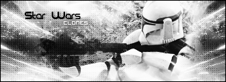
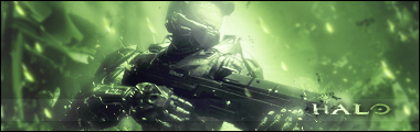
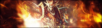
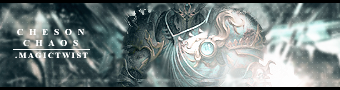
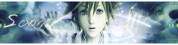
You haven't really improved.
Either your banners are too light, or too dark. Or, they are just too crowded. You need to make more space, and make sure you try new styles, instead of the same style every time.
Either your banners are too light, or too dark. Or, they are just too crowded. You need to make more space, and make sure you try new styles, instead of the same style every time.


")