• Hi all. We have had reports of member's signatures being edited to include malicious content. You can rest assured this wasn't done by staff and we can find no indication that the forums themselves have been compromised.

    However, remember to keep your passwords secure. If you use similar logins on multiple sites, people and even bots may be able to access your account.

    We always recommend using unique passwords and enable two-factor authentication if possible. Make sure you are secure.
  • Be sure to join the discussion on our discord at: Discord.gg/serebii
  • If you're still waiting for the e-mail, be sure to check your junk/spam e-mail folders

My Banners

lucarioisawesome

Who did this to me!
4Hello its me lucarioisawesome. You may know me from the fan sprite section or you may not. Well i just got photoshop element and GIMP yesterday and decided to make banners.
Here is my work so far(i will update every time i make more):
iaza12144354087100.png
iaza12144336629700.png

iaza12144353387500.png
iaza12144385619400.png

iaza12144397387600.png
iaza12144349737700.png

iaza12144356766900.png
iaza12144392634100.png
iaza12144358917100.png
iaza12144373845400.png
 
Last edited:

kyogreblue3

take a byte
your banners could use a lot of work . . . like blending in the image, and using brushes/C4D's/both/etc.
GIMP and Photoshop both have more abilities than just letting you slap an image on a render, if ya know what I'm sayin. Try experimenting with layer settings, Lens Flare, smudging, colors, gradient mapping, etc.

no offense but it shows you're a beginner. Erika's hair looks green in the front xD
 

Mr. Reloaded

Cause a pirate is free
your banners could use a lot of work . . . like blending in the image, and using brushes/C4D's/both/etc.
GIMP and Photoshop both have more abilities than just letting you slap an image on a render, if ya know what I'm sayin. Try experimenting with layer settings, Lens Flare, smudging, colors, gradient mapping, etc.

no offense but it shows you're a beginner. Erika's hair looks green in the front xD

But you have to give em credit for doing a pretty decent job with them though.
 

Virawl

•º°N¡ce Guy°º•
Like Kyogre said, there's a lot more you could do with Photoshop and GIMP. Those banners kind of look like they're made on basic MS Paint.

Try looking at more experienced banner-makers' works, read some good tuts, experiment, and practice a lot.
 
as kyogre said, it really does show that you're a beginner. especially in your second example. it looks like a basic MS Paint c/p banner, and there's a white bar on the left you forgot to get rid of. unless, it's part of the style? but i don't think it is.

now to critique both of your banners...

1st one;
erika's hair looks green, and you cut off the 'spiky' ends of it making her hair look shorter than it is. actually, it looks like you airbrushed ALL the hair. it's a messy job.
the background could use work too. it looks like you used a default gradient, and slapped on a lense flare. there's nothing wrong with gradients, but you could do SO much more.
but, i do admit the effect you have going on with vileplume is kinda cool.
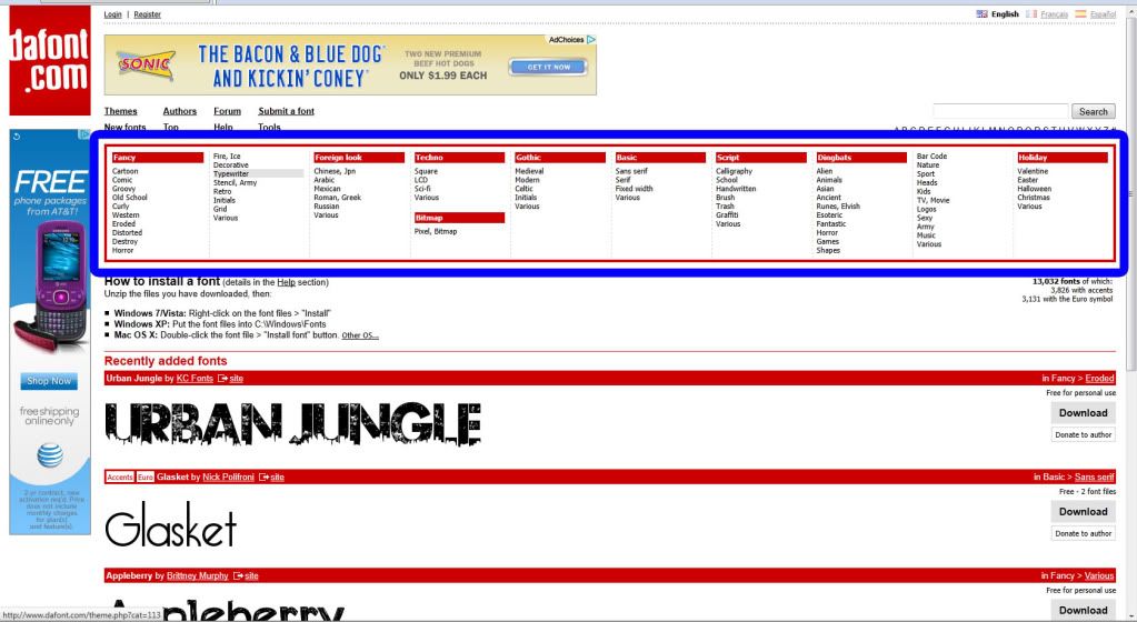
the text is..ugly though. it's very pixely, and doesn't suit the style of the banner at all. if you want a variety of fonts to suit certain banner styles, try www.dafont.com. they're free and have a great selection.

2nd example;
very sloppy, poorly done.
like i stated earlier, it looks like an MS Paint style banner with no thought/consideration. the background is very pixelated; it looks like you re-sized a smaller picture.
there's a faint line beside zapdos as well. it's a little disappointing to see this compared to your first banner.
the green text doesn't match at all. if you want to colour your text, at least make it match the theme. a black or a grey colour would've been more suitable.

i sound a little too harsh, i'm sorry. but if you want to improve, you need to be open to critique. there's numerous tutorials online and even on sppf to help you. also, play around with photoshop/GIMP. play around with filters, opacity, textures, anything.
 

Akemi Skye

Jyousei-Shinkou
Adding onto what previous comments have said about the beginner aspect, just give it some time and a good amount of practice, taking constructive criticism into consideration, and keep on editing. The best way I learned how to edit was by not only tutorials, but by not being afraid to mess with every single button of Photoshop. You have to explore each tool to see what they do and how it can help you.

Some good resources here on the forums could be this thread for help or this thread for collecting some useful additions to Photoshop to further expand your options for editing. The more you know how to do, the better you'll be.

Also, YouTube has various video tutorials by random users that might prove useful.
 

lucarioisawesome

Who did this to me!
Well i make these banner by GIMP cause i dont have photoshop.
Can someone give me a good tutoral. How do you install dafont's fonts onto GIMP?
Edit: i made some more banners:
iaza12144349561900.png

iaza12144339751100.png
 
Last edited:

Akemi Skye

Jyousei-Shinkou
1. Go to dafont.com

2. Find the font you want by navigating through the numerous categories listed at the top.

Untitled-1-10.jpg


3. Next to your desired font, click "Download".


Untitled-2-7.jpg


4. This dialog box will appear. Depending if you have a .zip utility or not (which I highly recommend the freeware IZArc for), it will ask you to open it in that utility or just to save it. Let's go ahead and open it.

Untitled-3-2.jpg


5. Now, this will open it in your .zip utility software (mine being IZArc). Once in your respective software select the font (which is always a .ttf file type so look for that extension), click the "Extract" button.

Untitled-4-2.jpg


6. Select the destination you'd like to extract the font file to (I generally just do the desktop since it's the easiest to find and I'll only have to delete the file after I install the font anyways). After that, click the "Extract" button at the bottom.

Untitled-5.jpg


6. After that, look at the destination you extracted the file to. Right-click it and click "Install". A dialog box will blink (at least it does for me) and it will be installed onto your computer.

Untitled-6.jpg


7. Open your own editing software (I use Photoshop CS5) and you should have the font you just selected and installed listed where you choose your fonts.

Untitled-8.jpg


8. Have fun with it :D

Untitled-9.jpg
 

kyogreblue3

take a byte
thnks akemi.
I made another banner :D
iaza12144336629700.png

iaza12144353387500.png

iaza12144397387600.png

those are still kinda plain.
they need pizzaz; and you need a style. a special style that screams "LUCARIOISAWESOME MADE THIS BANNER!"
a lot of artists have 'em; they're not essential, though.

Anyway, the Meganium and Typhlosion banners . . . the backgrounds fit the pictures, but . . . you need to blend in the image somehow. Like using C4D's and that stuff we all love using xD
 
your graphics look a little more thought out now, but there's still so much more room for improvement. i think the fonts really suit the themes, especially in the second banner. although, you did misspell 'Typhlosion'.
there's also a few stray pixels in your signatures. quite a few by meganium's back leg, a couple of black pixels to the left of typhlosion, and two by the eevee's ears. you should always double check if your renders for stray pixels so they'll look clean.

but the actual images you used are still very plain. not much editing has been done with the meganium/typhlosion/eevees. they still look very c/p. you could try blending in the images into the background, making them lighter or darker, adding effects similar to the vileplume in your erika banner?

and although your fonts suit your banners, the text is still very plain. here is a few tutorials on how to spice up your text, and other tutorials and they're for gimp too. :)
even if you don't get them right the first time, keep at it. you have a lot of potential to be a great graphics artist.

you can do so much with GIMP, keep it up. :)
 

lucarioisawesome

Who did this to me!
i dont know how the pixels got there.
I found the pictures on Serebii and the internet.
Anyways, i made another banner:
iaza12144385619400.png
 

Akemi Skye

Jyousei-Shinkou
Like others have said, just learning to blend between your two grounds (that being foreground and background) can immensely improve the level of your final graphics. Just keep learning new ways to do things and new things altogether, and you'll soon be learning how to put this method and that technique together to create great graphics. It took me about 3-6 months of hardcore editing and learning what each tool does before I was "good". But it's all about dedication and learning the software.

Just think outside the box as well.

i dont know how the pixels got there.
iaza12144385619400.png

Oh, and I like your use of opacity here. One tool that will help you get rid of the blocky edges and stray pixels is using the magic wand tool and having anti-aliasing on. This will smooth out those blocky pixels so it makes it look cleaner. Also, try seeing what an outer glow on the text (and even the lightning) would do. Might help bring out some interesting and highly needed focal points.
 
Last edited:

lucarioisawesome

Who did this to me!
i made another banner XD.
iaza12144356766900.png

I will be making another banner for my friend soon, so expect another one.
Edit: Im done with my friends XD
iaza12144349737700.png
iaza12144392634100.png
 
Last edited:

Akemi Skye

Jyousei-Shinkou
Wow, you've definitely been practicing! And getting better while you're at it. Your final products are steadily getting better :]

One thing I've noticed throughout some of your designs is it is hard sometimes to read your text. You can either make it blend with the background (which I like to do) but have it so it's easier to read, or make it pop out as another focal point. Take my signature for example; I fade it into my background while still keep it legible by using inner shadows and strokes to brighten up the text itself while a drop show to fade it into the background.

See what I mean?
 

lucarioisawesome

Who did this to me!
thanks for all your help akemi XD.
So far i think the "Phantom Dragon" one is my best XD.
Edit: I think this one is the best:
iaza12144333908000.png
 
Last edited:

Zhanton

le quant-à-soi
Hi.

Just a few comments and tips (I use Gimp as well).

+ Firstly, your renders tend to be of rather low quality and tend to have extraction marks. PlanetRenders have some decent renders, but the main thing you want in a render is that it needs to be large. The larger, the better. There's nothing wrong with having a 1200x1600 render for example; it's must better than a 200x200 sized render. The reason being is that if you were to start with a small render, you need to enlarge it/stretch it, and this stretches out the pixels and makes them look low quality. However, if you start with a massive render, you shrink it and still retain the quality.

+ Play around with brushes and layers. You can have countless layers for the one banner; for example, you might have one with just the render, and on top a layer with some colour adjustments or some brushwork set on a different layer mode or opacity. Just play around with using different layers and seeing what different layer modes and opacities do. As for brushes, go on DeviantArt and search 'Photoshop brushes' or something; if you're using one of the recent versions of Gimp, you can use Photoshop brushes as well which is great. Just download them and install them (there are tutorials online - Google is your friend) and play around.

+ Stick to regular shapes and sizes as you're just starting out. I don't think it makes much sense to straight away try and make all complicated shapes and whatnot without first getting a solid grasp at the basics. Using a regular old rectangle might seem boring, but they generally look better as well and will help you understand flow and stuff later on.

+ Try not to make your colours clash; basically, if it hurts your eyes, you're using the wrong colour. Try and make sure that the text colour matches as well (for example, if you've made a Charizard banner which is mainly orange, don't go and slap dark blue text on it; rather, use some orange or yellow text with a border so it goes with the banner in terms of colour but is also readable).

I understand this is all a lot of information, but please don't be discouraged. You're doing quite well, keep it up and keep practicing. There are a whole heap of tutorials online (once again, Google is your friend) which can help you learn the dynamics of graphics and some cool techniques. Keep it up, I'd love to see more work from you.
 
Top