• Hi all. We have had reports of member's signatures being edited to include malicious content. You can rest assured this wasn't done by staff and we can find no indication that the forums themselves have been compromised.

    However, remember to keep your passwords secure. If you use similar logins on multiple sites, people and even bots may be able to access your account.

    We always recommend using unique passwords and enable two-factor authentication if possible. Make sure you are secure.
  • Be sure to join the discussion on our discord at: Discord.gg/serebii
  • If you're still waiting for the e-mail, be sure to check your junk/spam e-mail folders

My First Sprites

Hello, I'm satchellwk, I'm new to serebii forums (although the main site has been my go-to guide for everything pokemon for years).
I have recently gotten revamped interest in pokemon, and yesterday, I got a random youtube suggestion of a video of someone's custom sprites. Well, I was hooked, and I watched a few tutorials and made a few of my own. I hope to get better at making them, and I thought that here would be a great place for advice and criticism, so, without further ado, here they are:
venonatariadosnincada.png

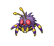
The first one I did, just to get a feel for it, is a venonat with ariados legs and nincada arms
Macargogeodude.png

My next one was a macargo shell with geodude arms and an aron's eye
darkbat.png

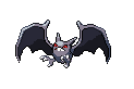
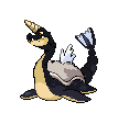
the next one is one that I feel came out the best of my first little batch, its a crobat with charizard's wings, pidgeotto's talons, and the color scheme of mighteyena.
lakemonster.png

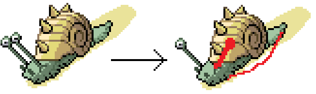
Next, I tried to test myself with a little more complexity. This is a lake monster thing that's a mix of lapras, tropius, gyarados, feraligator, and a rhydon's horn. It didn't really come out as I wanted it, and I could probably improve it more if I had mind to.
Wadjet.png

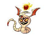
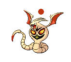
I feel like this is another one of my best, it's a sprite rendition of the mythical Wadjet of Egypt, made with arbok, crobat wings, absol blade tail, primeape color scheme, flygon antenna things, and a sun orb out of a ghastly.
Forretresscloysteromastar.png

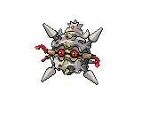
Following that I made an ultimate shellfish type thing by combining forrestress, slowking's "shellder of knowledge," cloyster, and omastar.
FireLarionaggron.png

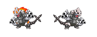
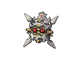
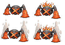
I wasn't sure which of these I liked better. It's an aggron body with a larion head, an onix/steelix tail, and triple blaster hands, made out of metapods and blastoise guns; one of them is aloso a fire-type. The hands were not my original idea, I saw someone else do it ("ashadow255" on youtube) and used his idea in my own. I'm pretty sure that's not stealing.
hogs.png

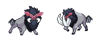
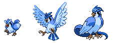
Finally, I made these male and female boar pokemon out of tauros, arcanine, mamoswine, piloswine, spoink, and mighteyena colors. They were probably the hardest ones, since I have to freeform the bottom portion of the female's head, however, I think they turned out pretty well.
That's it, so far. Please comment and share any advice or criticism that would be beneficial; I really enjoy making these and I would like to improve my skills.
 

kamionero

Well-Known Member
Its not stealing as long as you say where ur idea is from :p

Seriously, these are some really cool ideas. The firsts are simple yet effective. The Wadjet is great, I really love it, the only thing that I can see that could be changeable is the sun-orb. I think that instead of using a ghastly you would have been better off using different fire chunks from other Pokes like Ponyta, Infernape, Emboar, and make it into an orb. Granted, its probably a bit of a pain, but I think you could make it work.

The boar is my fave however. They really look amazing, and the color scheme works great.

The sea monster I think u should try to fix, I think u got something interesting there, the neck is the part w the most need for change, it joins oddly with the body and the head, i think u should try to make the neck thicker. the head also looks odd. I think a Croconaw head might in fact fit a bit better line-wise.
 

White2011

Member
NIce sprites! The crobat one looks pretty cool
 
Thanks!
I see what you mean about the orb. Originally, I just made a circle, but then I decided that maybe a ghastly would add more detail, but I think I might change it back, since the original intention was to be an orb, not a fireball.
Here's a pic of it with just a straight up orb, I think it's better:
Wadjet-Copy.png

With the lake monster, I agree, it needs a lot of work (It was late at night when I made it). The main reason the neck is weird is that I started out trying to use a tropius neck and head, and then the head didn't look right, so I tried feraligator, and then I pretty much gave up on it. If I do decide to re-do any of these, that one's at the top of the list.

By the way, I made another. It's a prehistoric conglomerate of sorts that has parts from omastar, tentacruel, krabby, kabutops, and yanmega, ( plus a few more minor parts from here and there) :
Untitled.png

I'm a little worried that I might have tried putting too much on this one, and made it look a bit cluttered.
As I said before, all comments and criticisms are appreciated.
 

AmbipomMaster

#TeamInstinct
Awesome, Awesome! They are great!!
 

Bert

Untitled
Whoa, whoa, time-out here SPPF, seriously?

Okay, man, first of all: welcome to SPPF and welcome to our little spriting community etc...make yourself at home.

Now, about your sprites: they're...alright. For a first try, they're better than what most people accomplish. But, for the love of whatever deity you worship: if you're new: KEEP IT SIMPLE.

The Ariados/Venonat is a really decent first try, no comments. But the second one already shows your totally biggest flaw. Using Magcargo's shell as a head is a really cool idea, putting Aron's eye in it is even cooler, and adding some Geodude's arms to it is fine as well, but the result looks...off. Let me explain:

- From a technical viewpoint this sprite is flawed: the shading on the arms is bad and does not match the shading on the shell (different lightscources). It's because I suspect you just copy/pasted the arms, and that's fine, but try to edit the shading at least (by shading I mean outline as well as color shading). It will look way better if you pull it off and you'll have learned at least if you don't, so try anyway.
- As a general reminder, stick to fusing 2 pokémon for the time being (you're doing a decent job at fusing more but you're just making this harder for yourself)

The Crobat came out pretty neat, mainly because the darker color scheme of the wings hides the fact that you've just copy/mirrored them, right? ;) Sort that out.

So the first three were really decent, then you obviously got overconfident and created some absolute monstrosities. That sea monster looks terrible,so does the Arbok (outline is too light and color scheme makes me sick, although with this one I guess it's just a matter of taste), and then...wtf?! The forretress-based shell thingy "could" work out I guess, but that kind of wicked stuff should be done by people who have some experience, which you lack. It's a cool idea, trying to cramp over 9000 pokemon parts in there, really, but as a beginner it's just not what you should be doing.

Same goes for Aggronator, seriously lol get some practice then try that again and maybe it will work out. Truth be told, I can only imagine how cool that could look if an experienced spriter tried that so don't get me wrong I like the idea it's just really...too soon. If you want to improve it right away I suggest fixing the color scheme, Onix tail isn't recolored etc...too many shades of grey.

That Tauros boar looks hilarious because the fangs are too big for its head so you shouldn't do that, lol. (ProTip: if something doesn't fit go find something else OR try scratching if you feel ballsy).

So, to sum it up: you're not terrible, you could be good, but for now follow these general rules of advice:

1. KEEP IT SIMPLE (don't make me say that again)
2. If you copy/paste (which is acceptable for beginners) try and edit the outline/shading
3. Practice, practice, practice.

I used to be an enthousiastic spriter myself, and I never, ever try to fuse more than 3 pokemon. It can be done, if you're good. And you aren't, yet.

Keep at it, show me some simple work and then I'll have more C&C.
Also, bonus points for using Magcargo (I'm a bit of a fan as well, check my sig lol :p )

Edit: regarding the advice on the orb for your Arbok; try copying a Tentacool/-cruel's orb and recolor it slightly.
 
Last edited:
Thanks for pointing out all of those flaws, I didn't even notice some of the subtle ones myself.
I see exactly what you mean about the macargo/geodude's shading. Like I said, that was the second one I did, so it could use a lot of improvement.
About using just two pokemon, I know what you mean, as a beginner, I need to keep it simple, but I have all these ideas and inspiration for complex splices, and one of the aspects that I was at least attempting to accomplish was making the products not look like spiced sprites, but new ones entirely (which, at the moment, I can tell is not happening).
Indeed, I mirrored the charizard wing, since the base sprite I was using at the time had the second wing at a weird angle. However, in my opinion, I don't think it turned out that bad; are having symmetrical wings such a bad thing?
I agree, the sea monster is terrible, I'm probably just gonna scrap that idea entirely. However, I don't really see the problems with the arbok, I suppose I could darken the outline a bit, but the intention of the colors was to make it sorta blend in with desert sand, and I don't think it turned out too vomit-inducing (but, as you said, I suppose it's just taste preference).
In all honesty, I liked the forretress thing. I know, like all my sprites, there's a lot of room for improvement, and I might have been a bit overconfident with the number of parts, but I feel like I did ok with it. I will say, the tentacles (those red things) looked pretty bad, but I have fixed them a bit since I posted that pic.
With the dubbed "aggronator," I'll admit, I cut a corner with the tail. I was about to recolor it and I thought "Oh well, it's close enough, no one will notice," but I suppose I shouldn't assume people won't catch flaws. I'll go back and fix that. But, again, besides that, I'm not sure what any major flaws on that are, I agree it could use some touchups here and there, but I don't think it's that bad.
In retrospect, I should have made the male "boaros"'s tusks smaller, they do look really out of place. I might just scrap the male and use the female as both genders. Were there any pressing flaws in that one?
Thanks for the criticism, and I'll try to keep them a bit more simple, but, at least to me, there are just so many possibilities that are eliminated when restricted to only two. But I understand, I'll try to be a bit more simple.
 
Last edited:

Victory

Banned
I think the Crobat is great! Keep it up! Some need some work though, just work hard and you'll be great!
 

Bert

Untitled
I'm not saying you can't be creative, it's just that mastering the basics becomes a helluvalot harder if you try to cram the whole pokedex into a sprite :D .

On the mirrored wings, no it doesn't look all that bad but you should edit the outline color and shading so the light source comes from the top-left corner on both wings. You can keep the shame but you need to edit the fill a little bit to make it seem less of an exact copy.

The Arbok thing is really just a taste thing, don't worry about it, but some parts of the outline are definitely a bit too bright.

The Forretress thing...well, I jsut can't make anything of it. it's a Forretress with a Slowking's crown, random tentacles and other stuff like that but it's not a "concept" (which all of your other sprites ARE, luckily). And again - I forgot to mention it last time - on the Beedrill's (?) drills the shading is all off on at least 3 of them since you just copied and mirrored it :). It looks OK shapewise but the fill needs to match the lightsource.

The Aggronator is a cool idea (alhtough it's not yours so I can't give ya credit for that :p ) but the color scheme messes it up a little and parts of the outline are missing on the right one (which is the best one the fire one looks even more crammed), at the claws, mainly. The guns it holds are again just the same thing copied and pasted which is acceptable at best. I really feel that this idea deserves to be worked out with a bit more patience, and skill.

I know your head's full of all these crazy ideas, but listen up: the real challenge is creating something crazy WITHOUT having to resort to a gazillion of different pokemon, WITHOUT having to use the very same part twice, and WITH a lot of work :).

Here's some practical advice: whenever you add a part, think to yourself "Does this part add value to the sprite?" and if the answer's genuinely yes, go for it. The Onix tail on Aggronator was totally unnecessary since Aggron's got a pretty cool tail already, get what I'm saying? Besides, when you work with simpler things you'll produce a lot more sprites, meaning we can give a lot more C&C, meaning you'll get better a lot faster. So basically, the sooner you start showing us your basic skills the faster you can get to work on all those crazy ideas you're having, right? Don't be let down, try to create an equally interesting sprite with only 2 or 3 pokemon. I can tell you're imaginitave, so go for it.

You have potential, I can tell, and I'd hate to see it get wasted (and honestly you should like these posts better than the mindless "OMG THEYRE SO AWSUM!!!" crap people seem to be posting everywhere all the time).

Edit: since you've asked for flaws on the boar, it's ears' outline is too light, there's no black in there at all so turn some pixels black. are those ears scratched? Because if they are it means you can pull it off and that'd be a huge improvement to any of your sprites if you scratched more whenever you feel that you can do it.
 
Last edited:
Thanks for all the advice!
Here's a shading change on the macargo/geodude; I hope I've improved it some:
macargogeodude2.png

I see what you mean with the wings; I'll fix that.
I'll see what I can do with the arbok outline, however, it won't be a t the top of my list of things to fix.
With the forretress, I have a concept in my head, it's just proving a bit hard to show it. I might remove the tentacles altogether; they seem to kind detract from it. And again, I'll fix the shading one the cloyster (not beedrill) spikes.
Let me clarify, the only part that I borrowed were the hands; the rest was all me (well, and gamefreak of course). With the tail, I agree aggron's tail li fine, and the onix tail might be unnecessary, it's just that I was trying to make it as original as possible; ie not an exact pokemon sprite with some stuff added to it, however, I'll change it, since it probably would look a lot better.
When did I say I didn't like the critical posts? I'm glad that you're giving me all of this helpful advice, since, as you can plainly see, I need it.
Sorry, no the ears aren't scratched; they're from arcanine, however, I did just partially scratch something I call 'omasnail' but it's pretty bad..... here it is, just for the critique value:
omasnail.png
 

Bert

Untitled
The shading is definitely better, but still not where it should be. Unfortunately I'm on a Mac right now so I can't really show you how exactly you should do it but I'll try to explain.

- The light source comes from the top left, keep that in mind. Draw an arrow if you have to, just make sure you remind yourself of it at all times. If the lightsource comes from the left, this has serious results for the right arm. How? Because the body is in the way of the light reaching most of it. So the upper part of the right arm should be dark.
On the middle part, though, the shade from the body has ended so you can make it a bit lighter here. On the actual hand, things are different again. Remember: a hand is not flat. Raise your fist up in front of your eyes and look at it. See how the light makes the top of your fingers lighter while the rest remains dark because of the three-dimensional shape of your hand. So on this little guy's fist, the top part of the fingers should be light, to go dark in the lower part of the hand (the palm should also remain dark).

Try to do this smoothly, with a curve, since the body (providing most of the shade) isn't flat either, but round. Now, the biggest flaw in your shading is the outline: if you look at your right arm closely you'll see that the darkest-shaded part as the lightest outline, which doesn't make sense.

Also, just as a suggestion, why not try to add MagCargo parts to the arms? The rock veins of Geodude's arms make perfect candidates to be recolored red so your fusion looks like a more coherent concept. Just something I thought would improve it a lot.

On to your scratch thing, it isn't half bad actually. The first thing I'd suggest to make it better is adding black outline, conform to the shading (take a look at official sprites to see how black outline works, you don't color it all black but in every straight line of pixels on the outline there are a few black pixels). Next, remove the right eye and scratch it again, but a little less identical to the left one, make it look a bit more to the right, to add depth to your sprite. Then make the shading a bit more round, it's pretty good but it needs that little curve to make it perfect. Lastly, get rid of the tail+slime (the tail is weird because the shell is supposed to be closed that way around ;) ).

Don't give up, keep at it. I know I'm being a little rough on you, but I just wish people'd have done that to me too back when I started spriting. I lost a lot of time making the same mistakes over and over again without anyone pointing them out.
 
Thanks for all the help and advice, it's been very beneficial!
Here we go, First the macargo/geodude's improvement:
macargogeodude2-1.png

Next, is the wing improvement on the bat; I had a bit of trouble getting the wings right since the light is supposed to be hitting on top and you're looking at it, I'm not sure what areas to make dark and which to make light, so any imput on that would be helpful :
darkbat-1.png

Next I fixed the ears on the 'boarous' and scrapped the male, what else can I do for this one?
boaros.png

Next, I took your advice on removing the onix tail and replacing aggron's, and I must say, it looks a lot better. I also fixed some of the colors on the hands, which didnt really match with the rest of the body too well:
Aggronator.png

Finally, you told me to make more 2 pokemon splices, so I made this guy with yanmega and whatever the new ant thing is called (I pretty much stopped keeping up with new pokemon around 4th generation)
I call it yanmegant:
Yanmegant.png
 

Bert

Untitled
Wow, that's quite the improvement on Magcargo/Geodude, really well done! It's obviously not perfect but for a very new spriter you can be very proud on that.

The wings on your Crobat are definitely a lot better now as well, I'd just double-check the outline on the right one since the light part of the outline is in the dark part of the wing and vice versa but it's a major improvement whichever way you look at it.

Your Boarous looks kinda funny but it's a solid sprite, I don't think you can do much more on him, unless maybe adding some pink Arcanine patterns on his body, it would look hilarious :D

The Aggron is definitely better as well, but what's up with the metapods? I only just noticed them and I think they're supposed to be some sort of gloves, right? If so, make them empty because now they look like you actually sewed two alive metapods on Aggron's amputated hands :p It's like you'd buy real leather gloves and there'd be an eye in them still, weird lol.

Your new fusion is technically flawless, which only proves my point that keeping it simple is the better way to achieve technical succes :). The idea is also quite nice.

Overall, way to go. I'll let you develop yourself now for the next couple of days, and I'll be back to C&C when you finished a bunch of sprites. If there are urgent questions you feel like asking, feel free to send me a pm. Good job.
 
Thanks!
So, here are a few that I've been working on the past two days, I've had a little bit of trouble coming up with only 2-3 pokemon splices, but I think they're good for the most part:
I'll start off with my set of fridgey, fridgeotto, and fridgeot; combos of the pidgey evolutions and articuno:
fridgeyfridgeottoandfridgeot.png

Next, I have laproise, a combo of lapras and blastiose (and feralligator's tail)
laproise.png

This is one that I like a lot, since I feel like I did a good job of not making it look like any existing pokemon. It's a tropius neck with diglett rock bottom, and pinsir colors/ mouth. The male also has rhyhorn's horns
wyrms.png

Next here are a few improvements on some previous:
omasnail-1.png

Here's omasnail, I feel like I've improved him, however, I still don't think I've gotten the eye's right,even though I completely re-did them. Also, I kept the tail/slime, since ( I want to say this without sounding too know-it-all-ish) morphologically, the foot of the gastropod comes out of the shell and extends in both directions, like this pic here: http://en.wikipedia.org/wiki/File:Snail_diagram-en_edit1.svg Therefore, despite there being only one aperture for the foot to come out of, it goes in both directions, making a head and tail end.
Ok, not that I've gotten some of this science out of my system, how do you think I've done with the improvement?
Also, I know you weren't really feeling my concept with the forretress/slowking/omastar/cloyster, I've made a few improvements, fixing some of the shading and removing the tentacles (which in retrospect I feel really detracted from the sprite), so, what do you think?
Forretresscloysteromastarimproved.png


Lastly, I have this thing I made when messing around. The idea behind it was to make an attack form on cloyster, but it kind of became a cloyster ghost. The idea is that it's the half-oyster shell with the inside on it like you get at restaurants to eat, but it's cloyster and he has a trident:
cloysterattackform.png

I feel like he needs more, though. The concept that I've had in mind has been hard to really put into a sprite, so, any advice you could give on him would be really great.
So, how do (or anyone else who wants to give me some constructive criticism) feel like I'm doing ,are there any major flaws that I'm missing on any of my sprites? Thanks again for all the help.
 
Last edited:

Bert

Untitled
Thanks!
So, here are a few that I've been working on the past two days, I've had a little bit of trouble coming up with only 2-3 pokemon splices, but I think they're good for the most part:
I'll start off with my set of fridgey, fridgeotto, and fridgeot; combos of the pidgey evolutions and articuno:
fridgeyfridgeottoandfridgeot.png

Okay, great. No flaws whatsoever, but not your usual level of imagination, although I do like the tail on the middle one alot, well colored. Mixing birds with birds doesn't give you many choices to be 'creative', though.
Next, I have laproise, a combo of lapras and blastiose (and feralligator's tail)
laproise.png

Hmm, at first I was gonna say he had outline issues but when I gave it a closer look it seemed to be all ok. Again a job well done, though he's really weird (he looks like a Blastoise who got all of his limbs amputated :p )

This is one that I like a lot, since I feel like I did a good job of not making it look like any existing pokemon. It's a tropius neck with diglett rock bottom, and pinsir colors/ mouth. The male also has rhyhorn's horns
wyrms.png

Mirror the left one and set them a bit more apart, I thought it was one pokémon until I read the description and if it'd be one pokemon the shading woudl be awful but luckily I jsut wasn't reading well so it's good. It's kinda cool, I'll admit and I'm mainly glad to see how you managed to keep it simple despite using multiple pokemon.

Next here are a few improvements on some previous:
omasnail-1.png

Here's omasnail, I feel like I've improved him, however, I still don't think I've gotten the eye's right,even though I completely re-did them. Also, I kept the tail/slime, since ( I want to say this without sounding to know-it-all-ish) morphologically, the foot of the gastropod comes out of the shell and extends in both directions, like this pic here: http://en.wikipedia.org/wiki/File:Snail_diagram-en_edit1.svg Therefore, despite there being only one aperture for the foot to come out of, it goes in both directions, making a head and tail end.
Ok, not that I've gotten some of this science out of my system, how do you think I've done with the improvement?

The outline and shading is definitely way better, while the eyes are not. What I'm trying to say is the eyes should look more like two separate antennas instead of one with a double-base, they need to be apart, one leanign to the left and one the right. Also making the antennas a bit shorter and the eyes themselves bigger could help. As for the tail whatever floats your boat, but in that case I'd make it more obvious by actually connecting the back and front end of your slug (making the body thicker) Definitely better.

Also, I know you weren't really feeling my concept with the forretress/slowking/omastar/cloyster, I've made a few improvements, fixing some of the shading and removing the tentacles (which in retrospect I feel really detracted from the sprite), so, what do you think?
Forretresscloysteromastarimproved.png

The drills are all good now except the top-left one. Keep in mind that you're shading a round object so it should be shaded as such and not as a piece of paper. I'd say look up on some Beedrill sprites which have their needle in a similar position and see how they're shaded then try to mimic that. The total concept definitely looks better now, although I'm still not a fan of how it jsut floats there with no legs, arms or feathers :p

Lastly, I have this thing I made when messing around. The idea behind it was to make an attack form on cloyster, but it kind of became a cloyster ghost. The idea is that it's the half-oyster shell with the inside on it like you get at restaurants to eat, but it's cloyster and he has a trident:
cloysterattackform.png

I feel like he needs more, though. The concept that I've had in mind has been hard to really put into a sprite, so, any advice you could give on him would be really great.

Now this here, mate, this is downright great. I can't see how you don't like him. He's fantastic, something I wish I'd come up with. The Trident could be a little more dramatic (it looks like a gardening tool right now :p ), maybe glowing or something but...damn that's a job well done. Also I'd recolor either the shell or the cloyster and the hands to get a bit of contrast (unless you go for a really flashy trident in which case it might or might not look good, try it out - also the hands should rather be cloyster's color and not the shell's). As a remark, the spike on the head doesn't fit (obviously you noticed this too) and I don't really know how you could fix this. As a last note on him I think making one with a Ghastly isntead of a Cloyster inside would be hilarious.

So, how do (or anyone else who wants to give me some constructive criticism) feel like I'm doing ,are there any major flaws that I'm missing on any of my sprites? Thanks again for all the help.

Answers in bold, you're definitely getting there. The last one was OM NOM NOM.
And yes, I know I'd "let you develop" but you're doing so awkwardly fast :D

Edit: since I felt like I couldn't explain in words properly, I took the liberty of drawing my remarks on Omasnail out real quick in a little schedule (I know, it's against the rules, but if it helps you then whatevs):
Naamloos-1.png


Basically, you got to remember that we're viewing the sprite in a threedimensional way, part from the front, part from the side. This means that everything on the sprite must match that criteria. Your eyes were from a 100% 'fromtheside' point of view, which doesn't go well together with the 3d-shell. I also drew a line for the body, if you find it too thick feel free to stick to your old one but I just think it'd look better of the front and back were more obviously connected.

Edit 2: Also you'll want to make the tail a bit darker since again, the shell blocks the natural sunlight to a degree.
 
Last edited:
Thanks for all the compliments!
I'll take your advice and work on omasnail and forretress thing.
Also, I never said I didn't like the cloyster, I was just a bit disappointed because I felt like I could go a lot farther with him. I'll try some of those suggestions definitely. I like the glowing trident idea, and I'll try it out. I indeed did try to recolor the hands to match the body at first, but my issue was that the body had 3 shades of color while the hands 5, what's the best way to overcome that? My best assumption would be to take the closet color to the one you're trying to match and then just adjust the brightness.
 

Bert

Untitled
Just make a few custom colors which are somewhere in between the colors you do have. We've all been there and it's something you'll have to adjust to, just try it out and if it looks bad you can always change it.
 
Update!
So, here are the improvements that have been made:
cloysterattackform-yellowtrident.png

I changed the hands and changed the shell color (mightyena colors look great on just about anything) and hand colors, and changed the colors on the trident, trying to give it a glowing appearance, however, I feel like like I did not achieve it. Any suggestions. I thought about maybe giving it a green glow instead of a yellow glow, so that it would contrast better, but I dont want it to start looking like a mess of color on it.
omasnail-3.png

Thanks so much for all the help you've given me on this guy, he's a whole lot better now. But still, any tips for improvement are welcomed.

Here's some new stuff. Today, however, I didn't have any inspiration for a splice, so I decided to try my hand at re-vamps. I started out with everyone's favorite glitch pokemon, the missingno fossil forms:
fossilaerodactlyrevamp.png

fossilKabutopsrevamp.png

Of course I had already finished coloring them with golem's rock colors when I remembered that they were, in fact, remade in FR/LG. Oh well, I think they look fine with these color scheme.
Next I did the red/blue version koffing, with the backwards face and symbol:
Koffingrevamp.png

Then I did probably sprite with the most personality than any other, the red/blue golbat:
GolbatRevamp.png

Just look at those eyes, and the massive tongue.
I was thinking about doing a few more revamps, however, I want to make sure I'm not doing anything horribly wrong beforehand. So, any critique is appreciated.

Edit: I went Ahead and did more!
KabutoRevamped.png

first, super simple kabuto, it was basically a recolor
OmastarRevamped.png

"well hello there!" says revamped omastar as he waves at you with the other main tentacle on his hip-area.
TentacruelRevamped.png

However, revamped tentacruel does not approve (If you can't tell, I just love the personality that the old-school sprites have!)
KinglerRvamped.png

then there's kingler who might have the most epic pose of any sprite; I mean, he looks like he's about to start guillotineing heads off!

Next, thanks to a look around your sprite gallery Bert, I had a little inspiration for another splice; I think you'll like this one.
Magnagross.png

I call it magmagross. The arms were practically scratch, with only the shape and a bit of shading from the originals used. the smoke was completely scratch, and the fire was scratch except for the far right point, it's macargo's that I used as kind of a guideline. I have 4 versions here, and I don't know which I like more, fire, smoke, both, or none. I want it to look, you know, epic, but I don't want it to look crowded. Any suggestions for improvement are appreciated!
 
Last edited:
I still want a little more CC before I make a whole lot more sprites, but here are a few more that I made:
shuckmasolidrock.png

ShuckmaLavaRock.png

Still on the lava theme, I made some shuckmas. However, I made one with a solid shell, while the other had the macargo red highlights, and I kinda liked both.
then a friend of mine requested that I make something with sneasel, and after a long time of thinking, I remembered how difficult to tell the sneasel is in fact an ice-type, since there are no noticeable characteristics, so I made a pure-ice sneasel; the result:
Icesneasel.png

Please, comments and criticism are welcomed.
 

Bert

Untitled
Update!
So, here are the improvements that have been made:
cloysterattackform-yellowtrident.png

I changed the hands and changed the shell color (mightyena colors look great on just about anything) and hand colors, and changed the colors on the trident, trying to give it a glowing appearance, however, I feel like like I did not achieve it. Any suggestions. I thought about maybe giving it a green glow instead of a yellow glow, so that it would contrast better, but I dont want it to start looking like a mess of color on it.

Make it a bit thicker on the points, it should look like a mighty weapon and not a gardening tool. Try making it like the trident from the king of that Disney movie (little mermaid or something?). Otherwise the color scheme looks pretty great.

omasnail-3.png

Thanks so much for all the help you've given me on this guy, he's a whole lot better now. But still, any tips for improvement are welcomed.

Great job. My suggestions: leave it as it is. It's obviously not 100% perfect but it's about as close as you can get right now. Just let it be for a while, practice on other stuff and in about a month or so try to see if you can improve it. That way you'll see just how fast you're improving as an overall spriter. If you really want a big improvement without much effort or time, I'd say making the eyes (the actual eyes, not the antennas) a lot bigger and more distinguished would give the pokemon more personality.

Here's some new stuff. Today, however, I didn't have any inspiration for a splice, so I decided to try my hand at re-vamps. I started out with everyone's favorite glitch pokemon, the missingno fossil forms:
fossilaerodactlyrevamp.png

fossilKabutopsrevamp.png

Of course I had already finished coloring them with golem's rock colors when I remembered that they were, in fact, remade in FR/LG. Oh well, I think they look fine with these color scheme.
Next I did the red/blue version koffing, with the backwards face and symbol:
Koffingrevamp.png

Then I did probably sprite with the most personality than any other, the red/blue golbat:
GolbatRevamp.png

Just look at those eyes, and the massive tongue.
I was thinking about doing a few more revamps, however, I want to make sure I'm not doing anything horribly wrong beforehand. So, any critique is appreciated.

Edit: I went Ahead and did more!
KabutoRevamped.png

first, super simple kabuto, it was basically a recolor
OmastarRevamped.png

"well hello there!" says revamped omastar as he waves at you with the other main tentacle on his hip-area.
TentacruelRevamped.png

However, revamped tentacruel does not approve (If you can't tell, I just love the personality that the old-school sprites have!)
KinglerRvamped.png

then there's kingler who might have the most epic pose of any sprite; I mean, he looks like he's about to start guillotineing heads off!

Well I suck at revamping myself (like, totally) so I'm gonna give you a little quote from someone I know/knew. It sounds harsh, but she said that to me and if you read through the hard tone, you'll see you could learn a lot from it.

... no I just saw what others did and read the Tut. for sprites.

untitledyx1.png


even if it's not the best revamp in the world ever it shows you what you have to start doing, ir shows you to make the sprite look like the advanced one as best as you can. Not shading in straight lines, not ignoring a lightsource or using many.

Now editing a sprite to make it look advanced;

butterfreeevampqv6.png
teamrevampms3.png


As you see with the Charmeleon it has been edited when revamped, and the tail sux but I tried to splice it with an RSE or FRLG sprite. The butterfree on the other hand is in the process of being revamped- and while I hate the wings, the body and etc has been edited and tweaked when I revamped it.

You can't just slop colors on and claim it's a revamp.

Don't get your spirit down, I'm jsut as bad as revamps, if not worse, than you are (and no, I won't show you :p ) If you follow the link to that post you'll see that she posted a whole lot more about revamps in that thread (it's a really old thread of mine where she really stomped puberty me into oblivion. Anyway, I think it'll be of some help.

Next, thanks to a look around your sprite gallery Bert, I had a little inspiration for another splice; I think you'll like this one.
Magnagross.png

I call it magmagross. The arms were practically scratch, with only the shape and a bit of shading from the originals used. the smoke was completely scratch, and the fire was scratch except for the far right point, it's macargo's that I used as kind of a guideline. I have 4 versions here, and I don't know which I like more, fire, smoke, both, or none. I want it to look, you know, epic, but I don't want it to look crowded. Any suggestions for improvement are appreciated

Haha, looks great, I can clearly see you share my love for Magcargo as a fusion pokemon :D. That's exactly how I make mine, use the outline as a guide and then scratch the lava on them. Great work! The lower right one is the best imho, I like the smoke (though it should be a little more irregular, it looks too much like the legs, smoke should go everyway. Refer to Torkoal or Entei just like you referred to Magcargo for the lava. Referring to existing sprites is a great way to work), but you should let the fire come out of the top of it's head (maybe scratch a crater or something :D) instead of behind it.

I still want a little more CC before I make a whole lot more sprites, but here are a few more that I made:
shuckmasolidrock.png

ShuckmaLavaRock.png

Still on the lava theme, I made some shuckmas. However, I made one with a solid shell, while the other had the macargo red highlights, and I kinda liked both.

I like the one without the lava better for now, but that's because the one with it is too rounded. The lava shouldn't follow Shuckle's forms that much and it should just make a few cracks randomly in the body. Still, nice work. It's pretty amazing when you compare all this stuff to your first works.

then a friend of mine requested that I make something with sneasel, and after a long time of thinking, I remembered how difficult to tell the sneasel is in fact an ice-type, since there are no noticeable characteristics, so I made a pure-ice sneasel; the result:
http://i1221.photobucket.com/albums/dd465/satchellwk/pokemon%20custom%20sprites/Icesneasel.png

[B]The outline should be darker at some places (especially the claws). Remember, it's not because the color is light that the outline should be too light too, especially when the outline is long. The outline should tell the pokemon and it's environment apart, so it should be pretty dark, "mostly". The only way to get that feel of when it should be light and when dark is too practice. However, I really think the icy-feel on its tail and ear is well done.[/B]
Please, comments and criticism are welcomed.

All in all, good work. The revamps probably need most work, but as I said I can't do it myself either so I can't really help ya out on them.
 
Last edited:
Top