Thats right, Another one 8D
Ok first, My newest palletes.
Purple Sadness

Ghost v2
 (Old Version:

And now, A couple of fusions. Fusions are my worst subject =/

Left, Darkrai, Magmortar, Lucario, and Infernape
Right, Manaphy, Spiritomb
And, Maps(They were for meh region)
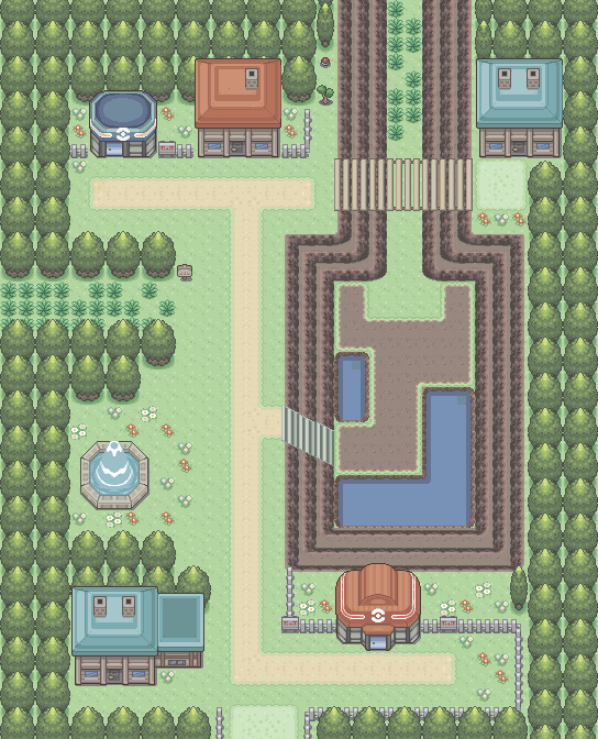
Gold town

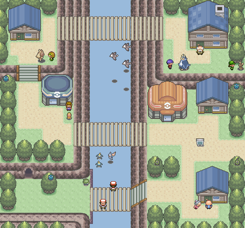
Route 9

Map for someone

More Shall come soon, so calm thy horses.
Ok first, My newest palletes.
Purple Sadness
Ghost v2
And now, A couple of fusions. Fusions are my worst subject =/
Left, Darkrai, Magmortar, Lucario, and Infernape
Right, Manaphy, Spiritomb
And, Maps(They were for meh region)
Gold town
Route 9
Map for someone
More Shall come soon, so calm thy horses.
 The style of the map is D/P but is meant for FRLG. Examples kind of tell me that you're just bragging and trying to lure people into your threads, no offense. You should try stating where it could be improved and where it went massively wrong. I think that the routes could use more grass, as pointed out by Lemon! And jirachi2808, I agree you are being a bit too harsh on Night but you do stand out with a good point and great constructive crit. Purple Sadness is a simple recolour that looks like it was made in Photoshop. No crit there as well as Ghost, except for the fact that Ghosts look like they have no shading and the eyes+mouth look horribly recoloured. The Darkrai Fusion is too Copy+Paste. Most parts don't fit together too well. The Infernape parts make the Darkrai Base look too deformed, whilst the Magmortar fist fits almost perfectly. The position of the Infernape arm+hand is too wonky. Maybe if you made it poke out instead of being merged with the body it'd look better. The Manaphy Fusion is good, creative, made me laugh and yeah ^^ I hope I helped.