• Hi all. We have had reports of member's signatures being edited to include malicious content. You can rest assured this wasn't done by staff and we can find no indication that the forums themselves have been compromised.

    However, remember to keep your passwords secure. If you use similar logins on multiple sites, people and even bots may be able to access your account.

    We always recommend using unique passwords and enable two-factor authentication if possible. Make sure you are secure.
  • Be sure to join the discussion on our discord at: Discord.gg/serebii
  • If you're still waiting for the e-mail, be sure to check your junk/spam e-mail folders

One of my best sprites, ever.

Status
Not open for further replies.

Blademaster_Jale

Feelin' Lucky?
Challenge1-3.png


Made for a face-off challenge on NSider2. It won, but barely; the other spriter was incredibly skilled.
 
Last edited:

M4zz

Banned
This is an ok sprite. Some of the things that I think are out of place would be the wings and tail. They are just too fuzzy and molecular-ish. Overall, the entire body is a bit awkward. Good job though.
 
Wow, it is really good. But, there's something about it bothering me that I just can't seem to place.
 

pichu_power

But Never Again...
I really like how creative this sprite is! :D

The only thing I would consider is the head...it's round skull doesn't seem to fit with the body...maybe a small horn on the back of the head...?

Other than that, it's truly amazing. :D
 

Nagaru

Safety and Seizures
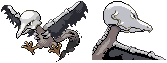
If the sprite has any problem is with the wings, there's little harmony between bones and feathers(?). Say for example, when the wing is flapped upward, the bones should be flexed in an "S" pattern and the feathers can look falling as they do right now; when the wing starts going downward or soaring, the bones stay straight as they do right now, but the feathers open and generate air resistance, so they should tend to a more horizontal position as they get closer to the wingtip. I know it's a ghost bird, I'm just explaining what "doesn't look right". Otherwise, it is a very good sprite.
 

Nagaru

Safety and Seizures
Well, common sense over aesthetics is fine. It looks good enough, anyway.

Out of curiosity, what exactly was your poke competing against?
 

Nagaru

Safety and Seizures
Haha, it's kinda true, both are great, they just appeal to different demographics. If I had to vote, I'd probably stand undecided for hours as both cool and pretty have the same appeal to me.
 

Killer_Squirtle

Follow my lead!
first one looks a bit... I dunno, scratchy.
This one looks way better! How much of it is scratched cuz I see some fearow in there.
 

Luminey

Aspiring Collector
OOOHOHOHO!! If your asking which program, i used paint. For pokemon, I used Fearow, Pidgeotto, Pidgeot, Oddish, and Articuno. For the colors, gosh i can't remember. I usually end up mixing pokemon's colors to get the right one I'm looking for.
 

Mewkachu

Sexuality is a cult.
This is actually--really good!
The only problem is that the head should be a BIT smaller.
 
Status
Not open for further replies.
Top