I hope the few people that like my stuff didn't think I had forsaken the .5mm #2 mechanical pencil =O
Pretty big art update, so I'll just copy and paste and fix it later =P
May 13 '09
Mother's day in mexico went by without me being able to talk to my mother =[. Ok enough about me, I always b!tch about me =P. I am going to show you people some things that I was working on a little while ago but wasn't able to upload until recently when I went to get them scanned. Funny story, the place I usually go to to scan my things was closed due to the
Swine flu =P As always to avoid mindless bandwidth abuse
Click on the thumbnail to go to the nice and pretty big version. And I put my comments on the DA thing for a reason people, stupid questions and stupid comments suck. I do, however, appreciate you taking your time to look at my stupid drawings =P
 That Happier Feeling - Pencil
This was just me doing someone else's drawing in my style.
I take no credit for it whatsoever. The original artist is in the description at DA and the original piece can be found
here.
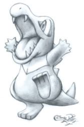 Andrew's Totodile
Please read the description at DA. I don't usually do requests anymore =P
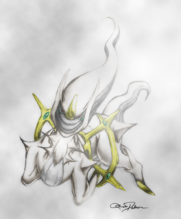
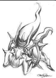 The Seventh Day
Lol, I have no imagination XD. I did this without a reference at first, then crumbled it up, then started again, looked at the original Sugimory art for some details, and at a picture of a resting goat =P, but that was after I did the face lol. His head is HUGE XD Mew was meant to be there, but have you any idea how complex mew is? Yes, MEW. Read the description in DA, on the other ones too =P.
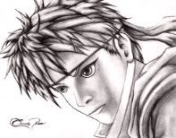 The Many Faces of Brawl - Ike
The hair took hours, and I didn't feel much like working avidly hard on the rest of the body, what you see is what you get. I felt a need to apologize to Ike for messing up my last drawing of him.
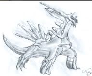 Dialga Trophy
This one's the trophy of Dialga from brawl, horrible drawing, I know. I did it before the Celebi trophy, a much better draw ^^; This was meant as a gift for my nephew. He's like 6 and just drools over Pokemon XD. Unfortunately this is one of the ones I was never able to give him ;_;, but he did take an awesome none-referenced Entei drawing of mine, I even drew a background for it =O, I never do backgrounds =O
")