-
Hi all. We have had reports of member's signatures being edited to include malicious content. You can rest assured this wasn't done by staff and we can find no indication that the forums themselves have been compromised.
However, remember to keep your passwords secure. If you use similar logins on multiple sites, people and even bots may be able to access your account.
We always recommend using unique passwords and enable two-factor authentication if possible. Make sure you are secure. -
Be sure to join the discussion on our discord at: Discord.gg/serebii
You are using an out of date browser. It may not display this or other websites correctly.
You should upgrade or use an alternative browser.
You should upgrade or use an alternative browser.
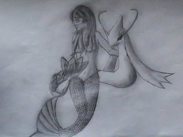
pokefan90's Milotic+Mermaid
- Thread starter pokefan90
- Start date
That my awesome friend, is ASTOUNDING. You have extreme talent and I hope to see more from you in the future! I must say that is so well done, an all rounded masterpiece. Perfectly toned, the physiques are superb, it is realistic, and in general simply mindblowing. Keep it up, I'm wowed over here!
Raunchy_fad
Ooh, maaaan!
The mermaid is absolutely beautiful, sir, but shouldn't you have drawn the Milotic in a style that would match the picture? If I were you I would've given it more scaly, fishy features instead of keeping the style of Milotic you always see.
Well, whatever works for you, man, but for me it just doesn't melt well.
Well, whatever works for you, man, but for me it just doesn't melt well.
*blush*Oh, stop it you
Thanks, I'm flattered
I was planning on adding a background, but I just can't find the time or the place. Also, I couldn't put the...err...you know whats in there because that is considdered hentai, I even asked Latios once.
This was for a friend that loves milotic, so I made it specifically like that, just kept it cartoonish. I've seen great stuff done to milotic to make it realistic, but come on, it's pokemon. It's supposed to be childish, yet magical.
Thanks, I'm flattered
I was planning on adding a background, but I just can't find the time or the place. Also, I couldn't put the...err...you know whats in there because that is considdered hentai, I even asked Latios once.
The mermaid is absolutely beautiful, sir, but shouldn't you have drawn the Milotic in a style that would match the picture? If I were you I would've given it more scaly, fishy features instead of keeping the style of Milotic you always see.
Well, whatever works for you, man, but for me it just doesn't melt well.
This was for a friend that loves milotic, so I made it specifically like that, just kept it cartoonish. I've seen great stuff done to milotic to make it realistic, but come on, it's pokemon. It's supposed to be childish, yet magical.
Last edited:
^^torpedo^^
Onions? Where??
3D obiviously.. I personally prefer more pencil drawings than coloured ones.. I am ok at drawing myself too but most of my works of art get ruined by those evil color pencils... they get messed up...
well...
my arts grade was 10..
well...
my arts grade was 10..
Fast_shoesXx
Well-Known Member
Very nice, only thing that I will say is that milotic's tail looks a bit stiff, not as "graceful" as it could be. Really good job, though.
Clockworkz
SURPRISE BUTTSECKS
How come no one else sees the errors in this?
I'll be blunt, because variation is sweet. Sorry, pal.
Her head/shoulder size ratio is horribly out of proportion; it's way too small of a ratio. The head looks big compared to the body. Her midsection, while almost hourglass like, looks thick, almost like she has extra weight, and I KNOW you didn't mean for that. The left arm looks manly; it's probably because of the line definition in the elbow. I know you like detail, but no. Do not do that kind of stuff unless you know how. Also, where the hell did her hands go? Did they disappear? Not good. Oh, it also looks like she has a pig nose. Again, try not to define so much in a smaller pic such as this.
The Milotic looks too thin at the end, and its head looks a bit too large as a whole. And what's the huge bulge 1/3 of the way below its head? That just looks really bad.
At least the shading is alright, since you seem to have a definitive lightsource.
Sorry. But I had to deviate from all these artgasms people are having over this, because it's really not worth artgasming over.
=\
Last edited: