• Hi all. We have had reports of member's signatures being edited to include malicious content. You can rest assured this wasn't done by staff and we can find no indication that the forums themselves have been compromised.

    However, remember to keep your passwords secure. If you use similar logins on multiple sites, people and even bots may be able to access your account.

    We always recommend using unique passwords and enable two-factor authentication if possible. Make sure you are secure.
  • Be sure to join the discussion on our discord at: Discord.gg/serebii
  • If you're still waiting for the e-mail, be sure to check your junk/spam e-mail folders

-Raiga-'s sprites

What do you think of my skill as a spriter.


  • Total voters
    96

noobiess

6 different pokemon
Wow I love the evolution of of the apple!. The placement of the arms don't look really natural tohugh. I also would change the color scheme to a little more green/purple because the both have a little bit of a ghosty appearance.

I really like the teddybear too but the shaidng doens't look right...Also the head is al ittle bit too small, compared to the body
 

-Raiga-

Well-Known Member
Wow I love the evolution of of the apple!. The placement of the arms don't look really natural tohugh.

Maybe its right arm connecting to the lance I can understand, but for a centaur I don't know why they aren't natural.

I also would change the color scheme to a little more green/purple because the both have a little bit of a ghosty appearance.

I did forget at the last second to change the second forms colors to something different from the first. However the thing you have to remember is that at least in the second form, I have not 1, not 2, but 3 things to get across already(knight, centaur, apple core), and introducing another element whether its shading, color scheme, ect., might be a bit too much for someone to take in.

I really like the teddybear too but the shaidng doens't look right...Also the head is al ittle bit too small, compared to the body

I agree, but frankly I don't really know WHERE its wrong. Also, by head do you mean its face, or his face and the cotton together? Because if its the latter, its already about half his body. Also I based his general body size around aipom's hgss sprite because I consider them to have roughly the same size.

Thanks for all the crit! Keep it coming guys!
 

Grovyl

Who dun dug diglett?
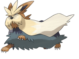
Wow! Something is off about it, but it still looks very cool! I like the movement in it, like how the mustache things are flying. Although, the more I look at it the more it looks like Stoutland, but it's eye could be more visible. Very cool, good job!
 

Zozo1999

has left Serebii
I don't think the mouth should be pure black, out some red/pink in there to show the toungue. Also, there is no Black outline on him, and the dull colours make it seem fuzzy, even though it's not
 

-Raiga-

Well-Known Member
Wow! Something is off about it, but it still looks very cool! I like the movement in it, like how the mustache things are flying. Although, the more I look at it the more it looks like Stoutland, but it's eye could be more visible. Very cool, good job!

If you look at both the offical sprite, and official art, his eyes are VERY small and hard to make out. I agree, something is off about it, but its always hard to tell when you work so long on sprite.

I don't think the mouth should be pure black, out some red/pink in there to show the toungue. Also, there is no Black outline on him, and the dull colours make it seem fuzzy, even though it's not

Using any more colors would be going over the limit of 4 colors on any given sprite, but I'll see what I can do. Although you hav to keep in mind his mouth is turned upwards, meaning his tongue would most likely be blocked from view.

Black outline is something I was going to add, I just wanted to make sure I got the entry in.

Anyways, thanks for the crit guys, I barely ever get it in my thread so it means lot. I'll have the new pic up in a bit.
 

Electricbluewolf

*pours beans down the waterslide*
Stoutlandwhiteout.gif


My entry for WSC week 110.

I lovee this one (And not just because I love Stoutland)

It's very clever with the 'action' pose, and I like it without the black lines-I don't know why, it looks better to me. The shading is just right, though his left paw (his view) looks a little odd coming out of the mass of blue fur. I also think the back of his body is 'square', and for 'dog' proportions, it looks odd. But otherwise, it's another fanastic sprite. I always enjoy looking at your sprites, they're really good (I could also eat that pixel art of pokemon sudowoodo, it is really good)
 

-Raiga-

Well-Known Member
Hmm, well, I'm not really sure how to comment to some of those things. His paw is just coming out of his fur like the official picture. Same with his boxy look(although the back of his body IS curved in the sprite to follow the action he's performing).

stoutlandreference.png


Thank you for all the kind comments.
 

-Raiga-

Well-Known Member
Vaporeon.png


Eh...I don't care for parts of it, but I think its decent for my first sprite in a year. That middle leg is bothering me(specially on the dark/black+white skins), and my linework is as crappy as ever.

Light is coming from opposite direction to mix things up, just thought I'd mention that before someone mentions the stupid "MLSS" stuff.
 

Bert

Untitled
I think the head is really well done, and that the pose could look great with a couple of touch-ups. As you stated the middle leg is't that good, but the other front leg isn't either. I don't now if it's the shading or the linework but something makes the legs look really frail. I also think the two main shades contrast a little bit too much, which doesn't help either.

It's better than any scratch I could pull off, but those are the things that caught my immediate attention.
It's good to see another sprite of you, Raiga.
 

Da Man X

Cυrsιvε Rσcκs-DαMαπΧ
Pretty Good! I like the chubby Entei.
 

-Raiga-

Well-Known Member
I think the head is really well done, and that the pose could look great with a couple of touch-ups. As you stated the middle leg is't that good, but the other front leg isn't either. I don't now if it's the shading or the linework but something makes the legs look really frail. I also think the two main shades contrast a little bit too much, which doesn't help either.

Hmm, well the shades were something I thought I got right actually. I was going for a hg/ss style of sprite, and they usually use two distinct shades plus one linework shade. My style of shading is a little different though, its not as clean-cut, so that might be why.

As for the middle leg, I think it might be the shape, especially towards the bottom. It was difficult though, because it gets smaller as it gets closer to the toes, plus combined with perspective... Anyways, the other front leg that covers it could probably feel a bit more like it's coming out at you too.

I'll edit this post later or something when I get the chance to edit it.

Pretty Good! I like the chubby Entei.

Its a fusion of Entei/snorlax actually. Thanks regardless!
 

DarkyWyvern

Reckless Trainer
I think the head look amazing, nicely pose and well scratched.

Although, you're right there are some issues with its front leg. (I suggest you google cat/cat walking/cat standing to get some reference of how they should be to look better)

- As for the current legs, I think both of its front legs are too thin, I think maybe 1-2 pixels wider would be enough.
- Also, there are some issues with the shading. The top of its front-right (his point of view(HPV)) shouldn't be shade while the bottom should.
- His front-left (HPV) looks too straignt, it's missing an elbow/knuckle.

Other than that, I think it's a rather good sprite
 

M4zz

Banned
Jesus Christ that was one hell of a bump.

My biggest qualm with the sprite outside of the aforementioned front leg issues is the shading on the head and lower frill area. The two don't exactly match up, and it seems like you've got MLSS coming from the bottom of the sprite. Needs more cowbell anti-aliasing to give it a more Gen III or realistic look, unless you're fine with the Gen IV / V cartoony-style.

Otherwise it looks good.
 

-Raiga-

Well-Known Member
I guess I'll get around to fixing vaporeon some other time(code for "I'm never going to touch the sprite the rest of my life")

Here is an icon(50x50) I made for my deviantart-

chinglingicon.png


Note a few things. One, I got really sick of making it toward the end(the scarf thing), so the linework and all that is f'd up.

Two, crit is fine, but this wasn't meant to be my greatest art, just a simple icon.
 

M4zz

Banned
It looks really good actually. Maybe reducing the amount of black outline, especially where the foot, arm, and part of the mouth to our right meet. Try a brighter colour too. If I recall, Chingling was a pretty bright Pokemon.
 

-Raiga-

Well-Known Member
It looks really good actually. Maybe reducing the amount of black outline, especially where the foot, arm, and part of the mouth to our right meet. Try a brighter colour too. If I recall, Chingling was a pretty bright Pokemon.

It is a bit brighter, but the big thing is chingling's real color is a bit more on the orange side. One of the main things I've been doing after coming back to spriting is color choice/hue shifting, as its something I never really learned before, so it may lead to results like this.
 

-Raiga-

Well-Known Member
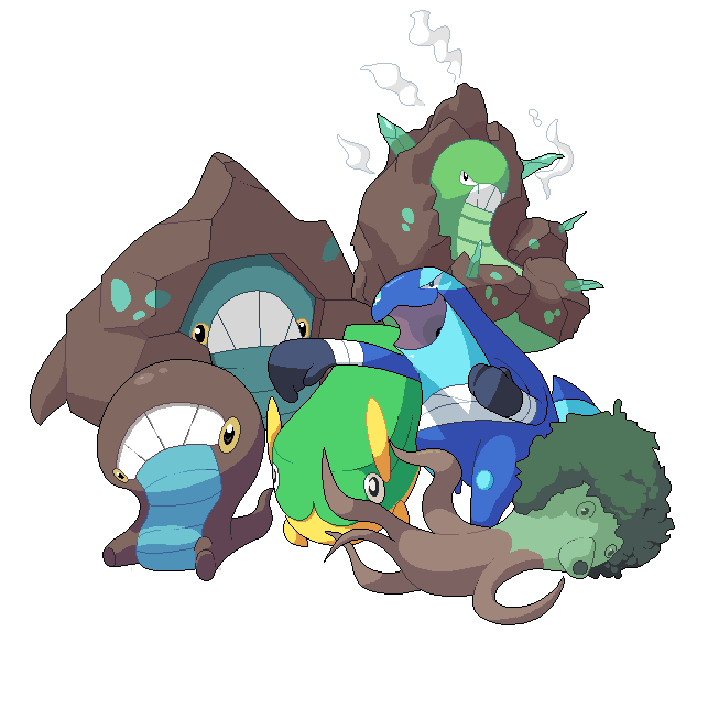
Wow, never thought I'd post here again. Anyways, I'm in college right now but I've still found time to work on the Pokemon Imperial Sky fan-game. These sprites have an in-game purpose, but I mostly did them for fun.

GroupHug.png


Other then the tree squid that I designed, all are designed by ~SirAquakip as he's known on deviantart, or plain ol Aquakip on here.
 
Top