• Hi all. We have had reports of member's signatures being edited to include malicious content. You can rest assured this wasn't done by staff and we can find no indication that the forums themselves have been compromised.

    However, remember to keep your passwords secure. If you use similar logins on multiple sites, people and even bots may be able to access your account.

    We always recommend using unique passwords and enable two-factor authentication if possible. Make sure you are secure.
  • Be sure to join the discussion on our discord at: Discord.gg/serebii
  • If you're still waiting for the e-mail, be sure to check your junk/spam e-mail folders

.::Rate my Banners::.

Light Venusaur

Konoha's FMA Ninja
.::Rate my Banners please::.

Here you can find my current Banners that range from Contests to Requests & other stuff.
Credit to: Xous' on Pokebeach for the nice Pokemon Art works


.::Contest Stuff::.
Banner-Contest_Shadelon.png
~Current
Banner-Contest.png
~This was for the WBC 3 weeks ago...but there was only 3 members who enterd it.
Banner-Contest1.png
~My 1st one like this

.::Requests::.
Banner-Steelzip.png

Banner-blackness777_non-split.png
~Requested by: blackness777

.::Other Stuff::.
Banner-silversnowcloak.png
~I made this for silversnowcloak on Live Journal
Banner-Dandylion.png
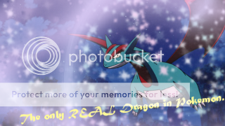
~I made this out of fun.
 
Last edited:

Aieny

Member
Nice stuff...!
But what happened to Mamoswine face? somthing looks a little off ^^"
I also think you should invest more in the fonts...make them more cohesive with the rest of the banners...

other then thet thy look great m8 ^^
 

pkmnhippy

Banned
The text is hard to read on some of them, and you should use different brushes.

I can give you more constructive criticism if you want.
 

pkmnhippy

Banned
Just because Gimp is for free doesn't make it bad, and you can download brushes for Gimp too.

As for your new banner, basically the same thing I said before, also it would look better if you got rid of the sparkles covering Salamence's face.
 

Ivysaurus

ONYXceptable
I say there ok, not great, but not bad, but try smudging, and gradient maps/ photo filters. You can find a lot of TUT's about them, but still they're pretty good. The snow kinda makes it to blurry for my taste. Sorry if that came off rude.
 
The top four are waaay too bright. Your typography is horrible and there's no flow and there's just no balance for them. Its scattered. Your one big banner is overkilled with a lot of brushes, there's no depths, flow, etc. It's like you just slapped it all in there and coated in, or the correct word is overcoated it in too much brush.

There's more for you to work on with your others. Especially the font and type, so download in some fonts and try them out. Keep in mind that there is some signatures/banners that will look decent with a particular font style, arrangement and colour. It'll also be better when the type and the image (one or the other) will have a flow with it. One of my suggestions is to try using some textures with some brushes and play with colouring. Have fun with it but the arrangement of the work matters the most.

To be real honest, out of all of them I like the one Dragonite signature. It just looks better and appealing to me out of the others.
 

Light Venusaur

Konoha's FMA Ninja
^The ;149; banner is: stock photo (from yahoo searching sky or beaches....I can't remember what is was), a Pixel Over (not mine) & a ;149; HGSS Sprite...with #149 Dragonite on it.
 

Northern Lights

[BritishSarcasm]
I tend to find that your banners stick to a certain ... style, if you will, try to get different looks, effects and layouts introduced to your banners.

Next thing, the text, i tend not to approve of the slanting text, unless it's aligning with something in the banner, otherwise i just use horizontal or vertical text, out of the way and to the side so it doesn't clash or take up any "main image" space.

However, i realise depending on what programs you use it can limit what you can do, but i will say this; when using WBG elements in a banner, such as your floral designs, which i must say are very pretty =], don't suddenly cut them off, blur them out or gradually fade them out, it looks a lot more graceful.

Keep trying and improving. 8D
 

pkmnhippy

Banned
You've improved a lot~

You should have the frame as the top layer though, otherwise it doesn't really work as a frame...
And you still need to improve on the text, it's still hard to read.
 
Top