• Hi all. We have had reports of member's signatures being edited to include malicious content. You can rest assured this wasn't done by staff and we can find no indication that the forums themselves have been compromised.

    However, remember to keep your passwords secure. If you use similar logins on multiple sites, people and even bots may be able to access your account.

    We always recommend using unique passwords and enable two-factor authentication if possible. Make sure you are secure.
  • Be sure to join the discussion on our discord at: Discord.gg/serebii
  • If you're still waiting for the e-mail, be sure to check your junk/spam e-mail folders

recent arts adventures(lol back from the dead?)

Shadow Flame

The Philosophizer
scan0089.jpg

http://smokin-aces.deviantart.com/art/Sister-piece-WIP-130410555

scan-1.jpg

http://smokin-aces.deviantart.com/art/Classical-WIP-131173707

scan0087.jpg

http://i204.photobucket.com/albums/bb298/shadowflame1639/scan0087.jpg

tell me whatcha think^^; C+C are always appreciated

man I been gone from here foreverz, um yeah hope to get some comments lol I don't know anyone anymore XD
 
Last edited:

Naomi

Addict of the Knife
You have a clean, lovely style. c:

Very cute pictures.
 

Yami Ryu

Well-Known Member
Ow wow. What lovely reviews.

Oh u has talent.

Wow. I mean seriously. Wow.

And 'lovely clean style' what the hell?


The poses seem a bit stiff and awkward, like you took it directly from a picture, a photo or something else for reference, without trying to give the bodies a more life like feel. The arms also seem to add to this, as the male's arms, seem to just defy the laws of reality and go flat across his chest and other arm, to hold the hand, while the other shows the dreaded CLAW FINGERS.

The other thing is the arms, for the most part seem to be equal sizes when there should be differences, and they seem to lack any real .. tone/definition. same with the faces. The clothes are also seemingly painted on as while you can tell it's clothing, there's no bends or folds like clothing should have, The heads also seem to 'big' in a depth way.

you have talent. But it still needs refining.
 

Naomi

Addict of the Knife
No need to snark at me for not wanting to crit right away. :/

I'm too tired to critique all the time, anyway. It's basically the same thing for almost 80% of the fan art section, anyway. I could copy-paste the same message in each thread I visit. Hips are too thin, eyes are too large and glassy, hands look like mutated fried squid on a stick and seem to be missing fingernails, coloring is too flat, needs more shading, clothes have shading/highlighting in areas that don't seem to need it(is there even a light source?), expressions are too dull and the poses seem to suggest a lack of bones.
 

Shadow Flame

The Philosophizer
yami ryu: yeah ur right about the arm thing I had a hard time giving it any sense of form, so it did turn out kinda flat, and yeas I was having issues(not that I still don't XD) with the hands. As far as clothing there should be more detail and I usually do, but I don't know why I didn't, probably just lazy or wasn't looking at the time or something stupid. Although I don't really see what ur talking about with the arms being different lengths, in general they should be almost the same. I don't think I left any othing out...Also did u even look at the other picture? thanx for the critique, but heads up. There's no need to be nasty, and ur gonna get flamed by ppl if u aren't careful.

naomi:um I don't know if that entire thing applies to me, bu the hand thing, and lack of bones one I can see for sure XD

anyway yeah I got a new pic its up top too, but yeah I'm puting it here also
scan0087.jpg

http://i204.photobucket.com/albums/bb298/shadowflame1639/scan0087.jpg

the coloring is a little rough I know, but thisis how my stuff normally looks
 
Last edited:

Naomi

Addict of the Knife
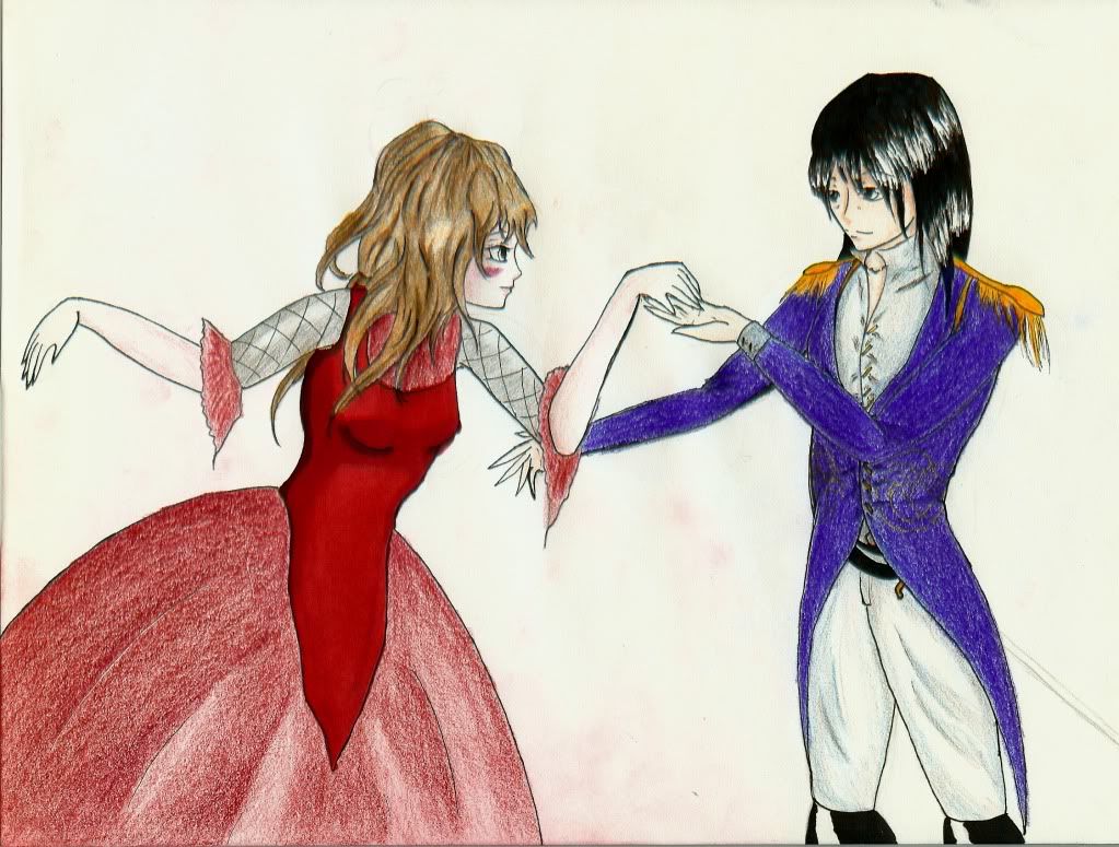
This one's much better anatomy-wise. But the foot behind her looks a tiny bit awkward, probably could use a slight reshape and shading like the rest of the body, and the ear seems just a bit too high up/far away rom the jawline. Looking in the mirror or at photographs helps a great deal here. Also, her right arm seems to lack the build of the left one, it's a bit stumpy and there seems to be very little wrist. My only other issue(and this one's a bit nitpicky) would be the placement of her eyes. One seems to be traveling off her face, juuust a bit too far. Otherwise, you did a pretty good job with her anatomy.

Color-wise, it's not too bad, you did seem to give it a clear enough light source(though you don't really need all the shines down her arm/in her hair, just a nice light grey or something to show lighter areas), though I like that you showed her hair isn't just one solid piece, and gave it strands. You get brownie points for that. I think you should've used some shading on the pink parts of her arm/leg warmers, since you shaded the black. Same goes for the fishnets. Even though they are just netting, you can still shade the skin underneath to give it more dimension.

All in all, it's a big improvement from the first image. Her pose is more relaxed/natural-looking, and your anatomy has improved quite a bit.
 

Shadow Flame

The Philosophizer
yeah the foot annoyed me when I finished it XD hm thanx that helped alot^^

coloring wise yeah lol funny thing was I didn't have the color to shade the pink very much at the time XD and yeah the fishnets...yaknow I never thought of that for some reason^^; lol yeah shines lol I have to much fun w/ 'em XD

thanx alot^^
 

Naomi

Addict of the Knife
A light or warm grey(or if the subject is in a shaded area, a cool grey) is a decent color to shade with, if you lack a darker pink/red/etc. When I use my copics or prismacolors, the warm greys give a nice, natural-looking shadow, and help me shade. It works even if you don't have copics or huge sets of colored pencils. XD Most sets come with a shade of grey, and it's excellent to work on details and shading with. It's also good for adding roots/darker strands of hair. c:

Another tip: if you're using colored pencils, a little rubbing alcohol helps with blending, and also fills in those little white "spaces" you get when you color. Just dab a little on a q-tip or a cotton ball and run it over the area that needs blending.


It's just a suggestion, if you'd like to give it a try. I use it sometimes, and it really improves the way my pictures turn out. I often use it to clean up the background, and give skies a more gradient look. c:
 

Shadow Flame

The Philosophizer
yeah I just got warm gray in copics and is amazing but I never knew about usinf it in hair or for shading colors...thank u^^

rubbing alchohol? serious? holy cow I never would have thought that...I gotta try that too... thank you alot XD
 
Top