XLugiaReshX
名誉
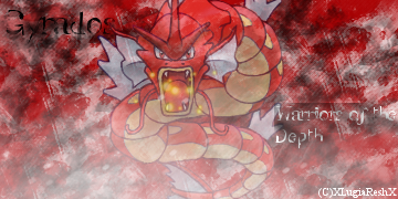
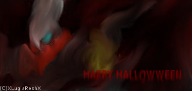
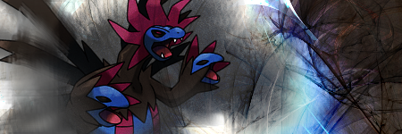
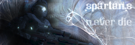
I just started making art on the computer about two days ago on gimp and I decided to post here to see what other people think. So enjoy looking and them and any advice that could help me improve is appreciated ")


Last edited: