• Hi all. We have had reports of member's signatures being edited to include malicious content. You can rest assured this wasn't done by staff and we can find no indication that the forums themselves have been compromised.

    However, remember to keep your passwords secure. If you use similar logins on multiple sites, people and even bots may be able to access your account.

    We always recommend using unique passwords and enable two-factor authentication if possible. Make sure you are secure.
  • Be sure to join the discussion on our discord at: Discord.gg/serebii
  • If you're still waiting for the e-mail, be sure to check your junk/spam e-mail folders

Rukaria's Art

benjaminshr

New Member
Nice art.I like that collection of yours.
Some of them are looks cool as a signature.Please keep sharing more if you have.
Thank you for this amazing collection..
 

kiogrey

RS REMAKES
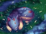
Your Latias and Latios one is beautiful *w*
The use of colour saturation as shading is a very effective technique and those white lines are make very nice highlights. I'd love to see it when it's finished with the background! :D
 

TheLupineOne

I'M GETTING WHITE.
For those who didn't get the Yellow and Purple bit... who else is Yellow and Purple on this bit of fan arts?
 

Rukaria

onechance.
oh wow.. the Latias and Latios look so delicious. *A*

Beautiful shading and drawing overall. I wish it were bigger though. xD;
Thanks c: You can see the larger image if you click on the thumbnail XD
Latias is turning Yellow and Purple... I think we know what that means...
Haha XD
Nice art.I like that collection of yours.
Some of them are looks cool as a signature.Please keep sharing more if you have.
Thank you for this amazing collection..
Thankyou very much c: I shall continue to submit more~
Your Latias and Latios one is beautiful *w*
The use of colour saturation as shading is a very effective technique and those white lines are make very nice highlights. I'd love to see it when it's finished with the background! :D
I should have it done this weekend. I haven't really had inspiration to do anything digital lately.

New Stuff:
English Sketch - Pond
Plane Flight Sketch
Angel Sketch
 

HakuBlue

Up and away

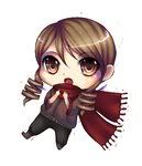
English Sketch: I really love her face and hair, and don't even get me started on the colors you used, they really went together (which looks easy, but isn't since you didn't even use that many). BTW, you drew this under the time span of a song, that's like insane, I can never do something like this, and my sketches tend to take obscene amounts of time. Anyways, I really like the strokes and the outlines, great stuff.

Plane Flight Sketch: This one is my favorite. I don't even care that it is a sketch. Though the shading is simple, for some reason it really works with the drawing, I think that the white background adds to it, and just makes it blend rather nicely with the shading. The armor was well drawn, very detailed and her flowy hair was well drawn, the angle that you drew her face was what really made me like it. I'm really not that great with different angles/perspectives so I admire those who can. Good job <:.

Angel Sketch: Out of the three, this one was my least favorite (not that it's not any good, I just think that the facial expressions were a tad better on the other two than this one). The overall effects worked nicely, though the cyan lighting/beams seemed a bit off, maybe they need to be placed differently (though I myself don't know what it is off about them, so I can't really explain, it's like a feeling ya know?) Over all, it was very nice, and the coloring of the hair I think was the best, cause it really gave some depth and volume, it didn't look flat or simply airbrushed.

On a side note, your Bluest Melody drawing is my all time favorite. The coloring/shading style used there was amazing (and in fact one of the ones I used to want to incorporate to my style, but it didn't work out).
 
Thanks c: You can see the larger image if you click on the thumbnail XD

Oh, never noticed that. xD; Looks even more beautiful that way. <3

Of your new sketches, I love them all. :3 Sorry I couldn't give any constructive criticism - I couldn't find anything to criticize. You're that good. XD
 

Rukaria

onechance.
English Sketch: I really love her face and hair, and don't even get me started on the colors you used, they really went together (which looks easy, but isn't since you didn't even use that many). BTW, you drew this under the time span of a song, that's like insane, I can never do something like this, and my sketches tend to take obscene amounts of time. Anyways, I really like the strokes and the outlines, great stuff.
I'm kind of surprised that they went well together. I didn't even really get to choose what colours I was going to use, these were all that was left over. Yeah, two colours and a lead pencil for defining can be difficult to work with, but you can get some amazing results. I'd recommend giving it ago at least once or twice. I'd actually drawn a similar pose a few days before this picture, so once I heard the song I was able to easily figure out what this one would look like and quickly sketch it up within two minutes. I envy the people who are able to do amazing sketches within a few minutes. Try looking up "music meme" on deviantart, you'll get some amazing results.

Plane Flight Sketch: This one is my favorite. I don't even care that it is a sketch. Though the shading is simple, for some reason it really works with the drawing, I think that the white background adds to it, and just makes it blend rather nicely with the shading. The armor was well drawn, very detailed and her flowy hair was well drawn, the angle that you drew her face was what really made me like it. I'm really not that great with different angles/perspectives so I admire those who can. Good job <:.
I'm awful at perspective too, that's why barely anything I upload is actually good imo xD I think you're better at it then I am currently~ I draw the majority of my sketches in an A5 sketchbook, so I'm usually just trying to fill up the empty spaces, lol.

Angel Sketch: Out of the three, this one was my least favorite (not that it's not any good, I just think that the facial expressions were a tad better on the other two than this one). The overall effects worked nicely, though the cyan lighting/beams seemed a bit off, maybe they need to be placed differently (though I myself don't know what it is off about them, so I can't really explain, it's like a feeling ya know?) Over all, it was very nice, and the coloring of the hair I think was the best, cause it really gave some depth and volume, it didn't look flat or simply airbrushed.
Thanks c: Yeah, not my favourite either, rather unoriginal of me too. I wasn't really paying attention to where I was playing the lines, I was trying trying to get rid of some of the empty space in the picture xD

On a side note, your Bluest Melody drawing is my all time favorite. The coloring/shading style used there was amazing (and in fact one of the ones I used to want to incorporate to my style, but it didn't work out).
I used the default brushes for the majority of my pictures. The brush I use is about the third of fourth different type on that list. It has the default sizes - 9, 13, 17. They work amazingly with pen pressure, so I'd suggest giving them a go if you have a tablet.

Oh, never noticed that. xD; Looks even more beautiful that way. <3

Of your new sketches, I love them all. :3 Sorry I couldn't give any constructive criticism - I couldn't find anything to criticize. You're that good. XD
Aw, thanks~ I still have a long way to go if I want to get to my desired level of skill though.

NEW STUFF:

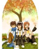
Cosplay Competition Entry(Lineart) - Code GeassxVocaloid
 

Electricbluewolf

*pours beans down the waterslide*

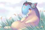
Wow! i love the idea for this! its a sweet pic with good proportion but
2 points-its how i rock and roll-
shading- you could use alot more shading on this. light shading on the grass, and like medium shading on Quilavas tummy!
headphones- eithen though i love this idead, the headphones look a bit 'off' and look like its slipping down his face!
Still, i love this drawing and your a very good artists and the rest of your work is brill!:)!
~EBW
 

Rukaria

onechance.
Wow! i love the idea for this! its a sweet pic with good proportion but
2 points-its how i rock and roll-
shading- you could use alot more shading on this. light shading on the grass, and like medium shading on Quilavas tummy!
headphones- eithen though i love this idead, the headphones look a bit 'off' and look like its slipping down his face!
Still, i love this drawing and your a very good artists and the rest of your work is brill!:)!
~EBW

Thanks c: I adjusted them a bit in the coloured version. They still look a bit off though xD

 
Top