Your graphics aren't half-bad, but there's always room for improvement. I'd like to know, do you use GIMP or Photoshop? Also, though I can see you have a sense of consistency, I wish you could make it seem as if the render's apart of the background-ish. Not to be rude by any definition of the word, but the render seems to just sit on top of the background. Additionally, there seems to be a lot of extra space in your backgrounds. What I recommend is downloading an assortment of free brushes (you can get some off of dA) as well as free C4D renders (also from dA). With different brush patterns, you can smudge images differently, or create a more diverse pattern on your images. With C4D's you can add a bunch of cool effects to your image by putting the C4D on certain modes (i.e. overlay, lighten only, addition, etc). If needed, there are tutorials on how to use C4D's (you can probably find some on dA).
-
Hi all. We have had reports of member's signatures being edited to include malicious content. You can rest assured this wasn't done by staff and we can find no indication that the forums themselves have been compromised.
However, remember to keep your passwords secure. If you use similar logins on multiple sites, people and even bots may be able to access your account.
We always recommend using unique passwords and enable two-factor authentication if possible. Make sure you are secure. -
Be sure to join the discussion on our discord at: Discord.gg/serebii
You are using an out of date browser. It may not display this or other websites correctly.
You should upgrade or use an alternative browser.
You should upgrade or use an alternative browser.
Shadow's Graphics
- Thread starter Astral Shadow
- Start date
I use Photoshop Elements 10, don't like GIMP's layout/interface. I do that with almost any sig I make :L I don't like it when a render blends in too much into a background. Something like this is too much in my opinion and I try to avoid. I've tried blending renders more, (Wailer and Corpse Princess sigs) but that's really as much as I'd like to blend a render into the background without feeling like I went too far with it.Your graphics aren't half-bad, but there's always room for improvement. I'd like to know, do you use GIMP or Photoshop? Also, though I can see you have a sense of consistency, I wish you could make it seem as if the render's apart of the background-ish. Not to be rude by any definition of the word, but the render seems to just sit on top of the background. Additionally, there seems to be a lot of extra space in your backgrounds. What I recommend is downloading an assortment of free brushes (you can get some off of dA) as well as free C4D renders (also from dA). With different brush patterns, you can smudge images differently, or create a more diverse pattern on your images. With C4D's you can add a bunch of cool effects to your image by putting the C4D on certain modes (i.e. overlay, lighten only, addition, etc). If needed, there are tutorials on how to use C4D's (you can probably find some on dA).
I think I might be good on brushes, have almost 1.25 gb of them(spent almost an entire day downloading and filtering through some). Never really paid attention to the empty space thing really. I have a ton of fractals(I usually make my own and just post them raw on DA) but most of them don't work well for blending into sigs(I've tried). But I will look up some free ones, just because they can add quite a bit to a background.
Thanks so much for the criticism c:
Edit:


Last edited:
Your banners are great, but I'm not big on the fonts. Idk why though.
Love the ocean and sandstorm Vivillon banners, as well as the Deoxys one :]
Is it the fancy old time English ones? XD I've only kept a handful of those particular ones(deleted some fonts yesterday).
Update later cause why not.
Hey man. Gotta love your recent works.
About the text. Hate to follow the crowd but I agree with some of the users above regarding the fonts. Some of em are too stand out and took away all the attention. Maybe because you duplicated the text layer and set the one layer to overlay? Reducing the color/lighting intensity for your text might help.
In addition to that, try reduce the size/intensity of your text outlines. They're all too dark and bold and most of the time they don't blend with the theme of the banner. This might be cure for your problem with text.
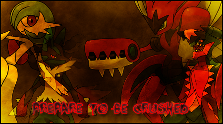
About renders lighting, ever heard about "Curve" tool in PS? you should try that for your renders. It helps a LOT for your case (assuming you havent try it yet). You got great great great great superb backgrounds like this one, but it would be nicer if the render fits perfectly with it the BG, like this:
^Easily my fav. The render blends nicely with the BG.
Good luck.
About the text. Hate to follow the crowd but I agree with some of the users above regarding the fonts. Some of em are too stand out and took away all the attention. Maybe because you duplicated the text layer and set the one layer to overlay? Reducing the color/lighting intensity for your text might help.
In addition to that, try reduce the size/intensity of your text outlines. They're all too dark and bold and most of the time they don't blend with the theme of the banner. This might be cure for your problem with text.
About renders lighting, ever heard about "Curve" tool in PS? you should try that for your renders. It helps a LOT for your case (assuming you havent try it yet). You got great great great great superb backgrounds like this one, but it would be nicer if the render fits perfectly with it the BG, like this:
^Easily my fav. The render blends nicely with the BG.
Good luck.
The program I use for text(Inkscape) doesn't put text on a separate layer automatically, and I never give text it's own layer anyways :L so not sure why it might look that way. The way I add the black outline for text is a filter called Black Outline in Inkscape, and I don't have control over it's intensity or how big it is. I've done text in Photoshop and it can look pixely, though I have control over the outline in there(pixely problem is why I use Inkscape for text).Hey man. Gotta love your recent works.
About the text. Hate to follow the crowd but I agree with some of the users above regarding the fonts. Some of em are too stand out and took away all the attention. Maybe because you duplicated the text layer and set the one layer to overlay? Reducing the color/lighting intensity for your text might help.
In addition to that, try reduce the size/intensity of your text outlines. They're all too dark and bold and most of the time they don't blend with the theme of the banner. This might be cure for your problem with text.
About renders lighting, ever heard about "Curve" tool in PS? you should try that for your renders. It helps a LOT for your case (assuming you havent try it yet). You got great great great great superb backgrounds like this one, but it would be nicer if the render fits perfectly with it the BG, like this:
^Easily my fav. The render blends nicely with the BG.
Good luck.
Yeah I don't think I really gave curves a try, maybe once or something. I have .psd of almost every banner I've done, so I could go back and edit them but the problem is the sheer number of banners I've put out @.@
Edit: I need to find some curve tutorials or something, I'm having no more luck blending renders in with the background.


All these were from before trying to use curves.
Last edited:


Only had some luck blending the render in with the background in the 3rd banner and the 2nd to last :L sigh.
This was a request from earlier. Tried blending in the renders with the background(excuse the bad looking text, they wanted black with a red outline).

Used what I learned in the bigger banner and applied it to this older one I did. Mega Venusaur stood out way too much in the first version, so blended him here.
If this looks like it's going in the right direction, I think I'm going to redo all of my banners that I feel aren't adequate. And move my personal banners to a new account since I have so god damn many 8D
Text might be a little big on the Mega Venusaur banner but oh well.
Hey, do you do Team Poses?
In my art shop. This thread is just to showcase my banners(only ones I make for myself too).
So. Project Rebirth is done. Since no one knows what that is, I'll explain.
I redid almost all of my 146 current banners. Yeah really.
The new ones are in the OP, and my 2nd post(post number #3).
Have to say, I'm proud of them all now. And soon I'll get to putting them on rotate in my sig.
Until next time :3
I redid almost all of my 146 current banners. Yeah really.
The new ones are in the OP, and my 2nd post(post number #3).
Have to say, I'm proud of them all now. And soon I'll get to putting them on rotate in my sig.
Until next time :3


Only posting a few sigs this time, even though there's more new ones.
Going to be working soon, so going to be uploading a bit less.