• Hi all. We have had reports of member's signatures being edited to include malicious content. You can rest assured this wasn't done by staff and we can find no indication that the forums themselves have been compromised.

    However, remember to keep your passwords secure. If you use similar logins on multiple sites, people and even bots may be able to access your account.

    We always recommend using unique passwords and enable two-factor authentication if possible. Make sure you are secure.
  • Be sure to join the discussion on our discord at: Discord.gg/serebii
  • If you're still waiting for the e-mail, be sure to check your junk/spam e-mail folders

ShinySandshrew's New and (Hopefully) Imrpoved Art Thread

ShinySandshrew

†God Follower†
Yeah... the old one died so I'm making a new one. Some of you have probably seen most of this stuff, but...ah! who cares?

Goodtimes.png

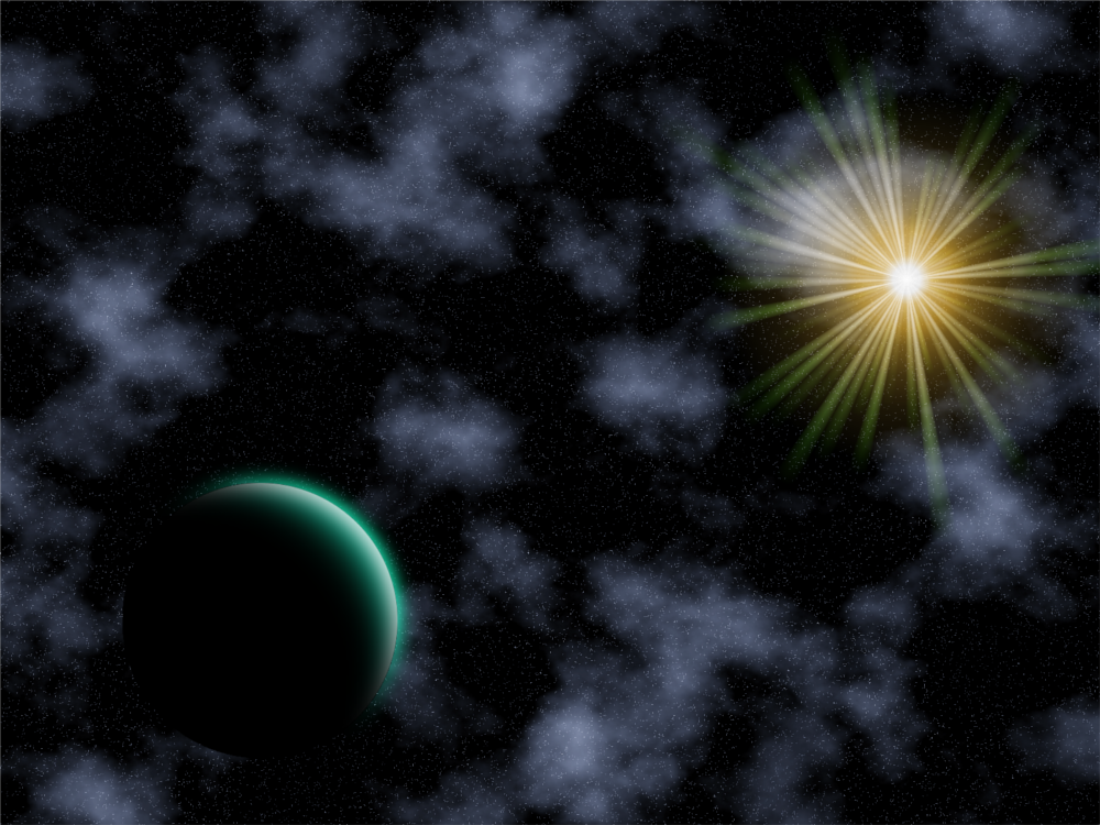
And here's a different version of the same piece:
Goodtimes2.png

FishareFriends2.png
FishareFriendsav.png

Proto2.png

(Click to enlarge)
Time2.png

login.png
Cloud.png

[IMG200]http://i927.photobucket.com/albums/ad114/ShinySandshrew/SS%20Graphics/Planets.png[/IMG200]


iPhoneBackground.png
HEAT.png


Arbackground.png

Harmony.png

normal_zelda-ww-31-1.png

a10b.gif

SteelTpye.gif

P13_A.gif

a4.gif


So...comments?
 
Last edited:
Yay! 1st commenter ftw. xD

Alright, you've got potential. My favorite of yours is the Celebi one. But if I could tell you anything to help you out in the future, I'd like to see wht would happen if you used fewer cutouts and mainly just the renders. Like use overlay on an image with a texture. But otherwise, just keep making stuff and working at it! :D
 

Bhatman

Chilled Hottie
Great work dude!

Your animations steal the show, you know what should go in the next frame and stuff like that, so i suggest instead of banners you go for more animations! Maybe you have never tried or don't know about it or maybe gimp doesn't have it, but the "tween" option is great for animating!
 

ShinySandshrew

†God Follower†
Thank you!

I do know that there is a function like that for GIMP, but I haven't done much in the way of making an animated image. (ie, something besides a banner with different frames.)

Well, I have a project I'm working on but it's now finished. I will give you what I have so far.

(Click to see full size image.)
 

ShinySandshrew

†God Follower†
Woo! I finally have something to post. I'm still working on the one I gave a sneak peek of, but I have something else to post.

[IMG200]http://i927.photobucket.com/albums/ad114/ShinySandshrew/SS%20Graphics/Planets.png[/IMG200]

Planets2.png
(Smaller version I made for my profile pic.)

Comments anyone? Pleeeeeeaese?
 

ShinySandshrew

†God Follower†
Well, I may not do any more work on the update I promised you because it is not much more impressive than the preview I showed you.

But! I do have some new things I did.
iPhoneBackground.png
HEAT.png


The first one is a background that I made for a friend's iPhone. The symbols represent faith, hope and love. They are based on the verse, 1 Corinthians 13:13: "And now abide faith, hope, love, these three; but the greatest of these is love."

The other one was something I did when I was trying to create a background for a friend's iPhone. It wasn't what I was looking for, even though it looked nice.

Just so you all know, I didn't use any scripts for these pieces. Both of these were based on tutorials I found on this site.

Comments?
 

Skiyomi

Only Mostly Dead
I didn't comment before because, to be honest, I've never really made these kinds of things. So I can't give you any kind of informed feedback here, but I'll do the best I can.

I like the reflection and rainbow effects on the purple one. I think the bevel effect on the text is a little extreme for a graphic that's mostly so soft looking.

I like the simplicity of the red one and the text effects. I don't really like that one of the slashes hits the text though. Other than that, they look good.
 

ShinySandshrew

†God Follower†
Thanks Ski! I appreciate your input.

Well, the reason I did that is because it was harder to see when I made it like the other glowing objects. Thankfully, I still have the GIMP file I used to create so I can check and see how it'll look if I change the text.

I see what you mean about the slash that hits the text. Unfortunately, I didn't save the GIMP file on that one. I can't go back and change it. But if I did have the file, I would take away the slashes and use some flames!

I have some more things to show off!


Arbackground.png
A background I did for a friend's phone

Cloud.png
It's Cloud...plus clouds.


Comments?
 
I am not a great rater.. so please don't expect anything.
I think the star-like brushes on the cloud one look good, but I think they'd look better if you went for a darker background. I think the oval platform where Cloud stands on was creative but it looks weird. the last "E" in the "cloud Strife" is kinf of in the way of the other text, and I think how it looks is kind of unfitting with the whole picture, there is also a bit of an empty spot unpleasing in the left-side of the banner. I really like the idea of the guitar one though.
 
Top