• Hi all. We have had reports of member's signatures being edited to include malicious content. You can rest assured this wasn't done by staff and we can find no indication that the forums themselves have been compromised.

    However, remember to keep your passwords secure. If you use similar logins on multiple sites, people and even bots may be able to access your account.

    We always recommend using unique passwords and enable two-factor authentication if possible. Make sure you are secure.
  • Be sure to join the discussion on our discord at: Discord.gg/serebii
  • If you're still waiting for the e-mail, be sure to check your junk/spam e-mail folders

ShinySandshrew's...umm..Graphics?

ShinySandshrew

†God Follower†
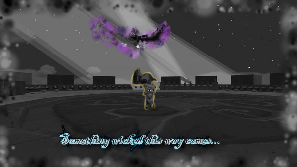
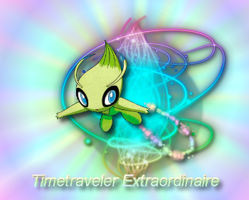
Well, since I got GIMP I've been um doin stuff with it. So here's some stuff I've done.

My old version of my Verse of the Week banner.

a4.gif
(Old version)


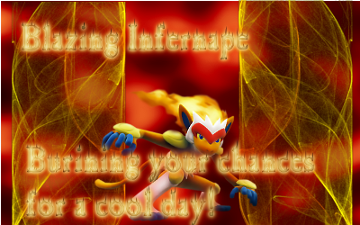
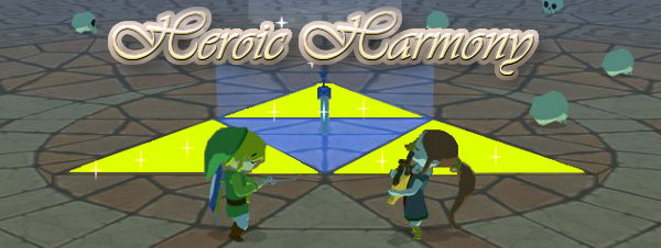
Some Zelda stuff I did.

Wicked.png


Let me know what you think! (I know, it's not top-notch.)

normal_zelda-ww-31-1.png


Harmony.png

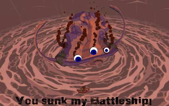
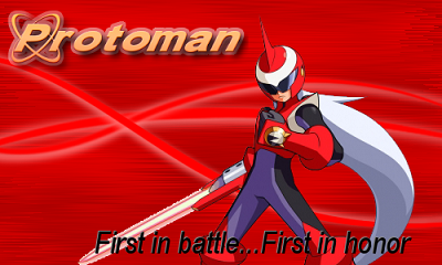
Here is a banner and avatar I did for a WBC. (I know. They stink.)

WBCban.png
Here is what I learned after the contest to make the look I was goin' for with the banner.)

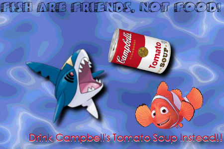
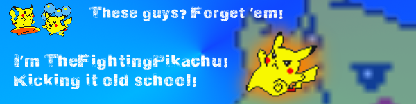
Aaaaannnndd an animated banner that I made. (Not very practical since it has a large kb size.)

SteelTpye.gif


Let me know what you think! (I know. They aren't stellar.)
 
Last edited:

The_Boss_Giygas

I. F.E.E.L. G.O.O.D.
The animated banners are cool, they show what they need to show. The zelda pics well the one with link and the bird girl is the better one, the dark one I'm not too fond of the square border thing make it so that link is in a circle or something. The octo one the eyes look out of place with the art style around it, but it adds to the comedy the message has so it can go either way.
Remember what doesn't appeal to some doesn't mean it won't appeal to some one else, find all kinds of critics and pick the ones you find more helpful.
 

ShinySandshrew

†God Follower†
And here's one that I had made when I was thinking of making a graphic shop.

P13_A.gif
 

junpearl63

their rooms
Uhm, it's really hard to make graphic with game screenshot, in my opinion. These banner I think is basically just take the image and add text/border, really nothing special. The animated banner was the same, really. but hey, at least the text fit. I see you have chosen the font very well. And urgh, the pikachu avatar, you really shouldn't disorted its face like that...I suggest adding some more effect or texture. to make the imnages and the texts blend in with each other...

Wait, is that Chuck Norris?
 
Last edited:

ShinySandshrew

†God Follower†
Well, the Zelda banner at the top needs some work. I'm going to try putting a glow around each of the two things that I highlighted to see if that works. That was kinda the idea I was going for but when I made it, I hadn't figured out how to do that yet.

Hmmm...which animated banner are you talking about?

The Pikachu avatar...really stinks. I probably should remove it.

And, yes. That is Chuck Norris.

EDIT: A banner that I made for my bro, TheFightingPikachu a day or so ago. Thoughts?

1.png
 
Last edited:

ShinySandshrew

†God Follower†
New stuff I made.

Time2.png
(Here is a larger version.)

I don't really think that anyone will want to do this, but if anyone wants to use this small one, they may if they credit me.

Comments please?
 

Bhatman

Chilled Hottie
First of all ShinySandshrew, you are one of the best people I've met in Serebii. :)

On your serebii banner, I dont think you should apply an drop shadow on celebi, it just kinda doesn't fit, the spirals are great, the text I guess needs a different color (dark?)

The one which you made for your bro, is quite funny, the simple and elegant looks of it just stands out! Great work on this! And hey in the middle of the banner is it an angle gradient?

Lookin' forward to see more of ya!
 

ShinySandshrew

†God Follower†
Someone responded!

YAY!! Someone responded!! :D

First of all ShinySandshrew, you are one of the best people I've met in Serebii. :)
Thank ya! That's very kind of you.

On your serebii banner, I dont think you should apply an drop shadow on celebi, it just kinda doesn't fit, the spirals are great, the text I guess needs a different color (dark?)
I'll try out those suggestions. What I was going for with the drop shadow was to make it look like Celebi was coming out of the thing in the background but it can also be interpreted as Celebi coming out of the the thing in the back ground and the image. (Odd. I actually made a piece of art that can be interpreted in multiple ways.)

The one which you made for your bro, is quite funny, the simple and elegant looks of it just stands out! Great work on this! And hey in the middle of the banner is it an angle gradient?
Thank you. It's probably my best one. And I did use a gradient. A conical gradient.

Lookin' forward to see more of ya!

Oh, you will...in about two seconds!


login.png


This was one that I made for nothing special. It didn't come out like I envisioned it, but it still turned out decent.


Proto2.png


Some of you probably have seen this one already, but this is a banner I made for the first week of ~.:NorthernLight:.~'s competition.

BLAZE.png

This is one that I made for my little bro. One thing that I want to note about this one is that the text needs to be redone so I don't really want comments on it.


This is something that I made by reading a tutorial for Blender. (Click the thumbnail to see a full-size image)

FishareFriends2.png
FishareFriendsav.png


Aaaaaannnddd....these are a pair of images that I made for the second week of NL's competition.

Comments?
 
Top