• Hi all. We have had reports of member's signatures being edited to include malicious content. You can rest assured this wasn't done by staff and we can find no indication that the forums themselves have been compromised.

    However, remember to keep your passwords secure. If you use similar logins on multiple sites, people and even bots may be able to access your account.

    We always recommend using unique passwords and enable two-factor authentication if possible. Make sure you are secure.
  • Be sure to join the discussion on our discord at: Discord.gg/serebii
  • If you're still waiting for the e-mail, be sure to check your junk/spam e-mail folders

Some banners to be rated.

Light Venusaur

Konoha's FMA Ninja
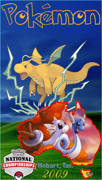
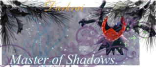
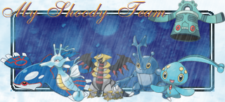
Here's some banners that I've made for people, contests or out of sheer bordem.
These are free to use...as long as you give me credit.


Requests:
Banner-Ultima0071.png

Banner-pokemon4ever.png

Banner-Kyroid.gif

Banner-shiney_altaria.png
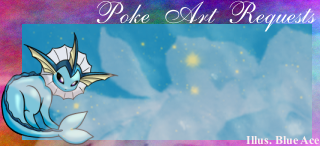
-credit to Xous (of Pokebeach Forums) for the taller Vaporeon.
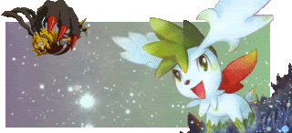
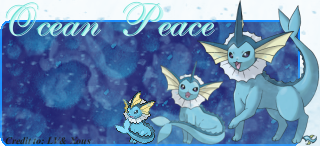
Banner-Shadow_Temi_8.png

Banner-azeem40.png


Contests:
Banner-Contest5a_SPPF-1.png
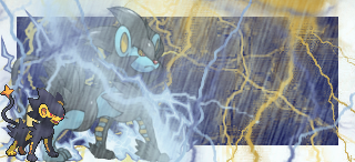
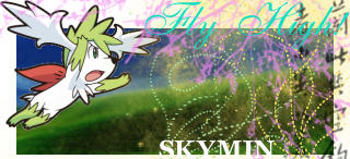
-Current Contest Banner (1 of 2)
Banner-Contest5a_SPPF.gif

Banner-Contest5_SPPF.png
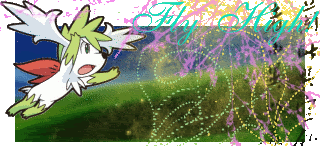
-Current Contest Banner (2 of 2)
Banner-Luxray.png

Contest.png
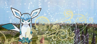
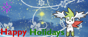
-One of the 2 winning banners of the WBC-Xmas contest
Contest11.png
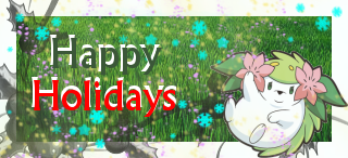
The 2nd winning banner of the WBC-Xmas contest
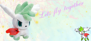
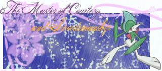
Sheer Bordem:
Banner-Klnothincomin.gif
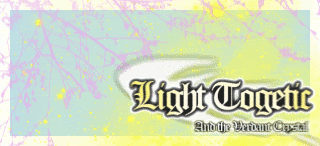
-I didn't make the font/logo...it's from Klothincomin's fan-fic (which is a must read).
 
Last edited:

Metamence

Well-Known Member
Well for most banners, you have your render with that ugly pixely border.I would erase or remove it.The Sheer Boredom one has Cressilia(typo?) all pixely and kind of blurry. On the Skymin Christmas banner, the Holidays is a tad hard to read..
 

Northern Lights

[BritishSarcasm]
The images you use need to be cut out much better if you want to transparent parts of the banner.

Try to use more effects - you seem to use the same ones over and over again

The same goes for the text - branch out more, experiment with more fonts instead of using the cursive font so many times.

The backgrounds are rather simple and the colour co-ordination you use on the banners clash - especially the text colour choice - try to match the colours better

I'd say the best one you have up there is the first Darkrai one, but the orange text throws off the dark and mysterious effect
 
Oh ok. Yea I heard that program sucks. anyways try to do some blending such as what you did do in the lightning one. also the text on the last one (the togetic one) is well done. For sll the other text it seems weird.
 

Metamence

Well-Known Member
Oh ok. Yea I heard that program sucks. anyways try to do some blending such as what you did do in the lightning one. also the text on the last one (the togetic one) is well done. For sll the other text it seems weird.

Well GIMP doesn't "suck"... Unless you were talking about Microsoft Paint.
The Skymin "Fly High" one has horrible white text that doesn't really work..
 

Shuam

righteous
To be honest, nothing blends in them. It all seems unnatural when there's just a random pokemon placed on the background, and then you have that horrendous what, 20% opacity yellow border on about half of them, which really should not be there. As for the animation, why the crap is the text all pixel-y and whatnot? I'm not a fan of the text on the banners either, because there's no effects on them whatsoever, except for the Cresselia one, and that's one's text was pulled of quite well, with contrast, and works. However, a flaw in that banner is how pixelated the pokemon are. They aren't smoothly shrunk, and... yeah.
Overall I'd have to give your banners a 4/10.
Sorry if it seems harsh, but they are very amateurish, and you need some work. Try using tutorials and stop using so many brushes, because over-brushing is never good. Your best banner is BY FAR the Light Togetic one, so try to stay on that path, instead of heading down past roads.
 

sweet_piplup123

I lost the game?!?!
The banners are cool--I remember my friends used one of your banners before ^_^

However, the animated tests, are pretty low-quality, maybe try to fix that problem? I don't really care much about the blending parts and such--you could make a Pokemon stand out like that purposely, but as they say, you could try a different technique instead of the same ones over and over again.

But overall, I like the banners, nice job ^_^
 

ChloboShoka

Writer
Aww, I think they are all really pretty. I think the backgrounds are nice and creative. I think with some kinks on the sprites and the text, they can look even better. I like the simplicity and colorfulness in the second banner.
 

Light Venusaur

Konoha's FMA Ninja
Here's 2 new one's from me (all current for this weeks contest).
Avvie:


Banner:

*It reads: Lets fly together*
 
Last edited:
Hmm I am jealous of you that you can put sprites in banners and they would look cool. D:

Any who, these banners are indeed lovely. You should have made the lightning in the Luxray more um... bright and stand out. XD

As for the Shaymin banner/avatar set, it looks okay although for the banner you should've made the sky background more visible like the banner. The end of the text is almost blended in with the rest of the banner. Good luck in the contest, either way! -thumbs up-
 

Light Venusaur

Konoha's FMA Ninja
Wow, thanx Sweet May.
The sky on the avvie is a stock picture (which I found doing a Google search for Clouds).
 
Top