• Hi all. We have had reports of member's signatures being edited to include malicious content. You can rest assured this wasn't done by staff and we can find no indication that the forums themselves have been compromised.

    However, remember to keep your passwords secure. If you use similar logins on multiple sites, people and even bots may be able to access your account.

    We always recommend using unique passwords and enable two-factor authentication if possible. Make sure you are secure.
  • Be sure to join the discussion on our discord at: Discord.gg/serebii
  • If you're still waiting for the e-mail, be sure to check your junk/spam e-mail folders

SPPF Weekly Graphic Challenge

Status
Not open for further replies.
Welcome visitor to the SPPF Weekly Graphic Challenge thread! Here you can participate with other graphic designers and create a certain digital work assigned every week.

There are some rules and regulations to joining so please read everything below if this is your first time.

Rules&Regulations
General
+ Challenge will be posted every Sunday, at 1 PM EST. If you live in another timezone, please check what time this thread was posted. That is when the new challenge will be posted every week.

+ The posted challenge is open to all graphic designers, beginning or advanced, for 5 days. That's 120 hours after the challenge post.

+ After 120 hours have passed, the 6th day will be critique day. Here, anyone is free to give critique to the participants' work.

+ This is not a contest, despite the similarities to the old Weekly Banner Contest. So there is no prize nor competition. This is just a place for fun and trying out different things and receive feedback on it.

+ You are free to send me a private message on what themes or tasks you hope to see in the future. Each theme/task combination is picked randomly.

Participating
+ If participating, you are only allowed to submit one entry. You are free to edit the entry or change it until the 6th day.

+ To participate, make your entry and then post it here! No sign ups or preparation required. Prevent from making posts like "Joining! I'll edit this later with my entry" or you'll be marked for spamming.

+ You can only participate in the current challenge. You cannot submit an entry for a past challenge or make up your own.

+ The theme posted is up to your interpretation. You may use any style and any render from real life, anime or manga, cartoons, video games, celebrities, etc in your entry.

+ The task must be followed at all costs. Nothing bigger or smaller than the requirements.

+ By entering, you have accepted the fact that your entry will be given critique and various comments on how to improve. Please act maturely to these posts and report any bad criticism to either me or Skiyomi.

Giving Critique
+ By posting critique, comments must be given to ALL participants.

+ By kind when giving critique. Negative and pointless comments will land you an infraction.

+ Refer to this guide if you are stuck on giving criticism.

+ Don't rush your critique. If you don't have time to give good critiques to everybody, don't bother posting.

+ You do not have to give critique on your own entry. You may if you really want to or you can use your spot in your critique post to answer to other critiques that you have received.

Current Challenge
Theme: Fantasy
Task: Create a vertical banner. Any size is permitted.​

Have fun and let's improve!
 
Last edited:

Brutaka

Ignition
Neat! I'm in! Who knows...this could be fun. I'll be doing it in the style of my latest banner(I hope that is what Freestyle means-that I can do it however style i want)
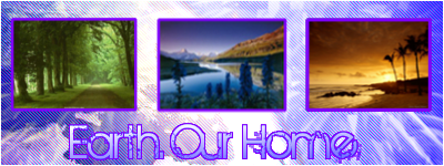
Ah, the Beauty of Earth...

earthh.png
 
Hm, well no one has posted up critiques yet. Were you all waiting for me to give in the signal? Well in that case, I'll extend critiques for another 24 hours. Hope this brings some people to drop by. Thank you to the three users who participated with their banners! Feel free to enter the next challenge and/or post some critique to the entries above~

Also moving on because it is the next week, here is the new challenge:

Theme: Light
Task: Create a banner with dimensions of 450 pixels in width and 150 pixels in height.​

Have fun!
 

Extroph

Gaijin Shogun
@BrutakaBlaziken: I like your style of showing a lot of Earth's landscape, also with the faint Earth in the background. The only flaw imo is the lack of color in the piece. I personally think that the beauty of Earth is shown through the diverse colors of the landscape. I'm only guessing that it's Pro-Earth due to the text btw. Overall, I like the layout and everything else, it was just the colors that threw me off.

@MagiMochi: Good variety of colors in the three landscape, and a nice bright background to put them all together. My only concern is maybe the little landscapes are a bit too small? Overall it looks good imo.

@Flame Mistress: Wow. Just wow. I've been trying to find out how to make that sun effect, but it looks really good, unless it was part of the picture as a whole. Either way it's awesome, especially the lack of saturation overall. It's something I might see in Instagram. Only flaw imo is the "Its Our Planet" is a bit hard to read.

Great entries, and congratulations, you've been critiqued by a guy who's never given a critique before xD
 

Brutaka

Ignition
I'll do a critique.
As far as mine goes, I should have let more color through, yes. But that is the style of that banner type that I do.

MagicMoshi: Pretty neat. Though I'm not sure if the purple goes with the pics. The pics, at least the left and middle ones, are a tad fuzzy.

Flame Mistress: I like! But like extroph said, the text is a little tough to read in places. And if you can't do glows on the text, then maybe use a darker/different color?


And well, I'm gonna go ahead and submit another one. Why not?
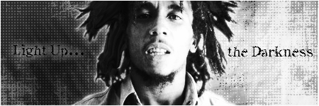
lightxq.png

Ya, same text. I like this text. Its nice.
 
Last edited:

Skiyomi

Only Mostly Dead
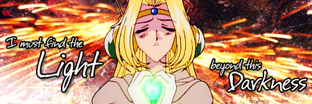
I meant to be around for round one, but things were hectic. Anyway, I've got a banner this time around:

imustfinethelight.png
 

Flame Mistress

Well-Known Member
I've finally finished my banner--

*notices that it needs to be 450x150*

*swears as loudly as possible*

Well, dammit. Guess I'm out for this week, then,
 
^ You couldn't just change the size of the canvas and adapt to it? Any way, please refrain from making spam-like posts and read carefully next time.

Okay just to be safe, the 6th day has arrived so anyone feel free to give some constructive criticism and comments to the entries above. =]
 

Skiyomi

Only Mostly Dead
Constructive Criticism

BrutakaBlaziken: I like the background effect--it's soft and subtle, but it's nice looking. Maybe it could've stood to be jazzed up in a few places, but it draws the eye quite well. I can't say I'm really fond of the text. I like that font too, but it seems a little too grungey to fit the positive "light casting out the darkness" feel of the piece. In fact, it would seem more appropriate if the tagline was "darkness casts out the light." Added to that, that particular font has a lot of lovely little intricacies to it that get completed blanked out when you use an inner glow on it.

extoph: I like the contrast between black and white there and the picture you've chosen really suits the background and goes well with it. I don't really like the outer glow on it because it just highlights the edges instead of making them blend in the background which I think would've looked better. The text is alright, but it probably could'ved used a little more oomph. Maybe "Light Up" would've stood out more in white? As it is "the Darkness" stands out much more in this light-themed piece.

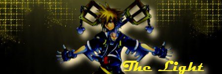
woebegonenick: I like that yellowy gridlike effect and wish it was on more of the banner, since the rest of the background looks rather muddy looking. I can dig the smudgey sort of look that Sora has, but I haven't quite made up my mind about whether I like or dislike the glow behind him. For me, the text is really the worst part of the banner. It's very generic looking and doesn't have the same feel as the rest of the banner and its placement takes focus away from Sora.

I hope somewhere in all that I said something helpful X_x
 
woebegonenick: I think this signature has massive potential. The grid-like pattern is interesting (that's a very generous statement, however) and the muddy looking background definitely shows that some smudge magic would look pretty fantastic. Your render is a bit low-quality but it would work great for incorporating flow into any smudging you would get going. The glow is obnoxious, it's too harsh, make it a lower opacity and more subtle. The yellow of the text is brighter than all the other yellow in the signature and it's very large, this makes it stand out a little too much (taking away attention from the render). Personally I prefer to just blend in my text and not let it play a mayor role but that's just me. I think making your text smaller and a clipping mask with a little bit of those grid patterns would look really swell but then again I am not that skilled with text.

As it is, not very good. if and when you improve it, it'll be amazing.

EDIT: oops, didn't read the rules, i'll give criticism to the others too in a sec.

Skiyomi: To be very honest with you, I am a bit dissapointed by the choice of colors, choice of render, lack of depth and just the simpleness of it. I like it, however, I just think it's not very interesting to look at. I don't feel I am in a position say much more because I feel you have a certain style to your signatures that's also in this signature and by the massive and consistent interest and praise by most of SPPF I think it can be said that this style is very successful. There's no point in criticising a winning formula.

BruatBlaziken: I think this is definitely the most interesting signature submitted among the four. I feel the subtext should somehow have been centered because it just looks kinda awkward in the right. The effects are nice and simple but a little too plain for my liking. A bit of shading in the corners could maybe give your text a little more attention and that edge it definitely deserves.

This one also has massive potential. Warping the text to have it look as if the text was going into the light. Angel Wings. Different Fonts. Many things could be tested in order for improvement.

Extroph: The contrast is original. It looks grungy, maybe expand upon that aspect and add some effects. It's very plain, not much else to criticise on. Definitely add some effects (and lighting, depth and flow while you're at it).

Q: I don't feel you have said enough to help me improve significantly! What do I do now?
A: Well, you could look at these:
-Choosing your colours
-Placement is key

They're guidelines not rules. But very helpful and true guidelines at that.
 
Last edited:
Thank you very much for the posts and thank you for all the participants this week!

Since it's the next week, let's have the new challenge, yes?

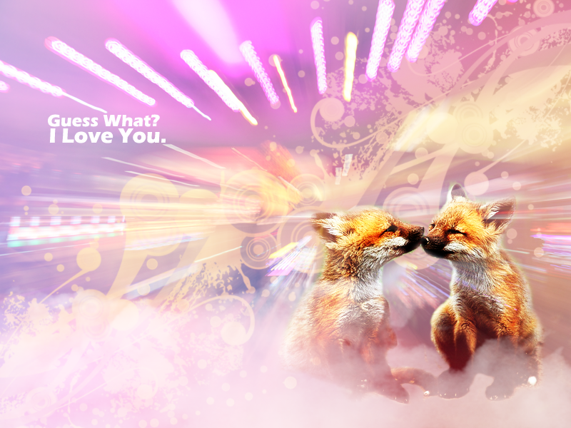
Theme: Animal
Task: Create a 800x600 sized wallpaper.​

Have fun!
 

Atari

Did it on 'em
I am somewhat unsure of the point of this thread, given that something so similar to this already exists (The Monthly Banner Contest). Although during some months participation turned out to be quite low, the level of interest is slowly starting to rise again. Also. although the fate of the monthly contest was in the hand of zhanton, who barely logs into the forum enough to manage the thread, I feel that the leadership could easily be transferred to a moderator or another interested and active member.

I'm just saying, as the purpose of this thread can be seen as to give and receive critiques, that honest and unbiased critiques can more effectively be given in the other format which is to keep the participants shielded in anonymity.
The Monthly Banner Contest is... well, a contest. This thread is basically what used to be the Weekly Banner Contest from Insidious_Dreamer and Zadros only without the voting and prizes. (unless you consider comments exclaiming how lovely your graphic piece is a prize) Plus unlike the MBC, this challenge runs on one thread. I can't do much for the activity other than post themes/tasks I think people would find interesting and hope some or many would join in. I won't get disappointed much if people don't join them for whatever the reason is. Quitting on this idea is so early so I'm willing to give this a few more weeks or months.

The Monthly Banner Contest can be transferred if zhanton wants it to be. However, that is a whole matter to be discussed with him or on the latest thread itself. (given others are already sharing their thoughts on future contests)

I'll consider the idea of keeping future entries anonymous but let me give it some more thought. I do agree it would keep off biased comments but that's why the criticism guide is there to help. If this thread isn't enough to help practice on making graphics, well then using this thread as help on giving critiques is okay too!

~~~

Any way it's the new week and even tho there's only one entry for the last week, I'll let critiques extend for another 24 hours. ^^

In the meantime, here's the new week's mission:

Theme: Fruit
Task: Create a banner and icon set. Any size is permitted.​

Have fun!
 
Thank you pupintheturd for joining the week~ Here's the next challenge:

Theme: Fantasy
Task: Create a vertical banner. Any size is permitted.​
 
Status
Not open for further replies.
Top