• Hi all. We have had reports of member's signatures being edited to include malicious content. You can rest assured this wasn't done by staff and we can find no indication that the forums themselves have been compromised.

    However, remember to keep your passwords secure. If you use similar logins on multiple sites, people and even bots may be able to access your account.

    We always recommend using unique passwords and enable two-factor authentication if possible. Make sure you are secure.
  • Be sure to join the discussion on our discord at: Discord.gg/serebii
  • If you're still waiting for the e-mail, be sure to check your junk/spam e-mail folders

Sprites of Bert

Bert

Untitled
PLEASE READ: A PERSONAL APPEAL FROM THE FAN SPRITES MODERATORS
^ Read it and act like it or I'll report you all into oblivion. No exceptions.

Hello. My name is Bert and I have been spriting for a pretty long time. If there's anything else you need to know or want to ask, feel free to send me a vm/pm.
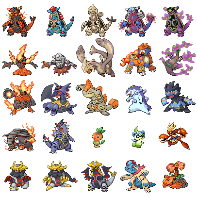
5th-Gen Fusions:
These are my new(est) works. Late 2011 - Present day (see last edit).

sprite-3.png
Magmorcandle-3.png
Krookorona-2.png
Suicune-1.png
Confagrigus-1.png


Spider-1.png
Drowsarna.png


1st row: Hydreigon/Armaldo, Magmortar/Chandelure/Dusknoir, Krookodile/Volcarona, Suicune/Corsola, Lairon/Cofagrigus/Ghastly
2nd row: Galvantula/Glalie, Drowzee/Musharna

4th-Gen Fusions
These are basically from my "first" life on here. Around 2008 - 2009. Because of that, I'm not really planning on changing/improving them anymore. I still appreciate C&C on them though, since that also helps me improve my future sprites.

FusionSheetRealWBG-5.png


1st row: Armaldo/Magcargo, Armaldo/Tentacruel, Armaldo/Relicanth, Armaldo/Latios, Armaldo/Spiritomb
2nd row: Darkrai/Magcargo, Darkrai/Heatran, Lugia/Relicanth, Entei/Camerupt, Flygon/Spiritomb
3rd row: Magmortar/Magcargo, Salamence/Armaldo, Feraligatr/Regirock, Typhlosion/Regice, Swampert/Luxray
4th row: Donphan/Magcargo, Tyranitar/Armaldo, Torchic/Turtwig, Teddiursa/Celebi, Scizor/Crawdaunt
5th row: Dusclops/Giratina-A, Dusclops/Giratina-O, Armaldo/Giratina, Feraligatr/Tentacruel/Milotic, Slowpoke/Magcargo/Venusaur/Ampharos

Design > Technique. I'm not trying to be a scratch*****. Heck, I can't even scratch that well. If something fits by copy/pasting it, it fits. My goal is to make something look good, not showing off my supposed skills.
I'm slow. I work at my own pace and only if I feel like it. Due to this it could take me anything between a few hours to several months (or, once, years) to get a new sprite done. Because of this, I also don't plan on opening a shop, don't take requests and I won't actively help you out on your project.
Influences. Spriters that have influenced me in some way include but aren't limited to: Dark_Firebird, BynineB, Skaisdead, tomthepom, MetalFlygon08, Frosty_Voltorb and Yami_Ryu. These are imo great spriters and if you like my stuff, I suggest you give theirs a look as well.
Resources. All base sprites used are from http://www.pe2k.com/sprites.html, and I love them for it. If you want to start spriting, go there. You'll probably also want to take a look at the tutorials sticky over here.

C&C, as always, highly appreciated. Clueless praise, as always, barely appreciated. Read the goddamned sticky.
~Bert
 
Last edited:

MetalFlygon08

Haters Gonna Hate
I remember you bert!

Your Armaldo fusions allways tickle my fancy.

A suggestion on the ENtei Camerupt fusion, try and make the magma smoke seem like it's coming from the volcano mabye?
 

Bert

Untitled
[Pseudo-Necro incoming] Thanks man, will consider doing that, it always bugged me but haven't gotten around to it.

Anyway, first 5th gen fusion here (and first one in years):
sprite-2.png

It's obviously flawed but I'm positive that I'll reach my old level again if I get more practice. Not too unhappy with it.

Edit: Also, could a mod maybe change the title to Sprites of Bert or something pwetty please? :D
 
Last edited:

Cc&B87

Kanto Trainer
Bert these are some very impressive fusions here all
Of them are Beautifully Created sprites you can tell
You put time, care, serious thought up to a level of
Pro spriter. Your top row of Almardos are great very
Artistic your (Teddiursa/Celebi, Scizor/Crawdaunt)
are the only one that are off to me, the Moon on Ted & Celebi
Clash with the eyes I had to look twice to adjust. and the crown
Ontop of your Scozor & Craw.d. It sticks out to much like its been
Throw on but in overall your sprites are fantastic. If you want to try something
Different try my project what am doing now witch is the "What If" pokemon
Sprites, you think off a the "what if" and the create the sprite example:
"what if" Pokemon all Started out as eggs. You get to create some preety
Unique eggs or "what if" geodude family were ghost, Dark or Steel type pokemon
You understand. check out my factory of all-Sprites fourm I've just finished
My first "What If" and theres some on there you can challenge
Yourself to what am in the middle of now. Your a great spriter Bert keep it up your be one of very
Few pro spriters out there.

All the best mate
 
Last edited:

Bert

Untitled
Thank you for your kind comments.
While the C&C on my 4th-gen sprites is helpful for the future, I will not edit any of them for the time being. Instead I'm focusing on getting used to 5th-gen fusing.$

Also I believe that theoretically every sprite is a "what if" one ;). My fusions are all "what if pokemon X and Y were, in fact, one?" The result would be Z.

Without further ado; I present Magmortar/Chandelure/Dusknoir.
MagmorCandle-2.png


Albeit being one of the strangest things I've made, I do like him. Something seems off though and I'm eager to know what, so any help is appreciated.
And yes I know I'm taking it slow with the new work, but I'll let you know that I have uni exams next month so I shouldn't be making anything new at all actually :D
 
Last edited:

Cc&B87

Kanto Trainer
Bert this is another great sprite you say there something off about him I can't really fault it, everything is coloured edited and spliced nicely, if you were to change it maybe the top metal bit of the head try eyes on the side and teeth were his eye is now, don't worry about not doing any other sprites for a while am taking a break over the Christmas/New Year period got College Work to catch up in plus visit family etc...oh and got Elder Scrolls: Skyrim so I can't get of that game lol good work again Bert you really are a great spriter.
 
Last edited:

Electricbluewolf

*pours beans down the waterslide*
I'd admit, most don't suffer from the problem of looking too C+P. The Relicanth x Lugia is pretty good- I like how you used Relicanths pattern on Lugias wings. The only one that caught my eye for "improvements" was the Slopoke x Magcargo x Venusaur. Even though it's from a few years back, I think turning Venusaurs leaves/stump into its fire equivalent (Eg, make the leaves on fire, on dropping magma, the stump out of hardened magma)
The Magmortar x Chandelure x Dusknoir is a pretty good fuse- most peeps would avoid them, as pokemon the Chandelure are quite hard to fuse into other pokemon. The shading is spot on- though I think it's the head that's off- it's slightly "different" from the rest of the head, as it stands out. But that is just my opinion. :3

Keep up the good work n_n
 

Bert

Untitled
Bert this is another great sprite you say there something off about him I can't really fault it, everything is coloured edited and spliced nicely, if you were to change it maybe the top metal bit of the head try eyes on the side and teeth were his eye is now, don't worry about not doing any other sprites for a while am taking a break over the Christmas/New Year period got College Work to catch up in plus visit family etc...oh and got Elder Scrolls: Skyrim so I can't get of that game lol good work again Bert you really are a great spriter.

Thank you :D I really like it too but indeed the head might look a little off. I tried to make it a bit more interesting by not making it perfectly round but in hindsight that might have worked counter-productively. Skyrim is a great game, enjoy it (but not too much, other stuff is more important :) ) and you'd bette rbe siding with the Stormcloaks or I'll kill ya. Speaking of which, I kinda want to make a Pokemon/Stormcloak fusion sprite now, just gotta find a good pokemon to turn into a soldier, lol :D Imma do that sometime later but thanks for the inspiration!

I'd admit, most don't suffer from the problem of looking too C+P. The Relicanth x Lugia is pretty good- I like how you used Relicanths pattern on Lugias wings. The only one that caught my eye for "improvements" was the Slopoke x Magcargo x Venusaur. Even though it's from a few years back, I think turning Venusaurs leaves/stump into its fire equivalent (Eg, make the leaves on fire, on dropping magma, the stump out of hardened magma)
The Magmortar x Chandelure x Dusknoir is a pretty good fuse- most peeps would avoid them, as pokemon the Chandelure are quite hard to fuse into other pokemon. The shading is spot on- though I think it's the head that's off- it's slightly "different" from the rest of the head, as it stands out. But that is just my opinion. :3

Keep up the good work n_n

Thanks a lot for the C&C, I think you're absolutely right on the Slowpoke-thing (it was for a contest or a request or something iirc which somewhat explains the odd choice of subjects) and I really like the idea of re-typing the tree. So much in fact, that I may just try that out :D.

Also, on my newest one, I don't think the shading was all that hard (by 'spot on' I suppose you mean the glass parts?) since I just kind of tried to translate Chandelure's shading to their resized counterparts I made myself. It's really just a question of carefully observing the original and trying to mimic it as closely as possible. By the 'head' I suppose you mean either the organic part under the eye or the glass bulb on the head (since you're also referring to something called 'the rest of the head' ? Which is which? Kinda confusing, sorry :( ) but I'll give it another look and try to see what you mean :).

I do try to keep shape changes and added parts to a minimum, and I specialize in pattern-/detail-fusing. I'm glad I'm able to get that message across :D.

Thanks again!

No new sprite this time, I'm afraid. Studied a lot the last few days, but I'll try to get one done asap.
 
Last edited:

Electricbluewolf

*pours beans down the waterslide*
Also, on my newest one, I don't think the shading was all that hard (by 'spot on' I suppose you mean the glass parts?) since I just kind of tried to translate Chandelure's shading to their resized counterparts I made myself. It's really just a question of carefully observing the original and trying to mimic it as closely as possible. By the 'head' I suppose you mean either the organic part under the eye or the glass bulb on the head (since you're also referring to something called 'the rest of the head' ? Which is which? Kinda confusing, sorry :( ) but I'll give it another look and try to see what you mean :).

By spot on, I mean perfect XD.
Reading back, I did word it kinda of funny- I met the glass bulb looked funny on Dusknoir's head-(It doesn't fit right) the "rest of the head".

n_n
 

kamionero

Well-Known Member
Hydreigon/Armaldo:
Torso is looking great, but I have a couple suggestions for the main head. The plate on his head really looks good, its well done, but it just clutters the area and it doesnt really look like it belongs there. Since its part of Armaldo's back, it looks a little out of place. The eyes look a little far appart, and i think if they were a little higher up they would look better and more incorporated to the head. The "back" eye i think should be a little more to the right, you would sacrifice eye detail but i think its worth it to get better perspective. The yellow on the main head's throat looks like it was leftover after u colored Hydreigon's "petals" and then got rid of them... so i would say get rid of it, or make it grey, so it looks like his wings.


Magmortar/Chandelure/Dusknoir I think u have here by far your best fire effect. The darkrai one and the magmortar/magcargo ones' fire is kind of iffy, I wish i could tell you how to sprite fire, but im not too good at it :p. There are many types of fire in the sprites, but I think a Rapidash-type flame, puffy and textured, would have looked really good in those cases. Anyway, point is here that u nailed it. Also wanted to comment on how well u incorporated the face like patterns of Chandelure and Dusknoir into one. The only thing is that the line between the yellow eye markings should curve a little to follow the shape of his body.
Other than that i wouldnt change anything. I was gonna shay the shading on his neck looked kinda weird but then i realized the darker circle comes from Magmortar lol. BTW, im glad u didnt add Dusknoir's collar, as it would have been waaaay too much going on there.
 

DarkraiMiestro

something or other
I like the Swampray and Heatrai, and the Mix of Darkrai and Magcargo(I can't come up with a name for it).
 

Bert

Untitled
that's an epic amount of work...

I like the Swampray and Heatrai, and the Mix of Darkrai and Magcargo(I can't come up with a name for it).

You must of put alot of time into them

Good name! And spelt properly too!

Thanks for the compliments and the name-thing (although I don't give my sprites names, whatever floats your boat is fine by me), but I'd like you guys to read the post I linked to in my first post and start being more constructive/elaborate. Alternatively, you can go increase your post count elsewhere. Thanks.

For further examples; refer to these posts:
By spot on, I mean perfect XD.
Reading back, I did word it kinda of funny- I met the glass bulb looked funny on Dusknoir's head-(It doesn't fit right) the "rest of the head".

It's partially a design element (it's supposed to not be truly rounded), but taking a closer look at it, I see a few pixels out of place. Thanks.

Hydreigon/Armaldo:
Torso is looking great, but I have a couple suggestions for the main head. The plate on his head really looks good, its well done, but it just clutters the area and it doesnt really look like it belongs there. Since its part of Armaldo's back, it looks a little out of place. The eyes look a little far appart, and i think if they were a little higher up they would look better and more incorporated to the head. The "back" eye i think should be a little more to the right, you would sacrifice eye detail but i think its worth it to get better perspective. The yellow on the main head's throat looks like it was leftover after u colored Hydreigon's "petals" and then got rid of them... so i would say get rid of it, or make it grey, so it looks like his wings.

Magmortar/Chandelure/Dusknoir I think u have here by far your best fire effect. The darkrai one and the magmortar/magcargo ones' fire is kind of iffy, I wish i could tell you how to sprite fire, but im not too good at it :p. There are many types of fire in the sprites, but I think a Rapidash-type flame, puffy and textured, would have looked really good in those cases. Anyway, point is here that u nailed it. Also wanted to comment on how well u incorporated the face like patterns of Chandelure and Dusknoir into one. The only thing is that the line between the yellow eye markings should curve a little to follow the shape of his body.
Other than that i wouldnt change anything. I was gonna shay the shading on his neck looked kinda weird but then i realized the darker circle comes from Magmortar lol. BTW, im glad u didnt add Dusknoir's collar, as it would have been waaaay too much going on there.

On the Hydreigon/Armaldo you caught me with the yellow stuff. However, on the eyes, I think those are a vital characteristic of Armaldo's identity. I will try to go for an in-between thing, though. The plate is a mixed-bag, I reckon. I used it to fill an otherwise totally empty space, and I can see where you're coming from. It's a design-thing, though, and as far as that goes I respect your opinion but I'll always have the final say in the matter ;).

On Magmortar/Chandelure/Dusknoir I completely agree with about everything you said. The flames on the other ones you mentioned were actually done in the style of Magcargo's 4th-gen flames. However those were minuscule and they didn't transition well to their current size. Maybe a Rapidash could provide the solution, but there's no point in improving my 4th-gen work anymore, I guess. Still, being able to point that out gained you a lot of credibility ;). I did actually try putting Dusknoir's collar on but halfway through the outline I thought exactly the same: overkill. I have made some slight adjustments according to your comments already. For others, such as the Armaldo eyes, I'll need to experiment more before indefinitely keeping the change.

Thanks for awesome C&C both you guys.

Well, I made a new one, and I decided to make it a bit of a challenge. Maybe a bit too much, dunno. The design looked a lot better in my head (it looks like a corrupted Psyduck who's way in his 80's now to me, don't know why :() so here's an appeal to the really creative guys and gals out there; if you can imagine what I was aiming for please help me reach it. Not to say I'm really unhappy how it came out but I guess I was just as surprised as I imagine you people to be :p. If someone spots technical flaws please do let me know as well.

Krookorona-1.png


Also, best wishes for 2012 people!
 
Last edited:

Manche

Active Member
that last one is a damn good one! I dont have such creativity or courage... I prefer the K.I.S.S. method
 

Bert

Untitled
Thanks for the compliment. There's a fine line between "keeping it simple, silly!" (K.I.S.S.) and not being ambitious. Practice makes perfect so sometimes you have to leave your comfort zone and get out there to do what you want ... without messing things up. With this last one I made I don't know which side it's on. It looks alright and stuff but it's so much different than what I'd pictured in my head when I started working on it.

That said, I'm not looking for compliments. I'm looking for suggestions and critique. I want to improve and people constantly telling me how awesome I am don't really help me with that, so I suggest - again - that you read the thread I linked to in my first post. I am not gonna keep repeating this.

...

There have been a lot of new spriters here recently posting their work and most of them look promising but aren't really confident in their own ability, so just to show that practice does make perfect, I'd like to show you guys some of my very first sprites. They're horrible (although the Mewtwo/Jirachi looks adorable imo :D), don't bother C&C'ing them, some are even saved as .jpg (can you imagine, lol :p) but maybe it gives you guys a better understanding at how important of a factor practice is.

Mewrachi.png
Aggron.jpg
Scizor.png
Enperuto2.jpg

I'll repeat: do NOT C&C these, there's no point. Thanks.
Just some encouragement for you guys, keep at it :). Every spriter's an addition to the community as long as they're willing to improve.
 
Last edited:

Bert

Untitled
Something really quick for all the ladies (and the guys, heck, whatever. Pink is cool now):

Suicune.png

C&C on how to make it more complicated/interesting appreciated.
 

kamionero

Well-Known Member
HA! love it! The only thing that comes to mind that you could try to incorporate Corsola and Suicune more by making the legs white (or maybe the hind legs up to the hip white?) and added the bubbly pattern Corsola has between the pink and the white, and get rid of Suicune's diamond markings. Also u could try having his legs end in shiny nubs, like Corsola, instead of paws. That might look silly... but i think itd be funny in a good way.

Krookorona hahaa! Amazing idea, great execution. Ok, somce critique... I honestly dont have much, something bout the eyes tho seems a bit off... maybe he needs one more light speck on the left side, or maybe the angle of the right one... idk... its prolly just me. Other than that, nothing looks off or wrong... or even improveable... i think that sprite is pretty mint.
 

Bert

Untitled
Thanks a lot for that C&C, it was delicious very helpful!

So I touched up on Suicune/Corsola per your suggestions, and I have to say it looks a lot better now. Thanks for kicking my lazy bum to fix it. The bubbles were kinda hard to sprite since they're so small but I just went for the easy fix and it looks 'kay. It bears some Girafarig resemblance now which I think is cool and makes it more interesting. The corsola feet are a neat idea but I'd rather not have my little princess pokémon's feet look amputated :(. Better Y/N?

I also tried to fix Krookodile/Volcarona's eyes, and I must say I gotta thank you because I always thought the left eye was off (since the right was a perfect mimic of Volcarona's) but this time I tried to edit the right one and it looks fixed now, imo. Also fixed a little issue on the right knee. Better Y/N?

Suicune-1.png
Krookorona-2.png


Again, thanks a lot kamionero, that was an excellent post :)!
 
Last edited:
Top