-
Hi all. We have had reports of member's signatures being edited to include malicious content. You can rest assured this wasn't done by staff and we can find no indication that the forums themselves have been compromised.
However, remember to keep your passwords secure. If you use similar logins on multiple sites, people and even bots may be able to access your account.
We always recommend using unique passwords and enable two-factor authentication if possible. Make sure you are secure. -
Be sure to join the discussion on our discord at: Discord.gg/serebii
You are using an out of date browser. It may not display this or other websites correctly.
You should upgrade or use an alternative browser.
You should upgrade or use an alternative browser.
Team SeaSoul
- Thread starter Cosmic Fury
- Start date
- Status
- Not open for further replies.
Terra Force
<-- Current Hunt
Welcome Quilapras too! Wow within a couple minutes we get two members.
Well thanks. I was kinda hoping for a reply from Dar or Juice, but thats cool too.
In other news, I have C4D and CS3 now! Whoo!
Ask and ye shall receive.
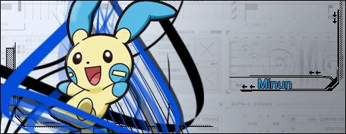
Definitely an improvement. The lighting is much better, but could still use work. Notice how a better render and lighting make minum jump out that much more? Ditch the black brush, it clashes, doesn't look good. You need to use colours which complement blue or that pale yellow on the body. Black is too solid, removes contrast and depth. You could do with using some gradient maps and photo filters on your banners, if you have that option available with your program. It would means that all the colours blend together better, atm the background and render and brushes are all too separated by their colours.
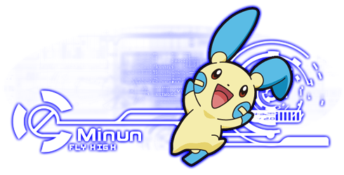
I know i said before about leaving empty space, but this is taking it to the other extreme. You've started off with a banner that is too big, i say that, because I prefer not to enlarge renders as they lose focus and quality. But yeah, you're banner is five times (if not more) bigger than the bulk of your render, as a rule of thumb I try and keep it as 3.5 or less. I think itf you'd chopped some height off the banner it would help a lot too, helps focus things if the render is more concentrated.
Flow. Big thing in a banner, makes a massive difference to the overall aesthetics. Look at Minum, it's jumping up and too the right, and therefore your banner should flow the same way. The background fo your banner at the moment flows the opposite way, those swishes are going from right to left. You might want to vary the shapes in yuor banner as well, variety is interesting and gives you more to look at. You've only used line brushes in your banner; on the Bouffalant one I've used circular brushes splatter brushes, vector brushes, smudged renders, clipping masks and displacement filters. The move you use, the more interesting it looks. the trick is to find the balance between interesting and crowded. I tend to crowd one part of my banner, and leave other parts blank, so this helps maintain the balance.
I'm really sorry but I'm too tired and lazy to write more, hope this helps in the meantime.
MegaSerperior
<--- My life
Welcome Quilapras and SuicuneScale!
Hm. I thought the black looked cool in it. Huh. And I'm not sure what Gradient Maps and Photo Filters exactly are, though I know I have them. I mean, I've used just Filters before, but I didn't think they really fit.
Definitely an improvement. The lighting is much better, but could still use work. Notice how a better render and lighting make minum jump out that much more? Ditch the black brush, it clashes, doesn't look good. You need to use colours which complement blue or that pale yellow on the body. Black is too solid, removes contrast and depth. You could do with using some gradient maps and photo filters on your banners, if you have that option available with your program. It would means that all the colours blend together better, atm the background and render and brushes are all too separated by their colours.
I always try and use the same banner size, its a good size for a signature, and the ratio of length by width is appealing. However, I could find a render that was bigger to start with, I shrunk this one anyways. I didnt want to lose most of the render.I know i said before about leaving empty space, but this is taking it to the other extreme. You've started off with a banner that is too big, i say that, because I prefer not to enlarge renders as they lose focus and quality. But yeah, you're banner is five times (if not more) bigger than the bulk of your render, as a rule of thumb I try and keep it as 3.5 or less. I think itf you'd chopped some height off the banner it would help a lot too, helps focus things if the render is more concentrated.
I've been trying to get flow, but I want to make some of the lines look like they're going around Minun, you know? I couldn't find any brushes that go in the right direction. As far as variety, I have tech in there as well which goes with the vector curves, but I'll see what else I could add in there.Flow. Big thing in a banner, makes a massive difference to the overall aesthetics. Look at Minum, it's jumping up and too the right, and therefore your banner should flow the same way. The background fo your banner at the moment flows the opposite way, those swishes are going from right to left. You might want to vary the shapes in yuor banner as well, variety is interesting and gives you more to look at. You've only used line brushes in your banner; on the Bouffalant one I've used circular brushes splatter brushes, vector brushes, smudged renders, clipping masks and displacement filters. The move you use, the more interesting it looks. the trick is to find the balance between interesting and crowded. I tend to crowd one part of my banner, and leave other parts blank, so this helps maintain the balance.
EmiiLava
Joltik Queen <3
SPPf Username : SuicuneScale
PO, Wi-Fi, or both? : Mostly PO, WIFI if needed.
Today's date : July 11/12
Do you use Xat? : Yes
Your timezone? : GMT -6
Recommended by? : No one.
Did you read the rules? : Yes.. ;245;
SPPf Username : Quilapras
PO, Wi-Fi, or both? : PO mostly
Today's date : July 11/12
Do you use Xat? : Yes
Your timezone? : GMT -6
Recommended by? : No one
Did you read the rules? : Yes ;245;
welcome welcome WELCOME!
 *sprays confetti over you and gives you both TSS cookies*
RoseSymphony
Cloud Princess
Finished request

AHGDFKJDHFKHDAK ITS BEAUTIFUL. I LOVE IT. <3
That background is gorgeous and it looks so awesome and yesss. THANK YOU.
Eliteknight
S.L.Y.
welcome to the 2 new members ill add you to my post
I was using the idea behind Tech Banners, and I made these:
I'll tell you, AMAZING, but, you only put the brushes, the render, the text, and that effect i cant remember its name, its basic, but a good banner, i would give it a 8.5/10.
You could give it a shadow, it would make the sig, looks like if its floating (?
I'll tell you, AMAZING, but, you only put the brushes, the render, the text, and that effect i cant remember its name, its basic, but a good banner, i would give it a 8.5/10.
You could give it a shadow, it would make the sig, looks like if its floating (?
That's point, its meant to be basic. Sometimes basic is nice. It goes Brushes>Text>Render>Outer Glow & Inner Glow
I could try a Shadow. I just started them today like 3 hours ago, so I'm still playing with it a bit.
That's point, its meant to be basic. Sometimes basic is nice. It goes Brushes>Text>Render>Outer Glow & Inner Glow
I could try a Shadow. I just started them today like 3 hours ago, so I'm still playing with it a bit.
with the shadow would be perfect!
ScizorFTW
Skyfall
I was using the idea behind Tech Banners, and I made these:
Wow, they look amazing!
I' haven't seen this type of banners before.Wow, they look amazing!
Ya, Decon Tech Banners. I haven't seen them either, but its something I thought of yesterday, and decided to test out. Incredibly quick and easy to do, and they make an amazing effect.
*ahemcheckthefirstpostweallreadyhaveoneahem*
However...what if we got together four of TSS's greatest art creators and made a collaborative shop in the Fan Art Request Shop itself? While we have more than four great workers, unfortunately four is the maximum. Cuz we have me, Dar, Juice, Lava, pkmnfn(though he cant do anything right now), novan...and i probably missed someone besides them.
A shop with me, dar, juice, and novan would be a big hit, I think.
Last edited:
- Status
- Not open for further replies.