• Hi all. We have had reports of member's signatures being edited to include malicious content. You can rest assured this wasn't done by staff and we can find no indication that the forums themselves have been compromised.

    However, remember to keep your passwords secure. If you use similar logins on multiple sites, people and even bots may be able to access your account.

    We always recommend using unique passwords and enable two-factor authentication if possible. Make sure you are secure.
  • Be sure to join the discussion on our discord at: Discord.gg/serebii
  • If you're still waiting for the e-mail, be sure to check your junk/spam e-mail folders

.:/|~The•Graphics•Club~|\:.

Status
Not open for further replies.

Azure Wolf

Well-Known Member
Do you use tutorials to make your graphics?

Initially I never used tutorials, they distract you from exploring the different areas of photoshop but once you know photoshop then they're required.

Currently I use HDR (High Dynamic Range, used in photo-manipulation) tutorials which help in giving my images a color edge. Sometimes I check out a few pen tool ones too but I don't rely on tutorials very much.

New Banner:
1214483333.png
 

Azure Wolf

Well-Known Member
Do you use tutorials to make your graphics?

Initially I never used tutorials, they distract you from exploring the different areas of photoshop but once you know photoshop then they're required.

Currently I use HDR (High Dynamic Range, used in photo-manipulation) tutorials which help in giving my images a color edge. Sometimes I check out a few pen tool ones too but I don't rely on tutorials very much.

New Banner:
1214483333.png
 

Da14u.C

La mort de Narcisse
Three New Icons!
http://i27.*******.com/2w7le9k.pnghttp://i28.*******.com/r8fpyt.pnghttp://i28.*******.com/2ia7n11.png
Nothing new.

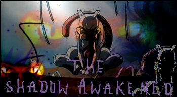
MewtwoEyes.png

Well, I ... liked this one, I guess. It looks like a fanfic banner... well, if that was what the request was for, you did a nice job. The things that annoy me are .. well, the Mewtwo. Like what Da14u.C said, it's colors can't really be seen anymore. Especially the purple. It looks transparent, in a way. The eyes, too are weird. And the Mewtwo in the corner doesn't really add up any points to me. The outline [?] of the tail makes it look thin, as you can see no other part of the tail. The text stands out a bit too much, too. Overall, it's an okay banner.

Please remember that my ... criticism [?] is based on my "seeing" of the banner. People can have different opinions. I know, my criticism sucks, but what the hell. I like posting here. ... and you use GIMP, right?

http://i29.*******.com/2s81w5c.png
copyofjw9.png

Well, I you have improved. You learned to put ... related things into the banner. Well, first one is too ... monotone [?] second one, well, I can't read the text at all. Yohr Hsfafgdsgs. The pink brush "border" isn't very appealing, either. Maybe you should've made it black/white? Since the man on the banner doesn't have a trace of pink on him...? And the image looks like you didn't do anything to it. Perhaps adding some fill layers and selective coloring [I dunno if there is on GIMP ):]

141658e25a.png

Hah, not much, same as your second banner. Except more squished up. And the image is blurry.

EEDDDIIIITT
keep forgetting to put it >>
[spoil]
junoooo.png
[/spoil]
Contains foul language, I guess. To all you little kiddies out there ):<
awww, the text was supposed to say "Your Handsomeness". gettit?like "Your Majesty" but Handsomeness instead of Majesty???
anyway, the image i added (with an oily sort of artistic thingy) was starmie o_O.... thanks for the c&c.... same to you arceus master, i appreciate what u said and i have noted it :)

oh, btw, Mr Yoshi, i LOVE your banner, i think it ROCKS!!! :) i got no negative things to say.... :p i'll probably find something tomorrow when i wake up >: )

welcome new member, pleased to met you :D
 

Shirota

choi jae ni
May I join?
§-Image Editing Program: Photoshop CS2.
§-How long you've been creating graphics: Two in a half years.
§-Your skill level opinion: 8-9?
§-Shop Owned: A while back.
§-Three Examples:
shirotatripplebanner.png

pridekenzoa4.png

69999231zz5.gif
 

Sammi

Banned
I'd like to join.
§-Image Editing Program: Photoshop CS2
§-How long you've been creating graphics: 1 year + 3 weeks
§-Your skill level opinion: 6 (Decent.)
§-Shop Owned: Many
§-Three Examples: 1 2 3. Not my best, but eh.
 
Last edited:

Mr. Yoshi

Well-Known Member
Two New Icons!
breloompika.png
pichuu.png


I'm just here to say welcome to Sammi and Shirota! =D

@ Shirota: I love the second banner you made, really different from everyone else's. The third one is quite bright. A bit too much for me x___x;

@ Sammi: Heh, you already know how much I love the second banner >w<
 

Da14u.C

La mort de Narcisse
i am assuming the two new members will be accepted, so: WELCOME!!!

Shirota, i absolutely adore banners 1 & 2.... banner 3 is..... unique :p (lol negativity isnt my strong point...)

Mr Yoshi, you have got to make me a starmie icon if you please. you are excellent at it.... (i prefer bannes and larger thingies to smaller ones....). <---- i hope that wasnt against the rules.... >.>

oh, new topic!: What are your favourite kind of effects to add to a graphic thingy you design?
 

Angelic Pika

i stalk you
Thanks for the semi-warm welcome, and hi to Sammi, Shirota and Chibbichan. :]

Do you use tutorials to make your graphics?
At first when I didn't have a clue on what to do to things, but gradually I would stop and just check out tuts for certain techniques.

What are your favorite kind of effects to add to the graphics you design?
Either pen tool lines since they're so cool when you make them, or textures and a lot of them since they make it more.. texture-y. Selective Color is an effect right? That's pretty awesome too. :]

Mr. Yoshi: The first icon looks pretty cool to me. But something's missing. Maybe add a little light texture on the bottom left? And the other one seems a little two bright for me. Duplicate the whole, desaturate and put on to soft light or whatever. XD;;

Shirota: Is your second and/or third banner from a tutorial on livejournal? :x I think I might've seen them before. Just wondering though..
 

Mr. Yoshi

Well-Known Member
What are your favourite kind of effects to add to a graphic thingy you design?
I like those nice textures ... that when you set them to screen, the black part gets off? ... yeah, those. and Selective Colorriiiiing =DDD I don't really do much to my icons, so yeah.


Mr. Yoshi: The first icon looks pretty cool to me. But something's missing. Maybe add a little light texture on the bottom left? And the other one seems a little two bright for me. Duplicate the whole, desaturate and put on to soft light or whatever. XD;;
Light texture? Hn, yeah, it does look quite empty now that you mention it ): Prolly next time, I don't usually save PSD files Dx But the duplicating part actually is a good idea. I've never thought about that. Ah, I shall use it on my future crap >:3

Mr Yoshi, you have got to make me a starmie icon if you please. you are excellent at it....

oh, new topic!: What are your favourite kind of effects to add to a graphic thingy you design?
Heh, I was bored, I made one.
http://i30.*******.com/rutjpx.png
Haha, really quick one. Not very nice. If you want something else, request at my shop ;D And thanks for the compliment. I don't get that much ^^; Sorry for the crappy icon xD;

aaaannnnd
waaaballooooooooon.png

I think this one's nice =w= It has the Jakotsu touch to it ;D Though I still think I should've put a white 1 pixel border =3=

and welcome to Chibbichan! Hope you have fun here and all~
 
Last edited:

Da14u.C

La mort de Narcisse
What are your favourite kind of effects to add to a graphic thingy you design?
I like those nice textures ... that when you set them to screen, the black part gets off? ... yeah, those. and Selective Colorriiiiing =DDD I don't really do much to my icons, so yeah.


Light texture? Hn, yeah, it does look quite empty now that you mention it ): Prolly next time, I don't usually save PSD files Dx But the duplicating part actually is a good idea. I've never thought about that. Ah, I shall use it on my future crap >:3


Heh, I was bored, I made one.
http://i30.*******.com/rutjpx.png
Haha, really quick one. Not very nice. If you want something else, request at my shop ;D And thanks for the compliment. I don't get that much ^^; Sorry for the crappy icon xD;

aaaannnnd
waaaballooooooooon.png

I think this one's nice =w= It has the Jakotsu touch to it ;D Though I still think I should've put a white 1 pixel border =3=

and welcome to Chibbichan! Hope you have fun here and all~
i think the icon is awesome! should i give credit? coz i just put it as my profile pic but i dont want to add anything to my signature :p

What are your favourite kind of effects to add to a graphic thingy you design?

definatelylighting effects, all my banners have light and e.t.c. on hem, it adds drama to the banner ( i like drama :p ) as well as the effect that makes your picture partially see throiugh so that the background can be seen :p

~oh, by the way, Mr. Yoshi, is that a potatoe in your 2nd icon?????? o_O
~Chibbichan, i LOVE your marril banner!!! it is awesome!!! welcome to the club (asuming you are accepted) :)


Phoenix Fire

scream your self
In-activeness kills.

Do you use tutorials to make your graphics?
I used to, and I still do sometimes, but not as much. That sounded wrong.

What are your favourite kind of effects to add to a graphic thingy you design?
Colouring effects are a must, experimenting with Levels is fun, and I usually add textures, but not brushes since I haven't figured out how.

I can't make and icons right now, since my computer is having problems yet again, which sucks since I have so much free time becuase it's summer vacation. Anyway, welcoe to the new members.
 

Shirota

choi jae ni
None of my stuff are from LiveJournal, thank you. I did my own crap with those work.

What are your favourite kind of effects to add to a graphic thingy you design?
A nice slap of vintage and grunge. I also display in originality and some love in it. That's what I do with my work.

Do you use tutorials to make your graphics?
I wouldn't say "I use them", it sounds like I'm stealing one's work. What I do instead is get the idea and twist it completely so it's not like I used it and it's really something I came up with my own. Otherwise, I don't feel completely true to myself. Why should I even follow someone's way when mine can be a lot better? It's nice to see how they do it, but in the end I prefer doing things on my own.
 
Azure Wolf: That's an odd banner for you to make. Not your usually style either. The first two sqaures with flowers in them are good with the recoloring effect and such and the last one is good; the lighting effect blends in nicely but it is really bright and eye-hurting. That's all I have to say since there's not much to the banner.
Shirota: Welcome to the club.
Sammi: Welcome to the club as well.
Da14u.C: Just a note: when make a topic (or any sentence) please use real words and real grammer. I am real picky that way.
Chibbichan: Welcome to the club as well. All three of you enjoy your stays here.
Mr. Yoshi: The first two new icons C & C is below. :3
1st: Even though it doesn't look like you did anything to it but I'm sure you did, I'll just stop at that.
2nd: I can see the effect done on this. It blends nicely together though there isn't anything else exciting to the avatar. If you haven't noticed lately, I like graphics to be exciting with effects, borders, anything.
3rd: It seems like everyone that says something they made is bad, is actually good. To me at least. The effect done to the avatar is very nice and I like that.
4th: Yeah, that's definatly Jakostu's effect. Everything looks fine but I'm just curious, what is that peach-colored object on the avatar? Is that a peach?
Phoenix Fire: That sucks about being unable to make graphics. Must be bad especially when you've got too much free time.

What are your favorite kind of effects to add to the graphics you design?
Lighting and render effects. That's just my specialty.
 
Last edited:

Azure Wolf

Well-Known Member
You're probably right, but then again I like to experiment on different styles.

1214576032.png


What are your favorite kind of effects to add to the graphics you design?
Grunge + Blurred + Dark
 

Phoenix Fire

scream your self
@Azure Wolf: That's a pretty amazing graphic. All the effects, brushes, text, and all of that looks awesome. Although the sky on the top, makes it seem a little weird, in my opinion.

@Arceus Master: Yeah it does suck. But my computer will probably be back by the end of the week.
 
Last edited:

Mr. Yoshi

Well-Known Member
@Phoenix Fire: Aww, too bad. D: Hopefully your comp doesn't mess up more. You make good graphics ;;

@Azure Wolf: great stuff as usual, I like the nice vector brushes ;DD

@Arceus Master & Da14u.C: Actually, it's a balloon ;; not a potato or a peach o_O;

cries.png
http://i25.*******.com/219xqoy.pnghttp://i26.*******.com/nqy51j.png
 

Sammi

Banned
What are your favourite kind of effects to add to a graphic thingy you design?
I don't know. I tend to draw in my graphics as well as add bright colors with gray.

Do you use tutorials to make your graphics?
I've only read around three tutorials and made use of two, that I remember. So, not really.

Also thanks for the somewhat warm welcomes.

EDIT: @Chibbichan: It probably sounds strange coming from someone like me, but even if I'm not a fan of glowy styles (anymore), I really do admire your Marill banner. Something about it strikes me as refreshing. It's actually rather nice.
 
Last edited:

Da14u.C

La mort de Narcisse
You're probably right, but then again I like to experiment on different styles.

1214576032.png


What are your favorite kind of effects to add to the graphics you design?
Grunge + Blurred + Dark
i love this! it looks awesome, and generally i hate naruto-related stuff..... i especially love the clearness of the text, very nice :)

Mr. Yoshi ~ i LOVE the avatars, especially the spoink one, it is just ooooooozing cuteness!!! the aipom one on the other hand...... :( i dunno.... i just dont like it, the lighting effects, the background e.t.c..... but the torkoal one is adorible as welll :)

arceus master ~ i like your new banner, the one in your signature. did you make it youself? and how did you blend those images together?

new avatar~: http://i29.*******.com/ilyghu.jpg
just trying out something dramatic.... but in a different way from how i normally do it
 
Last edited:

Phoenix Fire

scream your self
@Mr.Yoshi: Thanks very much. You Aipom and Spoink icons look cool, but the Torkcoal one seems a little plain. How much did yo do with it?

New Topic: Where do you normally go to find your resources [textures, brushes etc.]?
Shall answer it later.
 
Status
Not open for further replies.
Top