• Hi all. We have had reports of member's signatures being edited to include malicious content. You can rest assured this wasn't done by staff and we can find no indication that the forums themselves have been compromised.

    However, remember to keep your passwords secure. If you use similar logins on multiple sites, people and even bots may be able to access your account.

    We always recommend using unique passwords and enable two-factor authentication if possible. Make sure you are secure.
  • Be sure to join the discussion on our discord at: Discord.gg/serebii
  • If you're still waiting for the e-mail, be sure to check your junk/spam e-mail folders

The Artist's Corner

Who's club banner is the best? (see below)

  • Eeveelover824

    Votes: 6 11.5%
  • colorless-winter

    Votes: 0 0.0%
  • Sworn Metalhead

    Votes: 23 44.2%
  • Azulart

    Votes: 6 11.5%
  • Callie-Rose

    Votes: 1 1.9%
  • extroph

    Votes: 15 28.8%
  • Kutie Pie

    Votes: 1 1.9%

  • Total voters
    52
  • Poll closed .
Status
Not open for further replies.

Toyosatomimi no Miko

炎髪灼眼の討ち手
If you're using GIMP, I think the font size is either 10, 11, or 12. Can't remember. Make sure anti-alias is off (I forgot where you turn that off too but I think it's just a checkbox somewhere).
And don't use GIMP's stroke. It sucks. Use alpha to layer > select > grow > 1 > paint bucket. Don't try to pixel in the border yourself, it won't work.
Ahh Dangan Ronpa.

Anyway, I actually think the Koopa's is better. The black effect thing at the top is pretty close to what the original was like. I think what's missing is that where you have a white strip, the original has a gray to white radial (I think) gradient. So it sort of fades out.
Oh and the original uses tech brushes. You can actually rotate brushes in GIMP. I think. I remember something like that.

Be careful not to cut Koopa off.
 

Keldminrachi91

Just call me Cooki
I can actually see these.

They're pretty good and keep things simple without the flair. Only thing I would recommend is with the text. Set the anti-aliasing method to "None" if you're using a block/pixel font. That way, it doesn't look blurry.

If you're using Photoshop, this is where you change that:


Also, if you're using the Visitor font (which I'm pretty sure is being used in this case), keep it at Size 10. Anything else usually ends up looking pretty messy.

Oops. I always saw that there was an anti-aliasing box, but I never bothered with it. :/ Will keep in mind.

Also, 10pts to Akanjao, because I use GIMP. ;) And I always heard 12pt font, so that's what I used in these.

If you're using GIMP, I think the font size is either 10, 11, or 12. Can't remember. Make sure anti-alias is off (I forgot where you turn that off too but I think it's just a checkbox somewhere).
And don't use GIMP's stroke. It sucks. Use alpha to layer > select > grow > 1 > paint bucket. Don't try to pixel in the border yourself, it won't work.

I learned that the hard way. XP
 

MidnightCombat

Bird of Destruction
I wish I could make signatures. These look so crisp and clean.
I did a painting on Tuesday and needless to say, I'm impressed with the result (and the colors):
tj31qJB.png

My scanner wasn't big enough to scan everything and I didn't even want to take a picture of it (3DS camera is bad).
 

Avenger Angel

Warrior of Heaven
I did a painting on Tuesday and needless to say, I'm impressed with the result (and the colors)

Well, from what I can see, it's pretty darn good. I'm trying to figure out if it's a wolf or a griffon or something like that. But yeah, the highlighting and shading seems pretty good. Maybe take a picture with the 3DS anyway, just so we can get an idea of what the entire thing looks like.

Anyway, I made a new banner, tried a few new things as well. Criticisms are always welcomed, as I'm always trying to get better:

AATFBannerFinal_zpsd200d0c5.png
 

Pyroli

Banned
I'm /terrible/ at posting in stuff I join, especially when work and school are distracting me.


I've always been a fan of your banners. The colours in this are fantastic, the contrast very well and don't distract from the overall banner. Very well done. It certainly has a nice place in your signature.

-----

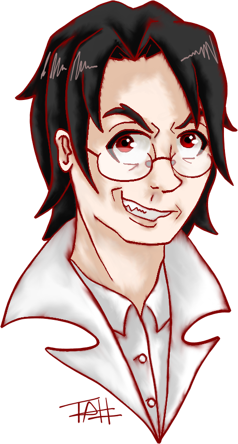
I finally actually drew something a few nights ago, during some planning for a story I'm writing. I wanted to flesh out my protagonist, although I really haven't drawn digitally in over a year.

5rl3.png

This dude is Isaac, he hasn't really been fleshed out much yet, but he's very timid which isn't really good when you have zombies surrounding you daily.
 

Dragonicwari

Artistically angry

Blood Red Absol

AquaMilotic's Waifu
I have been having art block lately real bad, but I did get around to drawing this lovely devil today :D
dante_s_rape_face_by_abbysol-d7arkou.png
He looks bad because I rushed him xD
 

Sohryu

Be a Man!
Well, from what I can see, it's pretty darn good. I'm trying to figure out if it's a wolf or a griffon or something like that. But yeah, the highlighting and shading seems pretty good. Maybe take a picture with the 3DS anyway, just so we can get an idea of what the entire thing looks like.

Anyway, I made a new banner, tried a few new things as well. Criticisms are always welcomed, as I'm always trying to get better:

AATFBannerFinal_zpsd200d0c5.png

Get better? Haha...
I don't really have much to say. That light (I suppose you used a radial semi-transparent gradient) on the left side of your text, seems a bit... Out of place. Although, I suppose you have made it this way, so it feels less bland? If yes, then there's not much to say.

I have been having art block lately real bad, but I did get around to drawing this lovely devil today :D
dante_s_rape_face_by_abbysol-d7arkou.png
He looks bad because I rushed him xD

I actually loved this. It's not my specialisation or anything, but I quite like your drawing, specially the lines and... The draw in itself. I liked it!

Also, can someone give some critique on my new sig? Learned the style today and I am quite liking it. Still has a lot stuff to work with, but... I loved the outcome!
 
Last edited:

Avenger Angel

Warrior of Heaven
Get better? Haha...
I don't really have much to say. That light (I suppose you used a radial semi-transparent gradient) on the left side of your text, seems a bit... Out of place. Although, I suppose you have made it this way, so it feels less bland? If yes, then there's not much to say.

True, and yeah, I did fudge around with that a lot and tried all kinds of settings to see what would work best, but through process of elimination, this is pretty much what I ended up with.

But hey, thanks for the insight though.
 

Shayminslicker

Comes out of Nowhere
I'm a bit late but nobody has said anything soooooo.... I want to ask if you start with light sketches and make it darker as you go? It will develop a more crisp clean look if you draw that way. Otherwise it looks excellent just a tad shaky

Yes. That's what I try to do with my drawings even though it really doesn't look like it. I'll try to work on that some more. I was just a little scared that if I made it too dark it would look ugly.
 
Hello!

The newest Artists Corner club has been approved so feel free to post here from now on. :] TY for your patience.
 
Status
Not open for further replies.
Top