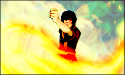
@Rainy: Oh, I forgot to answer this earlier: Yeah, Gradient Maps definitely could cause over saturation, especially if you have several different colours etc. on high opacity, or Normal blending more.
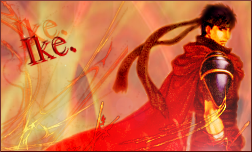
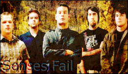
With regards to pixel fonts, they're acceptable sometimes, but generally they look very.. newbish, and rarely complement the flow, or the effects in the signature. Text can make or break a signature if not done right. For one it should always, always be placed using the Rule of Thirds (this is like, the no. 1 most important rule when it comes to Signature making), and it should fit the style of the image. This and this are two pretty decent looking tutorials (I haven't actually read them, but they sound like they know what they're doing) :b.
Anyway, yeah, I'm no text expert myself, but that's just my two pence.
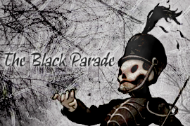
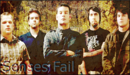
Last edited: