-
Hi all. We have had reports of member's signatures being edited to include malicious content. You can rest assured this wasn't done by staff and we can find no indication that the forums themselves have been compromised.
However, remember to keep your passwords secure. If you use similar logins on multiple sites, people and even bots may be able to access your account.
We always recommend using unique passwords and enable two-factor authentication if possible. Make sure you are secure. -
Be sure to join the discussion on our discord at: Discord.gg/serebii
You are using an out of date browser. It may not display this or other websites correctly.
You should upgrade or use an alternative browser.
You should upgrade or use an alternative browser.
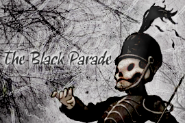
The Digital Art Club
- Thread starter Flurried Rains
- Start date

:O!! Lady GaGa. I love her so much, as I've probably said many, many times before, although maybe not in this thread. I just made a signature with her in it because I absolutely loved her VMA performance and I actually found good quality pictures of it today. I like that banner of yours, although she looks very orange.
And here's the Lady GaGa one I just mentioned. I gotta go organize my signature now so I can put it in...

Ahh thanks and that was the colouring I was going for :] I love that banner! It's a little dark for my liking, maybe add some more light in it and make the text stand out a little more.
Oh wow. It's really cute. ^_^ I love the colouring, it's all bright and happy.
http://i32.*******.com/somzi9.png
Well I did mine and... yeah. Thats my entry.
Thanks :} and the way you said "That's my entry" seems you think it isn't so good :'[ When I went over to the WBC I was like woah! There goes my chance of winning.
Manageyes there is no reason why you can't be as good as anyone else. Everything just takes practice and for you to experiment with different medias.
@Rainy: Katy Perry looks waay oversaturated, and there are too many focals. I generally don't like it when images (particularly faces) are obvious in the background. The focal of a piece should be just that. The rest should be subtly blurred, and generally the focal benifits from a little bit of a sharpen. Also lighting needs to be in the top right corner desperately. It'd make it much more alive.
@stelar: Your name is too long, so this is your new one. :3 But yeah, it's clean and simple. My only grudge with this is that it's too similar to your other pieces. It doesn't have it's own individual flair, you know?
@mangaeyes: Aye, it's all about practice, practice, practice. Once you nail the basics, and get your own styles under your belt things start to improve much faster. It's all about experimenting to discover what's right for you. :>
What is your favorite kind of Digital Art and why?
Signatures. I find them interesting to design, and they're not too time consuming, and yet at the same time you can generally find a way to improve it when you come back to it. The beauty of signatures is that there's always something that can change, and small changes can make the world of difference.
Flurried Rains
~No Day But Today.
Lol Frozen, I avoided uploading the Katy Perry sig because of that and I never felt like changing it. So I just uploaded it as it was and dealt with it.  . I like that sig you made, although I couldn't really tell what the image actually was for a while. I thought it was a robot or something and then I figured out that it was a face. Other than that, you pull off the simplicity of a blank background very well. :3.
Oh and PurpleMew, thank you!!. I would go in and lighten up a bit but I'm afraid I'd most likely screw up the lighting.
EDIT: Oh and mangaeyes, I really don't know what else to tell you. I've commented on all of your stuff before, given you the tips I thought would help, and all that I can do basically. Show me something new and I can help you out a bit more. I really think giving tutorials another chance would be good, since that's what really stepped up my Photoshop skills.
. I like that sig you made, although I couldn't really tell what the image actually was for a while. I thought it was a robot or something and then I figured out that it was a face. Other than that, you pull off the simplicity of a blank background very well. :3.Oh and PurpleMew, thank you!!
. I would go in and lighten up a bit but I'm afraid I'd most likely screw up the lighting.EDIT: Oh and mangaeyes, I really don't know what else to tell you. I've commented on all of your stuff before, given you the tips I thought would help, and all that I can do basically. Show me something new and I can help you out a bit more. I really think giving tutorials another chance would be good, since that's what really stepped up my Photoshop skills.
Last edited:


Flurried Rains
~No Day But Today.
:O. I wanna try to make a sprite banner eventually. Yours look really cool. Meh, maybe some day, or after I eat my brother's birthday cake. :3. Out of my boredom today I went back onto an old forum I used to post on because I remembered that they had amazing artists and stuff. Turns out that most of 'em are either gone, or I just thought they were really good because I sucked back then. Anyway, I am planning on entering their Signature Of The Month competition, and the theme is black and white. HELP ME WITH MINE. I want to win really badly.
. Here it is (yes, more Lady GaGa):
I feel like it's missing something, but I can't quite place it. These people are who I am up against if you are interested in looking.
EDIT: Another banner I just made, featuring Roger and Mimi from Rent.

MMK PEOPLE. WE NEED A NEW DISCUSSION TOPIC. SO HERE WE GO. Feel free to answer the last one as well if you didn't yet. ;P
When creating digital art, do you prefer to work with real life subjects, anime/manga/cartoon subjects, or video game subjects?
Personally, I prefer real life subjects at the moment. However I go through phases I guess. For a while I had an anime phase (even though I don't even watch anime or anything, I just used them a lot) and then I also used to use video game stuff a while ago. Now I just tend to stick with real life stuff because it's what I relate to the most. I don't play many video games anymore, so I never use video game renders and like I said before I don't watch anime, so the only stuff I'll use related to that is Pokemon stuff. With real life stuff I can do signatures with my favorite music in it
3), use stuff from movies, etc. Plus I hate searching for video game/anime stuff, it gets obnoxious after a while, since I don't know exactly what I'm looking for.
Last edited:
When creating digital art, do you prefer to work with real life subjects, anime/manga/cartoon subjects, or video game subjects?
I don't really have a single preference...as you can see, for me, it ranges from album mascots to magpies to TV characters. They are all, of course, things that interest me. I find pictures of celebrities a little more interesting because many photos of them are in a certain pose or certain style which can help the image flow.except lady gaga coz she sucks
Only joking.
No really.
I don't really have a single preference...as you can see, for me, it ranges from album mascots to magpies to TV characters. They are all, of course, things that interest me. I find pictures of celebrities a little more interesting because many photos of them are in a certain pose or certain style which can help the image flow.
Only joking.
No really.
Anyway, I am planning on entering their Signature Of The Month competition, and the theme is black and white. HELP ME WITH MINE. I want to win really badly.
I feel like it's missing something, but I can't quite place it. These people are who I am up against if you are interested in looking.
EDIT: Another banner I just made, featuring Roger and Mimi from Rent.
MMK PEOPLE. WE NEED A NEW DISCUSSION TOPIC. SO HERE WE GO. Feel free to answer the last one as well if you didn't yet. ;P
When creating digital art, do you prefer to work with real life subjects, anime/manga/cartoon subjects, or video game subjects?
Personally, I prefer real life subjects at the moment. However I go through phases I guess. For a while I had an anime phase (even though I don't even watch anime or anything, I just used them a lot) and then I also used to use video game stuff a while ago. Now I just tend to stick with real life stuff because it's what I relate to the most. I don't play many video games anymore, so I never use video game renders and like I said before I don't watch anime, so the only stuff I'll use related to that is Pokemon stuff. With real life stuff I can do signatures with my favorite music in it
I love the black and white theme, it really suits the image but I dunno like you said it seems to be missing something, I dunno some text maybe. On the second banner the image seems blurry and the text feels out of place.
except lady gaga coz she sucks
*ShOcK*
When creating digital art, do you prefer to work with real life subjects, anime/manga/cartoon subjects, or video game subjects?
I like to use people, animals and natural formes the most but can go with cartoon/anime characters easily aswell. I prefer natural images because I can easily express certain part more than say video game images.
I am working on some icons for HGSS and Lady Gaga.
interstellas
Banned
When creating digital art, do you prefer to work with real life subjects, anime/manga/cartoon subjects, or video game subjects?
It depends on what my mood is. I like using real subjects a lot more though. It usually involves someone Asian. xD Hah, yeah. Still it does depend on my mood anyway. I lost my interest with anime, I don't play much video games either so. Yeah.
What is your favorite kind of Digital Art and why?
Signatures and icons. Why? Why not? ;O
Anyway, I made this icon and it's real small... yeah. >>; It's bright though and I like it very much.
http://i37.*******.com/2tet4.png
@interstellas: I love the colours. Lime green and white are always going to by my favourite colours, I think. They just work perfectly together. Good job on that one. :3
Now, I want you to all go and enter the 50th ZU SotW contest because I run it and I want you to. :33
Lime green and white are always going to by my favourite colours, I think. They just work perfectly together. Good job on that one. :3Now, I want you to all go and enter the 50th ZU SotW contest because I run it and I want you to. :33
Flurried Rains
~No Day But Today.
Now, I want you to all go and enter the 50th ZU SotW contest because I run it and I want you to. :33
You see.. I would but: A) I don't want to join a forum for Zelda when I don't have any interest in Zelda at all. B) I'm trying to figure out what I'm going to do for two (possibly three) other SOTW competitions as well as do homework. :3. C) I'm too lazy to register. :]
MANGAEYES WTF LADY GAGA IS LIKE AMAZINNGGG. <3
Oh and I just joined this forum that's basically for digital art and stuff (although they did just add a gaming section) because that's what I want to focus on right now and I'm really only posting on this forums for this thread, the Gay/Lesbian Alliance, and the GPX+ Fan Club (which I'm not even interested in anymore). Wow, that was a run-on. BUT ANYWAY, I joined this forum called Digital Remix and everyone there is amazingly good at making signatures (or tags as they sometimes call them). It's very, very intimidating. Hopefully I can get a lot better there though, I'm thinking that all of the beastly signatures will be inspirational. :]
I haven't posted in the Zelda sections for years, they're basically the Pokemon sectioners of Serebii there. But fine, leave me all alone but not alone. ;---;You see.. I would but: A) I don't want to join a forum for Zelda when I don't have any interest in Zelda at all. B) I'm trying to figure out what I'm going to do for two (possibly three) other SOTW competitions as well as do homework. :3. C) I'm too lazy to register. :]
^MANGAEYES WTF LADY GAGA IS LIKE AMAZINNGGG. <3
Sigs, tags, those are what real men call their graphics. I'll have none of this 'banner' stuff. xD I might go check it out sometime. Who knows, Rainy, perhaps if you keep practicing you'll be as good as me [/modest]. But yeah, being serious, I don't think I'll ever be able to be like, a GFX pro. I might go get myself reclasses at the NSL though, see if I'm better than novice now. :bOh and I just joined this forum that's basically for digital art and stuff (although they did just add a gaming section) because that's what I want to focus on right now and I'm really only posting on this forums for this thread, the Gay/Lesbian Alliance, and the GPX+ Fan Club (which I'm not even interested in anymore). Wow, that was a run-on. BUT ANYWAY, I joined this forum called Digital Remix and everyone there is amazingly good at making signatures (or tags as they sometimes call them). It's very, very intimidating. Hopefully I can get a lot better there though, I'm thinking that all of the beastly signatures will be inspirational. :]
Flurried Rains
~No Day But Today.
Sigs, tags, those are what real men call their graphics. I'll have none of this 'banner' stuff. xD I might go check it out sometime. Who knows, Rainy, perhaps if you keep practicing you'll be as good as me [/modest]. But yeah, being serious, I don't think I'll ever be able to be like, a GFX pro. I might go get myself reclasses at the NSL though, see if I'm better than novice now. :b
HEY FROZEN I REALLY LIKE YOUR CURRENT BANNER IT LOOKS REALLY PRETTY AND BANNER-LIKE SO YEAH I LIKE YOUR BANNER BECAUSE IT'S A BANNER. teehee. :]
And I don't know what the site is like so far, as I've only made four posts. But most of the people seem friendly enough. I need one more post until I can check out the tutorial section, which is what I am excited for. AND THEN HOPEFULLY, ONE DAY, I CAN BE LIKE THE AMAZING BANNER MAKER FROZEN, WHO IS AMAZINGLY MODEST. what's the NSL? o_o.
God I love formatting posts just oh-so-much. :3
interstellas
Banned
D'ohhh. No fighting now. D: I'm scared of where this is going at.
I entered that one thing...again. Yeah, but I made a larger version of it so it looks real cool. I'm surprised of what I did and whatnot. It's so different than my other things. I'm proud of how I did it and I'm happy of my accomplishment because I pulled through something I don't (usually) do.
http://i36.*******.com/spy7mh.png
So, you like? I'm a sweetheart to give out the .PSD file if anyone wants it. ^^;
Flurried Rains
~No Day But Today.
D'ohhh. No fighting now. D: I'm scared of where this is going at.
I entered that one thing...again. Yeah, but I made a larger version of it so it looks real cool. I'm surprised of what I did and whatnot. It's so different than my other things. I'm proud of how I did it and I'm happy of my accomplishment because I pulled through something I don't (usually) do.
http://i36.*******.com/spy7mh.png
So, you like? I'm a sweetheart to give out the .PSD file if anyone wants it. ^^;
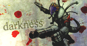
:O! That's certainly a different style for you. I like the tech-y feel too it. :3. The faded face in the background kind of bothers me, but other than that it's all good. Although the face does seem to be cut off from everything else kind of... I don't know how to explain it. Anyway, I've decided that I'm finally going to enter the SOTW here at Serebii, and the theme is boyish. So I made a signature with Megan Fox in it! Not sure if I'm gonna enter it yet though, I'm gonna fix it up tomorrow when I have more time.

I don't know why I use those colors all of the time. It's so strange. :l
It's kinda... messy. There's just no depth, so our eyes end up running alll over the piece trying to find a focal. The text brutally murders the flow too. :< It has potential, and it's cool to see something so different to you, but as it is it needs a'changing. Oh, and that clone in the back ground isn't so cool. :xhttp://i36.*******.com/spy7mh.png
So, you like? I'm a sweetheart to give out the .PSD file if anyone wants it. ^^;
Oh so you'll enter Serebii's SotW but not mine, huh? ;__; Anyways, this one seems kinda... bad quality to me, particularly the left. It's all pixelated and bleeh. The colours are nice, and Megoo blends in nicely, but there's nothing that really wows me there. You colour abuser! >:3:O! That's certainly a different style for you. I like the tech-y feel too it. :3. The faded face in the background kind of bothers me, but other than that it's all good. Although the face does seem to be cut off from everything else kind of... I don't know how to explain it. Anyway, I've decided that I'm finally going to enter the SOTW here at Serebii, and the theme is boyish. So I made a signature with Megan Fox in it! Not sure if I'm gonna enter it yet though, I'm gonna fix it up tomorrow when I have more time.
I don't know why I use those colors all of the time. It's so strange. :l

Flurried Rains
~No Day But Today.
HOLY FREAKING CRAP. You pull off all of that simple shit so well. You make me jealous Kitty. Very jealous indeed. Next time I make a banner (hehehe) I'm going to try and make it simple like all of your banners. :3. What is the render from anyway?
interstellas
Banned
It's kinda... messy. There's just no depth, so our eyes end up running alll over the piece trying to find a focal. The text brutally murders the flow too. :< It has potential, and it's cool to see something so different to you, but as it is it needs a'changing. Oh, and that clone in the back ground isn't so cool. :x
Oh so you'll enter Serebii's SotW but not mine, huh? ;__; Anyways, this one seems kinda... bad quality to me, particularly the left. It's all pixelated and bleeh. The colours are nice, and Megoo blends in nicely, but there's nothing that really wows me there. You colour abuser! >:3
D:< Yeah thats why I don't do this at all. I attempted it so, nyah. Bite me! XD
I also like the banner you did. It's all clean and the colours are fantastic.
Flurried Rains
~No Day But Today.
Well I found a shiny tutorial and even though I didn't follow it completely because I have no idea how the freaking pen tool works (any help here would be nice, I can't figure out how to make lines with it). But either way I came up with this (I made a black and white version as well as a colored version because I didn't know which I liked better) (oh and yes I tried a different sized signature this time) (yay for multiple parenthesis!):

