Warfare
liverliverliverliver
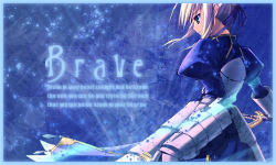
Well, there's a lot of experimentation involved with my text, but I usually do the same things in terms of what fonts I use and how I do them. It's best to have compressed and leveled text, which is why I tend to keep my text in either all lowercase or uppercase.So where do you get your textures at if you mind telling us. They look so nice and it'll be also good if you provide a typography tutorial on how you do your text. It's only because it's my weakness and I kind of want to fix it.


That's basically it. It's extremely simple. The only issue would be abusing text placement, but basically, if you're cramming things onto an image, then obviously it's a bad idea to have text.
As for textures, they're just popular ones on LiveJournal. ohfreckle, innocent-lexys, colorfilter, urbanstrokes, ewanism, 77words. Those are just off the top of my head, but there's more.


") Thank you. Yeah I do like it but it's not what I'll be using for my artclass. My teacher picked one of them for me to work with and so far it looks real nice and it makes me... happy.
Thank you. Yeah I do like it but it's not what I'll be using for my artclass. My teacher picked one of them for me to work with and so far it looks real nice and it makes me... happy. 