• Hi all. We have had reports of member's signatures being edited to include malicious content. You can rest assured this wasn't done by staff and we can find no indication that the forums themselves have been compromised.

    However, remember to keep your passwords secure. If you use similar logins on multiple sites, people and even bots may be able to access your account.

    We always recommend using unique passwords and enable two-factor authentication if possible. Make sure you are secure.
  • Be sure to join the discussion on our discord at: Discord.gg/serebii
  • If you're still waiting for the e-mail, be sure to check your junk/spam e-mail folders

The Graphic designer club!

Status
Not open for further replies.
@Crickee: Ahh your old banners look cute though. xD Yeah all I can color is manga scans too. OTL

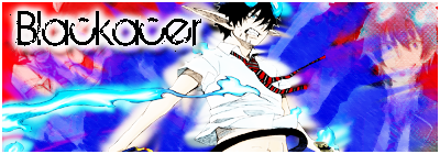
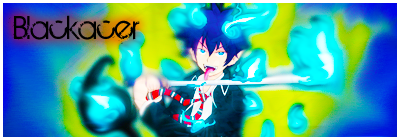
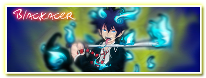
@Blackacer: Yep it's a great series. :D

@PPL: It's exactly what it is. Her skin looks yellow. If you look at pictures of her, you'll see her skin is a light peach. I'm not good with naming skin tones... xD;;

I like the banner, Mr. Joker. Simple but nice~ Hello!

Also this isn't an official welcome to the club, but hey Neo Pikachu! Trends come and go and yours is taking up the spotlight. I do love your works though. *__* I'd use the pen tool if I weren't so lazy. xD; I'm glad to see our results are going well. 8D
 

Blackacer

~Artist~
@Sweet May : Totally.
@PikaPika677 : Then you should join my clan :) I made with Bray / Dragonuser / Greek / AnakBae , inside you will find alot of familiar names :)

Anyway hey who got a good tutorial video about smudge banners?
 

PrismaticPrincessAnna

I'll do my Lilliest
@PPL: It's exactly what it is. Her skin looks yellow. If you look at pictures of her, you'll see her skin is a light peach. I'm not good with naming skin tones... xD;;

*facedesk*Ohh right.. I should look closely later, besides that work was done ages ago.. cant possibly edit it now XD

Btw, I no longer like Katy..I used to be obsessed with her but nah.. :/


I have another one here.
I used Illustrator mixed with Photoshop. I quite like this one for some reason I don't know
But is this better than my other one, nya~?
 
i like that picture, but the right hand side is empty compared to the other side. personally i think it would've been better to leave out the "katy perry" bit from the top left side, because it doesn't really seem to fit in. where your music notes on the green "katy perry" bit are, they could've fit better elsewhere.

i do like the "punk" feel to it though. paint splatters look neat. :)
 
Please stop spamming and making one-liners, guys. This is supposed to be a club to discuss graphics. :\ Plus you're not supposed to post until the club owner/co-owners approve your joining post.

Anyway hey who got a good tutorial video about smudge banners?
If you're asking these sorts of questions, you should at least try to post your results on learning these. I'm not that familiar with smudge style graphics but I believe the Smudge tool, some C4Ds and a nice render will be your friends to doing this.
*facedesk*Ohh right.. I should look closely later, besides that work was done ages ago.. cant possibly edit it now XD

Btw, I no longer like Katy..I used to be obsessed with her but nah.. :/


I have another one here.
I used Illustrator mixed with Photoshop. I quite like this one for some reason I don't know
But is this better than my other one, nya~?
Well you don't have to edit it considering it's an old work. xD; This poster thing is pretty nice too. I think her name would be suited better on top of all those shapes behind it but that's just my opinion.
 

millarc3005

Born a legend!
Welcome to all the new members, its great to have you hear.

I made this video tape banner and think it's kinda good, im looking for advice so here it is:

sb.png


I think it's good. But Im wondering what you think, please give me advice.

By the way guys, your pieces of art are amazing, I hope to reach that level of art making too.
 

Blackacer

~Artist~
Right now im on my ipod sweet may i'll post a failure of my smudge banner later.
 

Azulart

Shiny Hunter
Welcome to all the new members, its great to have you hear.

I made this video tape banner and think it's kinda good, im looking for advice so here it is:

sb.png


I think it's good. But Im wondering what you think, please give me advice.

By the way guys, your pieces of art are amazing, I hope to reach that level of art making too.

Its alright, i still have to admit it looks pretty basic though

Also, If it is suppose to be playfull, why is everything alinged in 3 pieces all vertical
hmm its hard to explain what i mean, because of my average english
but i still hope you have an idea what i kinda mean.
 
Last edited:

millarc3005

Born a legend!
Well ok, I thought it looked good but you sayed so. Anyway Im gonna try and make a smudge banner and see if you like it.
 

Azulart

Shiny Hunter
Hey guys, i made this for an friend of mine.

strongbadazuafsmall.png


He has a trade shop, and wanted 4 four banners

1. A-F
2. G-N
3. O-S
4. T-Z

I would love some feedback :)
 

millarc3005

Born a legend!
That's a cool banner you made there azulart. It's cool how you fitted the pokes into the circles.

And now for my smudge banner. Just to say, I think it is the best banner I have ever made!

Spiderman.png


I put some C4d's in there with some galaxy scenes. Oh I also made a texture! Here it is:

texture-1.png


Use the texture if you want, I'll also put it on the front page. If you wanna use the spiderman banner please give full credit.
 

Blackacer

~Artist~
Oh yeah using C4D as background is a awesome idea! Anyway this is a EPIC FAIL smudge banner lol...
Blackacer-1.png

AoNoExorcistBanner.png


Oh and anyone know where to get awesome pokemon renders? I found non shiny i need those shiny versions.
 
Last edited:

millarc3005

Born a legend!
You kinda need to ditch the glow, they dont go with any of the banners. oNly do a glow if it is a really dark coloured background. Could've done the msudge a bit better too. What dya think about mine. Check google images. Then type "(Pokemon's name) Shiny render".
 
Last edited:

Blackacer

~Artist~
Yeah they needa glow because they look really dark here..
CBlackacer.png


Good thing i keep all my arts in photobucket lol.
 

millarc3005

Born a legend!
Thats much better, the others looks too glowish. 'm gonna try and make one as good as my spiderman one later. Look out for it.
 

Azulart

Shiny Hunter
Oh yeah using C4D as background is a awesome idea! Anyway this is a EPIC FAIL smudge banner lol...
Blackacer-1.png

AoNoExorcistBanner.png


Oh and anyone know where to get awesome pokemon renders? I found non shiny i need those shiny versions.

The text is to bright, it ruins the whole picture,
collor doen't match up well together aswell imo.

But the about the renders.. I just find really good renders of pokemon
on either Deviantart or just plain old Google lol.

- Name pokemon - Render PNG.

That should do the trick.
 

Blackacer

~Artist~
ohh okay thanks.
I'll try to search them later on.
Hmm... I'm currently checking on http://www.guildinn.com
That link that audino shared. Its totally awesome it almost have any tu
 
Status
Not open for further replies.
Top