Umm... I don't watch that much anime, and I'm certainly no expert, (I'm not even in high school yet, for god's sakes) but I'll give it a shot.
Here's a file with some lines and sketches I added. And... here are the explanations that go with it (please take what I say with a grain of salt, and keep in mind that what I say may not be entirely accurate).
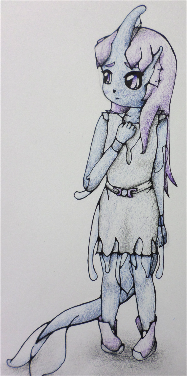
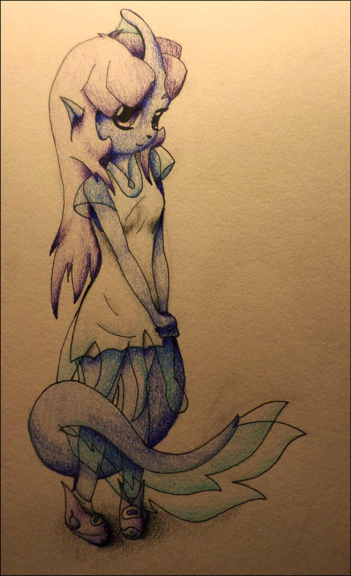
[spoil] First off, what strikes me right away is her breasts. I imagine that this is a big part of why you said female characters are your weakness. I am going to go ahead and assume that you are male, because this isn't really how breasts work.
At the core, breasts are fatty. They're certainly not entirely composed of it (what would be the point of that?) but it is of a very similar... feeling? Breasts naturally fall downwards because of gravity. I don't think that the binds the female character is wearing are tight enough to pull them very far up (it would be hard to breathe if it were that tight, as it isn't a proper chest binding material), so most of the weight in them would fall downwards, making a kind of... waterdrop shape? However, since your character is wearing binds, it still works to some effect of binding them. The breasts would fall out and downwards, so there'd be stretch in between them, no matter how big they are. They would not in any standard clothing look like two distinct ones.
Now that that's out of the way, I don't really feel like elaborating on much else. Her torso/midriff is much too long, and by consequence, her arms. I also think her legs are long, and the angle her thigh is going, her calf will be too small. Her hips are uneven, I think. Her hipline things (I don't know what they're called) are below the belly button, and form a kind of triangular shape with the crotch area. Her skull is a bit too high at the top.
Assuming none of this is just artistic choice!
[/spoil]
Um, sorry if I came off as picky, or rude. 0_0