-
Hi all. We have had reports of member's signatures being edited to include malicious content. You can rest assured this wasn't done by staff and we can find no indication that the forums themselves have been compromised.
However, remember to keep your passwords secure. If you use similar logins on multiple sites, people and even bots may be able to access your account.
We always recommend using unique passwords and enable two-factor authentication if possible. Make sure you are secure. -
Be sure to join the discussion on our discord at: Discord.gg/serebii
You are using an out of date browser. It may not display this or other websites correctly.
You should upgrade or use an alternative browser.
You should upgrade or use an alternative browser.
ummm can you tell me whats wrong
- Thread starter Pichu_fan
- Start date
munchlaxboy
Catching up on XY
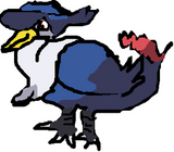
If you know that it is bad, then why are you posting it? I think the head is a little misplaced and the feet don't look very good. The outlining isn't very good either. Also, part of the tail isn't even connected to the body.
SilverFlame
png = PwNaGe
Yes it is very messy, it looks deformed.
Jason Park
The Steel Master
One thing I can tell right off the bet is that its feet don't look lke they are solidly standing on ground.
What I usually do it to draw a grid underneath to represent ground/floor. But it's not really easy to explain in words (especially when I'm not good at explaining. @.@)
Don't let others discourage you! Keep drawing and you will get better!")
What I usually do it to draw a grid underneath to represent ground/floor. But it's not really easy to explain in words (especially when I'm not good at explaining. @.@)
Don't let others discourage you! Keep drawing and you will get better!
blazikenBAM
alittlestitious
^that's a bit extreme don't you think?
i wouldn't go as far as to say it "sucks" but i will provide some critique.
i'm ot sure how you made this (tablet, mouse, etc), but the lineart needs work. make your lines as fluid as possible and really focus on anatomy. if the anatomy is correct, just the lineart a little choppy, a lot of imperfections can be overlooked.
as stated, the tail isn't attached. i'm not sure why it isn't, but it really should be. extend the line from the left (our left) edge of the tail down to connect it to the body.
finally the proportions are a bit off. the "hat" is a little small height wise and the legs are quite stiff and thick. really study the official art, if you really want to duplicate it.
good job so far, just keep working on it.
f you know that it is bad, then why are you posting it? I think the head is a little misplaced and the feet don't look very good. The outlining isn't very good either. Also, part of the tail isn't even connected to the body.
He/she posted it to see how he/she could improve.
As mentioned the head should be placed a little farther back, the tail shouldn't be disconnected to the body and the feet need to look sturdy and set on something solid.
The shadings ok, but you should work on the line art the most.
I think if you get the line art correct, you'll make a great pic no problem ^^
keep at it and don't let others discourage you.
If you know that it is bad, then why are you posting it?
Seriously. Threads like this just clutter up the forums. -_-
It almost looks like you were going for some kind of WindWakeresque style. You know, like the cell shading in the Zelda game?
VampirateMace
Internet Overlord
proportion... line quality, shading based on light- all possible improvements for this pic.
To comment without repeating what others have said- the feet appear as if they have been drawn looking straight on, but the body is clearly drawn at a side angle. To fix this, tuck the left leg behind the right slightly. If (for future reference) you draw the subject facing the right, then tuck the right leg behind the left.