• Hi all. We have had reports of member's signatures being edited to include malicious content. You can rest assured this wasn't done by staff and we can find no indication that the forums themselves have been compromised.

    However, remember to keep your passwords secure. If you use similar logins on multiple sites, people and even bots may be able to access your account.

    We always recommend using unique passwords and enable two-factor authentication if possible. Make sure you are secure.
  • Be sure to join the discussion on our discord at: Discord.gg/serebii
  • If you're still waiting for the e-mail, be sure to check your junk/spam e-mail folders

~Zero-Wolf's Gallery~

Zero-Wolf

Lost my memory....
Hello, I'm Zero-Wolf. I'm a graphic designer as a career. I decide to show my Banners, Icons, Wallpapers, and etc...And they are a bit different than original unique.

Rule:
*Follow the SPPF Rule*
*Don't say anything such as "you are not good" or "Suck"*
*If you want to get one of my banners, etc... Then please send me PM first and give credit to me. And please show me which one you want to pick*
*Please, need C+C what I need to improve.*


Thank you!
I will continually improve w/GIMP.
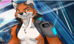
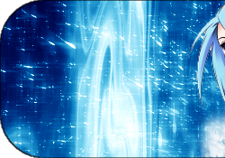
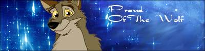
Here's Gallery:

Squall.png
Yunapiece1.png
Yunapiece2.png
TifaLockheart.png
FFTheSpiritWithin.png
Bahamut_Neo.png

Rinoawallpaper.png
FinalfantasyCheerfulWallpaper.png

Pleinair.gif
Veemon.png
GrellSutcliff.png
NightWizardAkari.png
Vandread.png
Shanoa.png
Gutz.png
Gutz2.png
AlicePandoraHeartspiece1.png
AlicePandoraHeartspiece2.png
lightwolf.png
Red-Wolfpiece1.png
Red-Wolfpiece2.png

Arcanine.png
Arcanineflames.png
Buizelpiece1.png
Buizelpiece2.png

Arcanine GIF banner couldn't be allowed to anyone.
Lucario.png

ChronoCrossKid.png
Kid.png

Luciapiece1.png
Luciapiece2.png

Rukia.png

FoxMcCloudSwimming.png

Balto-1.png

 
Last edited:
The banners aren't too bad, but the images don't completely blend with their backgrounds. The one that says Pleinair is by far the best though, considering that it blends fairly well and is animated.
 
The banners aren't too bad, but the images don't completely blend with their backgrounds. The one that says Pleinair is by far the best though, considering that it blends fairly well and is animated.
 

JaimeGreenan

Well-Known Member
The Rozalina picture is a bit blurry and the Veemon there is a little white line around the image which makes it stand out.
 

Metamence

Well-Known Member
Pleinair banner: The border is too big and she looks blurry.
Try to do this: Filters>Enhance>Unsharp mask to sharpen it.
The G-Flare on the Rosalina one looks out of place, I recommend that you desaturate it and set it to dodge. This is a good tutorial for G-Flares if you want to use it. http://www.gimptalk.com/forum/topic/Needs-More-Lens-Flares-20883-1.html
There are unwanted white pixels on the Veemon one.
You could do a Copy Visible and paste it on a new layer.
Then do a Gradient Map (choose a BG and FG color or choose a pre-installed one[Colors>Map>Gradient Map)
It just gives it better coloring if everything doesn't mesh together.
 

Zero-Wolf

Lost my memory....
Pleinair banner: The border is too big and she looks blurry.
Try to do this: Filters>Enhance>Unsharp mask to sharpen it.
The G-Flare on the Rosalina one looks out of place, I recommend that you desaturate it and set it to dodge. This is a good tutorial for G-Flares if you want to use it. http://www.gimptalk.com/forum/topic/Needs-More-Lens-Flares-20883-1.html
There are unwanted white pixels on the Veemon one.
You could do a Copy Visible and paste it on a new layer.
Then do a Gradient Map (choose a BG and FG color or choose a pre-installed one[Colors>Map>Gradient Map)
It just gives it better coloring if everything doesn't mesh together.

Oh, thanks for giving me advice and the comment. *sigh*
 

Metamence

Well-Known Member
The Richter one:He looks blurry(do the unsharp mask thing), the displaced red G-Flare (I think) doesn't mesh with the blue background. Try to desaturate it and go Color Balance/Colorize it.
The Moogle one: It has unwanted white pixels around it...
PS: I think this belongs in Digital Media??
 

Zero-Wolf

Lost my memory....
The Richter one:He looks blurry(do the unsharp mask thing), the displaced red G-Flare (I think) doesn't mesh with the blue background. Try to desaturate it and go Color Balance/Colorize it.
The Moogle one: It has unwanted white pixels around it...
PS: I think this belongs in Digital Media??

I don't think. Moogle is from deviantart(I forget to give someone credit)
Well... I check Gimp tutorials today.


Looper.gif
 

Amazing Red

Well-Known Member
these are ok. I'd say the lion hear one is the best.
 
Nice banners Zero! I thought I'd take a look and I'm really impressed whith how well you can merge characters and make them look well in front of a unique background :0
 

Metamence

Well-Known Member
Tenebrae looks blurred up due to that it was resized possibly, try to sharpen it/unsharp mask it (don't you pay attention to one of my posts!?
The Richter one:He looks blurry(do the unsharp mask thing)
The bubbles stick out and it doesn't appeal to me maybe you could set it to screen and lower the opacity?
And great job, it's is rather unique and it is better than your others.
EDIT: It looks a little plain IMO, maybe you could use some c4ds?
 
Last edited:

Zero-Wolf

Lost my memory....
Tenebrae looks blurred up due to that it was resized possibly, try to sharpen it/unsharp mask it (don't you pay attention to one of my posts!?
The Richter one:He looks blurry(do the unsharp mask thing)
The bubbles stick out and it doesn't appeal to me maybe you could set it to screen and lower the opacity?
And great job, it's is rather unique and it is better than your others.

~_~.... I just playing with that Tenebrae. I wanted to see what I liked.
Thank you.
 

Metamence

Well-Known Member
~_~.... I just playing with that Tenebrae. I wanted to see what I liked.
Thank you.

And here I am critting your work, to help you improve, you posted in the fan art section because you have to be open to crit (I think you did) :p
 

Shadow Eeveelution

DracLord Dread
They are nice excluding the Veemon. Look like a copy paste job alot
 

kirby8933083

mai husbando
Not bad. :/ Just want to say that it might be better if some of the images you use are better quality, clear, clean, doesn't have to be stretched.Also it would be lovely if the background works well with the image. The Moogle banner, with the rainbow trippy background? It doesn't create nice contrast, it clashes.

However, your one animated banner is amazing. Really. Clean, nice image, the boarder fits in well. As is your newest banner, the fire dragon. Keep on improving. n_n
 
Top