• Hi all. We have had reports of member's signatures being edited to include malicious content. You can rest assured this wasn't done by staff and we can find no indication that the forums themselves have been compromised.

    However, remember to keep your passwords secure. If you use similar logins on multiple sites, people and even bots may be able to access your account.

    We always recommend using unique passwords and enable two-factor authentication if possible. Make sure you are secure.
  • Be sure to join the discussion on our discord at: Discord.gg/serebii
  • If you're still waiting for the e-mail, be sure to check your junk/spam e-mail folders

ZOMG, I fail. ;P

sweet_piplup123

I lost the game?!?!
Okay, this is the last time I'll bash myself about my arts. Next time if that happens again would someone please give me a cyber-slap across the face.

Well, here are some banners I've made...to be honest they're the best ones I've made so far...*facepalm*

I use Photoshop 7.

Untitled-1copy-2.png
Untitled-2.png


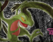
(A friendship banner I've made...xD I think I might've done a bit too much on the circly things though...)

Untitled-1copy-1.png
Untitled-2copy.png


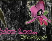
(Oh nozes! a shipping banner :O Anyway what I did was I desaturated the forest background since it's got to do with the dark future and all, then pasted on a Grovyle TCG art and some anime Celebi art I found on Bulbapedia. I was trying to make them blend in but somehow the thing got a bit too overwhelmed with the darkness...*sweatdrops* not to mention I deleated the psd file too...)

Milotic.png


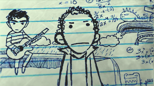
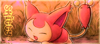
(It was a birthday present for a friend so uhh...any suggestions?)

DavidWelsh.jpg

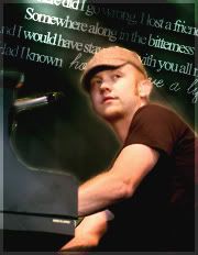
(lol, David Welsh from The Fray, or I think that's his name since I kinda got mixed up with their names before...*got stoned* I was fiddling around with colours and saturations this time.)


Newest ones:

Heartless2copy.png

(I edited this off a screenshot.)

isaac_slade_001_081907.jpg

(A quick 15 minute work... And shut up about my obsession with The Fray. xP)

Skittycopy.png

(WBC entry, forgotten about the week it was in)

TI--DeadandGone.jpg

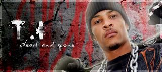
(T.I's Dead and Gone, I kinda like this song... though the banner sucked since it only got one vote in week 49 XD...

Untitled-1copy-5.png
Untitled-1usless.png

(WBC entry 52. Picture found on photobucket. I almost panicked when I stuffed up the background at one point...)
 
Last edited:

Flurried Rains

~No Day But Today.
I'll post here since no one else has. :3.

For your first banner, I think it's probably your best or second best out of all of those. The text placement makes sense, the background is plain enough that it doesn't take away from the images themselves, and I just like it lol.

For the second banner, you went wayyy too crazy with the textures. It takes away so much from the images of Celebi and Grovyle and doesn't match them too well either. I like the text in that one though.

For the third banner, I think you should try to avoid scan lines, or at least lower the opacity on them. To the left of Milotic's head they are kind of distracting. Other than that the only problem is that it is too plain.

Your fourth one is tied for first with the first one. The color is nice, and the lines and text fit in very well with the rest of the banner. Not much else to improve on.

Hope that all helps at least a tiny bit. :3
 

sweet_piplup123

I lost the game?!?!
Whoo! My first critique! ^_^

Thanks for the advice :) Yeah, for some reason I preferred working on photos than cartoon graphics because they're somewhat easier to manipulate -_-;
 

ChloboShoka

Writer
I like these Sweet Piplup. ^_^ I think the Milotic one is my favorite cause I like your choice of image and how it stands out in that lovely shade of blue. I actually like the scanned lines. The first one is really cute too, I'm quite fond of the background. On the second one I think it's interesting how you've chosen the shiny cerebii instead of the normal green one. The last one, I'm not quite fond of the yellow but it's still nice.
 
It's interesting, your stuff are vibrant. o_o The colours look so rich and I find it real attractive. The layout of it is nice, there's some good and okay ones. I don't see anything bad from it except with type in some of your work. But typography is what most people are crappy in. Other than that, the layout of your stuff is decent.
 

Illusione-Tempus

Well-Known Member
On the second one I think it's interesting how you've chosen the shiny cerebii instead of the normal green one.

Ain't the Celebi who's in love with Grovyle at MD2 pink?

First one looks pretty cool. Although you surely did too much one the circly things =/

Second one... looks too dark although I understand your point about the Dark Future, but don't make it too dark or both of them. They got light colors.

Third one... Haven't reply with a "thank you" back then since I was away. Oh noes I spoiled it! Yeah I was the birthday girl she sent that banner to :p
 

sweet_piplup123

I lost the game?!?!
Thanks guys :)

Yeah, I gave the last banner a yellow filter because I thought it could match with the wooden door colour ^_^

I made a new one, it's off a screenshot from this video:

Heartlessone.png
Heartlesstwo.png


I think I've done an okay job at turning the picture from a bad quality screenshot...though I admit there's not much to it because I couldn't think of anything to add on it without making a complete mess...
 
Last edited:

Ahmed48

Tactician
You should blend the renders with the background, that'll give it a nice look.
 

sweet_piplup123

I lost the game?!?!
Interesting suggestion...

So do I feather around the edges with the lasso tool or do I use an abstract brush of some sort?

So far the image has got light/colour adjustment and overlayed with a paper texture.


EDIT: Done a little variation to it, I thought it might look better if I make the lines a bit darker...
Heartless2copy.png


btw, Issac Slade (the one at front) looks funny. xD
 
Last edited:

Lucariofan-atic

avant ǝpɹɐƃ painter☆
Wow, the colors you use here are 'brave'.

For the 1st banner: This is (maybe) the best of all the banner you have here. i like the way you put images and text so they blend well with the background.

2nd banner; that's a texture? o_O *surprised*, i thought that was, like branches, you put them too much on the banner, and both of the images don't blend well with the background, either (sorry!)

3rd banner; Maybe withought the lines... i tink it's better and match each other.

4th banner; Same comment with the first banner XD

Sorry if my comments sucks a bit harsh!
 

sweet_piplup123

I lost the game?!?!
Don't worry Rayquaza, I don't mind ^.^

Colours I used are 'brave'? lol I dunno... but I do like bright colours when doing any art:)

EDIT--Done this in a space of 15 minutes... I swear I need to lay down on this obsession with The Fray. xP
isaac_slade_001_081907.jpg


EDIT 2: Come on, where is everyone? Anywho, my fail okay WBC entry ^^
Skittycopy.png


...I luv strikes.
 
Last edited:
Hi! I haven't critiqued yet, so my advice might not help well.
1st banner: Oh I remember that one! I kinda wanted to be in it >_< It's really nice and the circles don't look like you overdid it.
2nd banner: My favorite pairing <3 The Pokemon look a bit too dark but I guess lotsa people said that already.
3rd banner:
Yeah I was the birthday girl she sent that banner to :p
I knew it! It's really cute. Very nice for a birthday present.
4th banner: Uhhh... It's good, but since I don't listen to The Fray that person is unfamiliar.
5th banner: The one in your sig looks like a pencil drawing. But I saw the video, so ignore that comment about the pencil drawing :p
6th banner: Uh... No comment?
7th banner: Wow! What a cute entry for a contest.
I really hope I helped... If I didn't... >_<
 

Illusione-Tempus

Well-Known Member
Oh I remember that one! I kinda wanted to be in it >_< It's really nice and the circles don't look like you overdid it.

Just ask us if you want to be in it, via VM or PM (if you want to make more work for Pippy :p)

1st newest banner: Er, No comment?
2nd newest banner: I like it! The color of the background suits with the mood of the banner. The picture looks really cute too :)
 

sweet_piplup123

I lost the game?!?!
Haha, don't worry, I don't mind work so long as it's not school-related xP

My epic fail cool and awesome WBC entry for week 49.
TI--DeadandGone.jpg


EDIT 2: Bummmmmmp. Anyway, it's Coldplay this time ^_^ What? I need to give my second favourite band some time to shine...lol.
http://i36.*******.com/fepj09.jpg

EDIT 3: WBC entry week 52. *yawn* so quiet....

Untitled-1copy-5.png
Untitled-1usless.png
 
Last edited:
Top