
-
Be sure to join the discussion on our discord at: Discord.gg/serebii
You are using an out of date browser. It may not display this or other websites correctly.
You should upgrade or use an alternative browser.
You should upgrade or use an alternative browser.
CC needed
- Thread starter mangaeyes
- Start date


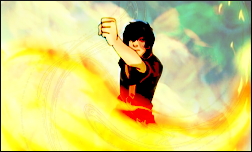
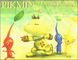
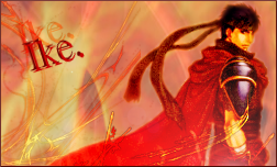

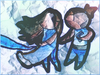





Warfare
liverliverliverliver
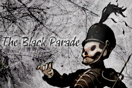
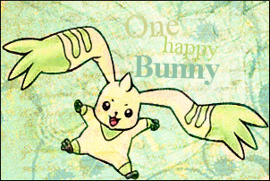
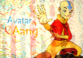
Well, I think you've gotten better, but you're overwhelming everything with the textures/brushes. Other times, the colors are a bit weird and are desired to be fixed.
lol, this will end up being a post full of tips. I honestly don't know what you exactly use in GIMP, so it's not like I'm taking you for an idiot or something if I'm showing you something you already know or use. ):
Sometimes, you need to erase parts that are covering your focal points. If you're using a texture that has colors that are altering your image in a way you like, but is probably covering, let's say, a person's face with grains, you can gaussian blur the grains covering the face or something. That will help keep the color while removing the grains.
Try to practice curves, color balance and channel mixer. I guess you can focus a bit more on brightness/contrast too, since there's no selective coloring. Even though I use photoshop and I'm open to several more things, curves, color balance and channel mixer are things I still use to alter the colors. For example, they help me remove the blues from extremely blue images.
Curves especially helps remove colors if the whole image is overshadowed in one color. Somewhat like this for blues:

Uh, it somewhat(?) looks like you did this on some of you images? But try duplicating your base and setting them to soft light, then duplicate that and set to screen if your base needs somewhat of a brightening up. You can change opacity too, obviously. Then you can copy merged/visible (shift, ctrl, c) and have it pasted on a new layer. From there you can start working on what I mentioned above, and then some of the things that you do. You can somewhat incorporate these things to make it work with your backgrounds, brushes, and so on.
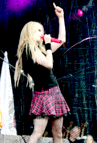
The text bothers me too. Don't be afraid to cover your focal points with text, but don't do it if it's going to cover things like faces or important parts either. And don't do it at all if you don't even have the room for it, like your Avril Lavigne banner. I see you somewhat have problems like that looking at your 120 x 120 icon and Peach banner. It's really not necessary to shove some text in the corner. Allow some more room for text before you start.
Just some fonts I use, idk:
Georgia, Cooper Black, Fh Nicole, Joyful Juliana, Myriad Pro (in bold and for fun), Print Dashed/Clearly and Violation.
Non-pre-installed fonts @ dafont.
I also tend to make my text big in size, because it's either thick enough or extremely skinny, just because of the size.
lol, this will end up being a post full of tips. I honestly don't know what you exactly use in GIMP, so it's not like I'm taking you for an idiot or something if I'm showing you something you already know or use. ):
Sometimes, you need to erase parts that are covering your focal points. If you're using a texture that has colors that are altering your image in a way you like, but is probably covering, let's say, a person's face with grains, you can gaussian blur the grains covering the face or something. That will help keep the color while removing the grains.
Try to practice curves, color balance and channel mixer. I guess you can focus a bit more on brightness/contrast too, since there's no selective coloring. Even though I use photoshop and I'm open to several more things, curves, color balance and channel mixer are things I still use to alter the colors. For example, they help me remove the blues from extremely blue images.
Curves especially helps remove colors if the whole image is overshadowed in one color. Somewhat like this for blues:
Uh, it somewhat(?) looks like you did this on some of you images? But try duplicating your base and setting them to soft light, then duplicate that and set to screen if your base needs somewhat of a brightening up. You can change opacity too, obviously. Then you can copy merged/visible (shift, ctrl, c) and have it pasted on a new layer. From there you can start working on what I mentioned above, and then some of the things that you do. You can somewhat incorporate these things to make it work with your backgrounds, brushes, and so on.
The text bothers me too. Don't be afraid to cover your focal points with text, but don't do it if it's going to cover things like faces or important parts either. And don't do it at all if you don't even have the room for it, like your Avril Lavigne banner. I see you somewhat have problems like that looking at your 120 x 120 icon and Peach banner. It's really not necessary to shove some text in the corner. Allow some more room for text before you start.
Just some fonts I use, idk:
Georgia, Cooper Black, Fh Nicole, Joyful Juliana, Myriad Pro (in bold and for fun), Print Dashed/Clearly and Violation.
Non-pre-installed fonts @ dafont.
I also tend to make my text big in size, because it's either thick enough or extremely skinny, just because of the size.
Forever&Always
DanceInTheDark
there nice. I like the biomerge one the best because i had that toy growing up.
What I'd like to see most is an improvement in text effects. Your text either seems to get lost in the image, or just doesn't look like it belongs there (like on your Avril Lavigne image).
There's also a bit of a problem with cohesiveness in a couple of these, like your last one with Lugia and Ho-oh. It just basically looks like background + 2 pokemon. You want to try to bring all the elements into one banner where everything looks like it belongs. For example, you did a great job of that in your Pikmin banner.
Overall, I love that you're not afraid of bright colors. That's a big plus. Keep striving forward and trying new things.
There's also a bit of a problem with cohesiveness in a couple of these, like your last one with Lugia and Ho-oh. It just basically looks like background + 2 pokemon. You want to try to bring all the elements into one banner where everything looks like it belongs. For example, you did a great job of that in your Pikmin banner.
Overall, I love that you're not afraid of bright colors. That's a big plus. Keep striving forward and trying new things.
Northern Lights
[BritishSarcasm]
It's nice to see you have improved - but you definatly needto work on your text placement, as i told you.
try to gain a 'feel' for the banner - i know, it's hard to explain, but the theme or atmosphere you get from the banner, and choose a text to match.

i like this banner out of all of them, the bright colours with the lightened overlay, very nice ^_^ but the text in brackets ... ditch it, it looks out of place and spoils the banner imo =\
try to gain a 'feel' for the banner - i know, it's hard to explain, but the theme or atmosphere you get from the banner, and choose a text to match.
i like this banner out of all of them, the bright colours with the lightened overlay, very nice ^_^ but the text in brackets ... ditch it, it looks out of place and spoils the banner imo =\
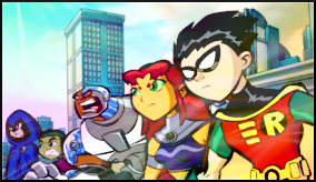
I really like this banner because the colors look awesome and the effects accentuate the main image instead of overpowering it.

I really like the effects on this one. My only critique is that it might be better off cropped smaller so there's less empty space.

I really like the background on this, but the skewed angel of the umbreon really throws it off. Also, it looks a bit empty. A possible option might be to try adding some decorative brushes behind umbreon (sort of blossoming out from it) to draw the eye more toward the main feature of the banner.
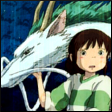
This one also looks a little squashed, but I don't think it's a resize/transformation issue. I think it's just because you cropped off the nose, so it looks a little crowded. Nice colors and textures though.
You definately are improving and it's very cool to get to see your progress
